Vista and Office 2007 are interesting as they provide major user interface work that also includes new sets of fonts. I thought it would be interesting to show the evolution of the various styles.
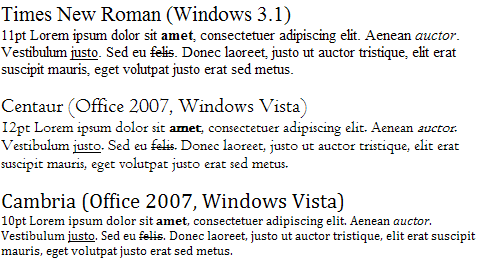
Serif
Times New Roman has been the default typeface in Microsoft Word since version 1 and was originally designed for printing newspapers on high speed printing machines whilst still retaining legibility.
Curiously enough whilst Office 2007 provides a couple of new serif typefaces the default has switched to the sans-serif font Calibri although a number of the the themes within Office 2007 utilize these typefaces.
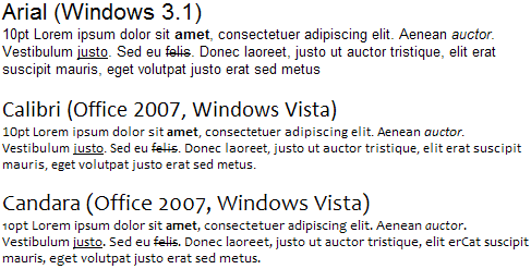
Sans-serif
The infamous Helvetica clone Arial primarily used for on-screen document-type work and even used in some applications user-interfaces throughout the years gives way to two new lighter fonts that like most of the new ‘C’ named typefaces rely on ClearType to look legible at small sizes.
Calibri is now the default font of choice for Word documents and will therefore probably become a familiar typeface in a short space of time.
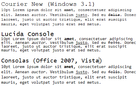
Monospace
Primarily used for programming and other environments that require it. At least all those programmers too lazy to try something else will enjoy Consolas as standard in Visual Studio 2007.
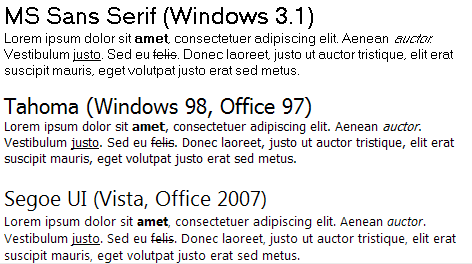
User interface
The Windows user-interface switches to a new font once again despite large chunks of the Windows UI never making it past Microsoft Sans Serif (the scalable version of MS Sans Serif pictured below).
[)amien
0 responses