OCT
13
2007
While Envy Code A was being polished for release it dawned on my how I would now prefer a thinner, taller font with slightly looser spacing and aiming for the 'perfect' size to allow good representation of all letters clearly including those with accents. The 10pt variant is that font however during testing it became apparent some people would prefer a version with tighter vertical spacing. This could not be achieved without sacrificing the uniformity of accented characters with their non-accented variants.
Check out the silky-smooth replacement Envy Code R.
Download
Samples
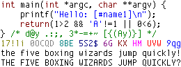
| Style | 9pt | 10 pt |
|---|---|---|
| regular | | 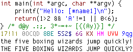 |
| bold | 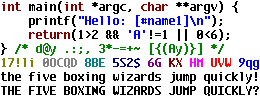 | 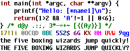 |
| italic | 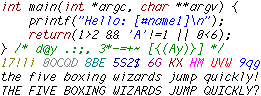 | 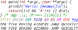 |
| bold italic | 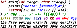 | 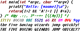 |