Linux vendor Red Hat have released a font family named Liberation under a GPL license.
The family consists of three typefaces known as Liberation Serif, Liberation Sans and Liberation Mono each in normal, italic, bold and bold italic variants. The fonts are not hinted in this initial release so may not look too great on-screen at some sizes. Red Hat expect to release better-looking hinted versions in the future. Having attempted hinting Envy Code R font myself they have my sympathy.
These new fonts are designed to be metric-compatible (and therefore interchangeable) with the standard Windows fonts of Times New Roman, Arial and Courier New intending to "Liberate" documents from Microsoft’s fonts. Bearing in mind Office 2007 pushes new typefaces as the default I’m not sure how successful this will be long-term.
Microsoft’s typefaces were designed to be metric-compatible with the classic Times Roman (1931), Helvetica (1957) and Courier (1955) typefaces in the first place so perhaps Red Hat would have been better off licensing or mimicking those instead.
Screen shots follow.
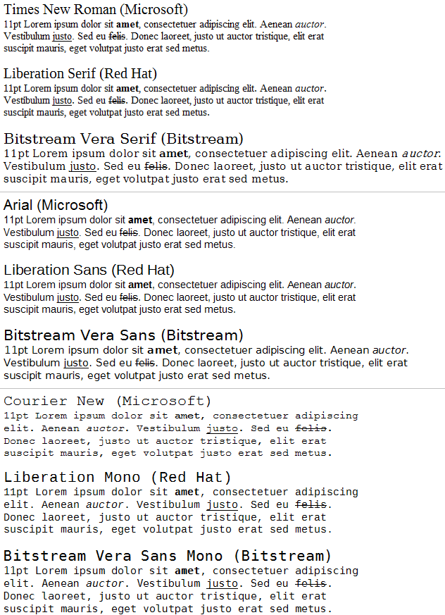
Windows
The Liberation fonts on Windows using ClearType alongside the Windows fonts they intend to replace. The free Bitstream Vera family equivalent is also shown (only Vera Sans Mono is metric-compatible).
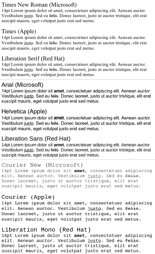
Mac
Microsoft’s Windows fonts alongside Apple’s versions of the originals and the Liberation fonts again all rendered with Mac OS X and sub-pixel precision aliasing. Point sizes have been increased by 3pt to compensate for the difference in on-screen DPI.
[)amien
9 responses
Red Hat's site has been updated with the latest version of the Liberation fonts, which includes full hinting and a distinguishable zero in Liberation Mono. It's now become my default coding font.
The first check that I perform when choosing a monospaced font for programming is whether I can differentiate between a 1 (one) and an l (lower-case L), and between a 0 (zero) and an O (upper-case O).
The monospaced Liberation font fails these tests. The font may look nice, but it's useless for programmers.
During my days as a code-monkey I used a bitmapped Lucida Sans Typewriter for programming and have recently switched to Bitstream Vera Sans TTF once Emacs on OS X supported AA fonts.
Ah I assume you mean the blog look and feel.
It's a standard termplate that comes with my blogging software.
I am working on a look of my own.
Damian,
Your being a typeface cognoscente, why do you use Arial, the ugliest font of the all below 17px, as well as, the least legible? Furthermore, why did you pick the bizarre color "6a604f", causing severe eyestrain in lowly mortals due to extremely low contrast?
Courier New is a pretty ugly font - check out some of the other posts on my blog about other replacements for programming (Consolas, Inconsolata, Monaco, Envy Code R)...
ugh! the liberation mono is certainly no replacement for courier new imo.
That explains it ;)
I'm no font connoisseur (hence why I've stuck with Courier New when coding for years and never even noticed) but I have been frustrated by the lack of freely usable standard font replacements - when distributing OGRE (which uses some TTFs) we had to hunt around for decent standard-looking fonts we could distribute because the MS free fonts license wouldn't let us. So this is a good thing.
My only strong opinion on fonts generally is that Comic Sans really irritates me. A certain personnel department insisted on using it and it just looks ridiculously unprofessional and 'My First Website'y.
I know serif fonts are out of fashion now but in print (rather than the web), they are much better IMO. There's a reason Times has been around so long..
Because they are beautiful and important with a rich and interesting history.
My second career choice was typographer but I didn't have the skills or resources to do it - much like my first career choice of Pro BMXer.
Software development was third choice and far more realistic.
Damien,
Out of Interest, why are you so obsessed with Fonts ???
Lee