A newer version of Envy Code R is available.
The last few days have been frantic ones putting the final touches to the next release of the Envy Code R typeface as I bring it closer to my idea of the perfect coding font.
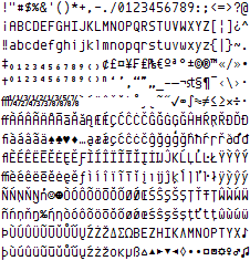
Many glyphs have been redrawn, curves improved and a many additional characters and symbols added bringing the number of glyphs to 461, enough to cover common European and US code pages including Windows/ISO 1250 & 1252 as well as MacOS Roman and a few others.
There was some interest in a bold variant and so once that was done I felt the urge to make an italic one too:
Phew!
As a bonus I’ve created a variant that overcomes Visual Studio’s aversion to italics by marking the italic font as bold. Choose ‘Envy Code R VS’ in the Font and Colors part of Visual Studio’s Options and choose bold wherever you want italics.
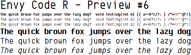
Here’s a sample at 10 point/ClearType with my own color scheme:
Yummy.
A few things to note:
- The new glyphs for accented characters, ligatures etc. might not be correct, they’re new to me
- Bitmaps are missing so if you don’t use smoothing/anti-aliasing/ClearType stick to the prior PR4 release
- Optimal size: Windows 10 point, Java 13 point and Mac OS X 12.5 point but looks good at larger sizes too
- Some glyphs will be improved (96?&) but others can’t (WwMm@) as there are no more pixels to play with
- At some sizes individual letters aren’t the right height, e.g. u,v,x at 12 point (damn hinting)
Download of this older version no longer available.
Feel free to leave comments and suggestions here (or better yet blog about it!)
[)amien
42 responses
Many thanks, it looks so good that I start to enjoy coding :D
Thanks...it works really nice on e-text editor and Aptana IDE.
Hey Damien Just came across this post and your fonts. Very nice. and I really like your color scheme.
I've been a consolas guy for a number of years now, and one of the big reasons is the lower "m".
Envy seems to have a similar prob as a lot of other fonts. I'm guessing because it's compressed a bit horizontally, the lower m doesn't have much space to breath, so (at least to my eyes), it tends to fuzz considerably at 14 pt in VS.
Whereas Consolas's lower m is much clearer.
However, I really like your line draw chars, and the Bold-Italic trick for VS is utterly fantastic.
Do you see what I mean about the m's? I can shoot you some screen shots if you like. And again, it might just be me
This is just..WOW!!! amazing, perfect coding font!
I'm using the fonts in my text editor, too. Very clear.
I donn't know why but its working today. oO
Stupid Vista...
hi, i have some trouble getting the "italicasbold" version to work under vista sp1. it seems its not recognized as a valid truetype font :(
Go into Start Menu > Control Panel > Fonts
Now unzip the file using extract all. Then drag the .ttf and .otf files from the unzipped folder into the Fonts window.
For a newbie, how does one install fonts from the files in the zip archive that I downloaded, there's no installer (setup.exe). I have windows xp sp2.
thanks
Damien,
I've been using envy r vs for awhile now and I am hooked hard, but I am running into the weirdest issue with it. Whenever I view Visual Studio (08 or 05) over remote desktop, all of the lowercase a's are converted to lowercase d's. This is kind of a nutty problem, but do you have any ideas about it?
Thanks, Shawn
Wow!!! This is the best font I have ever seen. Thank you.
pretty font but not very usable IMHO. on my screen, commas look like periods. semicolons look like colons. two of the most important characters in C# coding.
Having gone through a barrage of monospaced fonts, I realized Envy Code R is by far the best free font available. Although, I really liked Paragmata font, I couldn't use it due to the hefty price tag on it ('am not earning yet).
Envy Code R has everything I liked about Paragmata, so basically it's a no brainer for me.
Thank you Damien!
Just wanted to post that I've been using the font for a few months now and am REALLY enjoying it. I'm using it right now with kde4 and kdevelop. I'm also one of those optimists that check back on your blog every few days in hope of seeing an update. I can hardly wait to see what more you do with it! Thanks so much! This is a phenomenal coding font.
Chris
It's the best font for programming I have ever used. Its compact, clear and nice. Thank you for the development!
Awesome work! This is a killer programming font, and looks to replace my current Bitstream Vera Sans Mono preference!
Great font, I'd like to use it instead of Droid Sans Mono. Unfortunately does not work with Russian Windows-1251 codepage.
Hi Damiel,
your font rocks!!!!!! Very good!!!
Thanks Bye Federico
Sweet font. I've tried it on both Linux and Windows as a font in gvim, and it looks sweet - on Windows it's getting a trial as my new programming font.
Netbeans on Linux at 13pt is nice, but I think my current favorite (DejaVu LGC Sans Mono at 9pt or 10pt on Windows and Linux, or 13pt for Java apps like NetBeans) still wins.
If I were forced to come up with suggestions:
Great work!
It's okay, your comments can stay :) I'll give that one and shot and see what it looks like. The real problem is that the renderers on Windows, Mac, Linux and Java all draw the fonts very slightly different and diagonal lines is one of the major headaches. What looks great on Windows looks too heavy on Mac/Java...
Once I get this font looking just how I want (probably PR7) then I'll have to seriously look into hinting the font to try and get it spot-on for each platform. Failing that I could branch off another version and tweak that for 13pt on the Mac to look just as good (I find all the characters are a bit bold on the Mac atm at 12.5).
Mr Moderator! Please feel free to dump my previous message. I forgot to hit back and comment in a forum discussing fixed width fonts which linked to your font. I was not intending on spamming your Envy discussion with alternative fonts.
I did find Triskweline more comfortable than Envy Code R though. The Zeros in Envy were far too heavy for me.
Regards, aid
I've been using Triskweline quite happily, at 12.5 or 13pt on a Mac,
http://www.netalive.org/tinkering/triskweline/
I find it open and clear.
Hmm, not sure why that might be. I have finally got a copy of Vista (via the MS employee store for $45 :D ) and will be installing it just as soon as my new HD arrives (about a week).
Will be able to test then and issue a fix.
I can't seem to install the font(s) on Vista. I get some error:
The file is not a valid font file and cannot be installed.
Is this a Vista problem? Or is there some special way to install the font other than to drag and drop the font files into the font folder?
Thanks for the kind words - it's good to know they look pretty good under Gnome.
The font will remain free-of-charge but copyrighted for now but if any of the Linux distributions are actually interested in including it I could quite likely be persuaded to switch to a proper open license.
When I entered the message, I included the g, and got the andale/consolas/pragmata version as example, but the posted version doesn't show this. I've used Envy fonts, and generally like them, except for the g. Many fonts leave the descender too small and the circle too large, Envy R not as much as some. The other versions have g as a very unique glyph; it can't be confused with anything else. Likely more work, too; I suspect.
As to the java issue. I use jswat debugger, and Envy R is unreadable. About the only one that works is Andale; dotted zero looks too much like an 8.
Not entirely sure what you mean by the full-monty. You mean more of a curve on the existing open-tail or conversion to a full loop-tail?
I'm not a big fan of loop-tails when used in fonts designed for clarity/small sizes so I don't see that happening but I could re-introduce a curve if there was demand.
At some point, I don't recall seeing it yet, would you consider the full monty lower case g ? The Envy version isn't bad as some, but still not fully differentiable from q and o.
thanks
For what it's worth, the issue appear only at sizes 13 and below.
-- Eddy
I'm really not sure what is causing it. I will have to install NetBeans or JEdit and try experimenting. At a guess I'd say it could be something off with one of the metrics but they are auto-calculated by the design software.
Damien,
The font looks great in the editor, but unfortunately in some Java apps (NetBeans auto-complete drop-down list) the fonts are all messed up (as Jay wrote).
Is there any interim fix that we could try?
Thanks,
Eddy
This looks really pretty in Windows! Unfortunately, Windows Java 6 w/Swing gets very, very confused by something:
http://www.jay.fm/files/envycoder.png
I would like to suggest a tweak to the comma. It is difficult to see the difference in smaller point sizes between a comma and a period, and between a colon and a semi-colon.
I recently discovered Envy Code R and it easily replaced Dina as my favourite coding font. It's very clear, yet still pleasing to the eye. Great work!
BTW I'd also really appreciate added block-characters, so I could use it in PuTTY as well...
This font is absolutely awesome. The VS italics hack is brilliant! Envy Code R is my favourite coding font from now on, beating Consolas and Inconsolata. Thank you, and keep up the great work!
Damien,
First time I tried Envy Code R, and it's looking mighty fine! Love the VS italicss hack :) My only complain would be that 14pt is too small, while 15pt is huge :)
To echo Andrews comment and provide more info; it only happens at sizes 12 and 13. Works otherwise.
That's almost certainly a problem with the font itself - I'll take a look tonight. Probably one of the Mac-specific metrics gone askew although I tested it with Terminal before release.
Hey Damien,
I'm relatively new to Mac's so this may well be user error, but using PR6 on textmate I get strange problems.
Give me a shout if you need more information about my setup to figure out whats happening ;)
Cheers for the Capital 'R' change, it looks a lot better than before.
Under Java, the slash through the zero is rendered very heavily, so too 'NMWZ', lowercase is perfectly fine.
see image for a screenshot
As you have said before, Java has a bastardised font renderer so it may never look as awesome as on the mac/win native renderer.
Having used EnvyCode since its beginning, I have to say that this is the best yet. The spacing issues of the early versions seem to be sorted.
I also like the fact you've created a Visual Studio version for italic support... now, hows about fixing all the other annoyances Visual Studio? ;)
Wow, this version looks really good. This is (and has been for a while) my favourite font to code in - absolutely superb! Thank you :)