Google’s Android project, an open platform for mobile devices, has been hitting the news a lot in the last couple of days with it’s open APIs, Java-based development platform and optimized virtual machine.
One thing not too many people have yet been raving over is the lovely set of typefaces from Ascender Fonts known as the Droid family.
Hidden away into the downloadable SDK’s emulator is system.img which contains various binary files including these new fonts. Being that the image is almost certainly in Linux ext format and I found no easy way of mounting it in Mac OS X or Windows I was pleased when I stumbled upon Beeno’s page of the extracted files.
I have already covered Droid Sans Mono with an eye for using it for programming but thought it would be worth showing the other members of the family although I haven’t drawn direct comparisons with the Mac and Windows supplied fonts as I did with Red Hat’s Liberation fonts.
Updated October 2011 from Ice Cream Sandwich SDK!
Download Droid Font Family (ZIP of TTF) (1.9 MB)
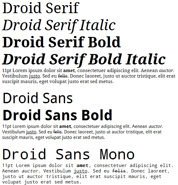
Droid fonts in Windows XP via WordPad
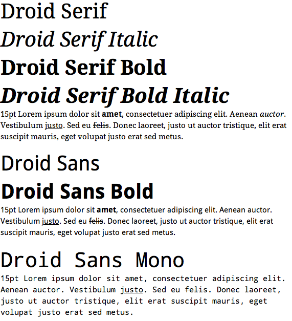
Droid fonts in Mac OS X 10.5 via TextEdit
[)amien
19 responses
freetype under linux can produce the same output with hinting turned off and Cleartype-like subpixel filtering (this feature exists in freetype since 2.3.0, but needed patched Cairo and libXft to utilize it). Droid Sans in UI: http://www.ljplus.ru/img4/a/s/asphyx_lj/xfce_droid.png
@Kriston Because they are designed to be used on Google's Android Platform for mobile phones that will always be anti-aliased.
Awful fonts. Why aren't they hinted for non-anti-aliased viewing? I expect more.
The real difference is that on Mac Apple has given you a Text editor that has a few nicities and a decent level of flexibility with file formats and encodings. With Wordpad on Windows you have a perfectly acceptable font engine that isn't being used in Wordpad because MS only tosses that in as a cut-down version of an ancient version of its cash cow MS Word (now only bundled in MS Office). The fully expect you to upgrade to Office (which would replace Wordpad's file associations anyway) since everyone uses Office anyway, right??
@Radomir: The Windows screenshot does not having smoothing disabled - it is using ClearType smoothing hence the sub-pixel precision you observe.
Lets not exaggerate, Windows sucks but not that much, if you look closely you'll see that the Windows rendering has simply disabled smoothing. Some people disable it, I have no idea why. (but Note that both screenshots have subpixel hinting enabled, which can give pretty bad effects for people not using LCD screen or using one with different subpixel layout.
The fonts are very nice, I especially like the monospace font, I'm glad that designers finally start to gravitate towards the original VGA fonts. Still, Terminus seems to me to be much better for programming and terminal, shame it's not a real truetype font.
The font looks great, even a bit better than BitStream Vera/DeJaVu but has far less characters (560 total) than DeJaVu... There is no italic/slanted version of Droid Sans Mono :(
The sans-serif face really reminds me of Myriad Pro (Apple's corporate typeface). The serif face looks similar to Cambria, one of the new Vista/Office 2007 fonts.
There is no point showing the XP rendering, it is well known that Windows does not render type to professional standards. There is mp information to be had there except yep, Windows still can't render type. Better to show Illustrator or Photoshop rendering next to Mac.
The headlines on the Mac are the same 'point size' however the different DPI's mean that you have to bump fonts up 10% to get similar sizes so it's not that easy to compare directly.
To my eye, these look like attempts to be visually compatible with Georgia and Verdana, and are not particularly amazing designs in their own right. This is good for web sites that target the standard MS fonts for their designs, though.
I <3 Mac font smooothing.
Those are some nice fonts, but how anyone can look at both the XP and the OSX renderings and prefer the XP version is just beyond me. The pixel boundaries are so sharp and ugly that the imperfections in the 'D' in the first "Droid Serif" just grab the eye and won't let go!
Compare the OSX renderings. It's the difference between CGA graphics on an ancient PC, compared with hard-copy printed text. And this is progress ? Colour me luddite and spare my eyes...
Why did you have to use different font sizes on Mac and XP?
If you want to extract the fonts yourself on a Mac, it's pretty simple; no need for mounting the filesystem. Run the emulator, then ddms from the SDK (in the tools directory). In ddms, choose File Explorer from the Device menu, then you'll find the fonts in /system/fonts. Select one or more fonts and hit the left toolbar button (looks like a floppy disk with a left-pointing arrow on it) and you can save them wherever.
The font is nice, but that's just it : another font. I'm amazed though, by the difference n the rendering between Mac and Win... If you wonder why you feel netter on a mac, start here...
it's distributed under which licence?
Buhuu...I want to download it :-(
They sure look like nice fonts! Droid Sans looks good, though it also appear they still need a bit more work (some rough edges).