Google’s Android project, an open platform for mobile devices, has been hitting the news a lot in the last couple of days with it’s open APIs, Java-based development platform and optimized virtual machine which includes the lovely set of typefaces from Ascender known as the Droid family.
Check out previous coverage of the well-known and lesser-known coding fonts.
There are a number of Droid fonts including Droid Sans and Droid Serif but of particular interest for developers is the Droid Sans Mono font that looks great in Visual Studio not only at my favorite 10 point… but from 7 point upwards with either ClearType or standard font smoothing although some might find the fact it smooths at all sizes a little soft (or Mac-like).
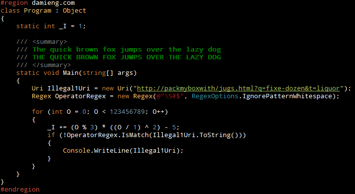
Here it is at 9 point with Rob Conery’s Vibrant Ink (WekeRoad Ink) theme:
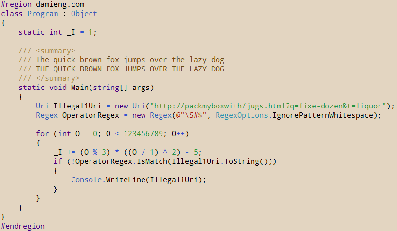
Here it is at 11 point with my Humane theme:
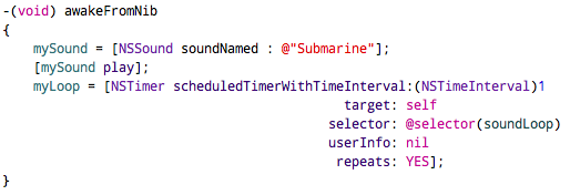
And here it is 12 point in Xcode on the Mac:
The only issues are:
- the lack of a bold weight or italic variant which limits the syntax highlighting options
- the 0 is currently not slashed (there could be some other indistinguishable character pairs)
Being that the Droid family is Apache licensed no doubt somebody will fill that gap (okay, okay, I’ll give it a shot when I get some time;-)
Download Droid Sans Mono (TrueType TTF) (79 KB, 10/2011 source)
Try my free scalable coding font Envy Code R (shown below) with Visual Studio italic support, has a bold variant and distinguishable pairs 0O etc:
[)amien
33 responses
Heh, I actually just stumbledupon your post Damien and since I did, I then went on to download the font. The bold is richer than regular types, which isn't a bad thing as it makes certain key words more distinct. I think I'll stick with it for a while, see how it feels :)
Thanks for the tip. It's a really nice font except I find the semi-colon hard to read. It looks like I may have to revert to my old font, Bitstream Vera Sans Mono.
p.s. your comment box thinks that isn't a valid character in an email address!
I tried using this font in my windows theme and it created all kinds of havoc with printing.
Rich
If I have to work with code all the time, I don't want it to be in Courier. I want a clean antialiased gorgeous font I can stand looking at for hours on end - e.g. Consolas, Bitstream Vera Sans Mono, Inconsolata.
I have the same discussion with friends and professors regarding Times New Roman. Yes, everyone uses it. That doesn't mean I want to look at what has to be one of the ugliest serif fonts in use today. It's a pain to read, it's a pain to edit my work when the font is giving me a headache, it's a pain when I'm reading it on a Mac where all these fonts look amazing.
The choice is most definitely personal. I prefer to look at what I want to look at if I have a choice, rather than to just deal with a nasty default.
Lastly, a good font can actually help with coding. I don't know about you, but I get to deal with partners who have problems typing. Syntax errors galore, and sometimes with the wrong font I can't spot why. On the other hand, a good font would make it fairly easy to spot a place where someone accidentally confused the letter O with the number 0.
Pissing on someone for pointing out a useful font to others makes no sense to me. Staring at code all day long can be a vastly more pleasant experience if the font is easier on the eye. Coding with a good font saves time in the long run.
Total time I've spent looking for a good font to code with? Zero minutes--thanks to this post.
"The choice of font is a PERSONAL thing; you choose what you find pleasing or helpful or whatever to look at." Exactly. And I didn't know that this font existed until Damien was kind enough to point it out. I know have a pleasing and helpful font to use.
For someone all fired up about not wasting time, you spent time posting somthing negative that did nothing to contribute to the thread.
Damien,
I just want to give my thanks for pointing us to a beautiful font. This font runs beautifully at 8pt.
Lack of bold style. No slash through zero. I'll also stick with Bitstream Vera Sans Mono.
anyone else here reminded of the scene in American Psycho where the executives are sitting at the table comparing almost completely identical business cards?
...I know, I know, I'm a font zealot too, just playing devil's advocate. :)
If you take pride in your code surely you want to spend a few minutes choosing a comfortable font that makes working with it even more pleasurable.
I'm with Cem Gencer here.
Why are so many coders always yammering about which font is best, where they SHOULD be spending their time coding and/or debugging? The choice of font is a PERSONAL thing; you choose what you find pleasing or helpful or whatever to look at. I'd rather see the end result of a good programming job than all this yammering about fonts which isn't going to fix any bugs!
I sugest you look at Dejavu Sans Mono; it has support for cyrillic and many diacritc marks.
The coding font to rule them all is Pragmata
..it's not free but well worth the small dough.
Why do coders spend so much valuable time to search for a font, where they could create tons of code in the same time? Looks funny to me. Coding isn't dependent to the font. It wasn't back on Commodore 64 where only the system font was enough to code thousands of games. lol... :)
This looks exactly like BitStream Vera Sans mono to me. I might need a side by side comparison to see a difference, if there is any. Personally, I use Proggy Clean Slashed Zero in vim.
Part of the problem is that different systems render the same font in different ways (Windows, Mac OS X, Java, Flash, Linux/FreeType) each of which offers a number of smoothing techniques and variances. Add in the mix of personal preferences for color schemes and font sizes and that's a mammoth task.
Hi Damien,
Could you contrast this font with the current top programming fonts, showing where it is superior to the others and also highlighting where it has drawbacks when compared to them.
TIA!
I am impressed that it is not ASCII-only! I love Vera Sans Mono, but it has no support for Cyrillics :(
That is partly because both fonts elect to use full smoothing at all sizes rather than snap-to-grid hinting.
Inconsolata didn't start off with a slashed zero, that was added later. It's possible Ascender or Google will revise it... or somebody else will.
Looks very similar to Inconsolata, which does have the slashed zero.
Great font, I'm going to give it a whirl in gvim today and see how it goes... thanks for sharing!
Ah! Submarine, repeated every second! How can you stand it!
Looks great in emacs but since it doesn't have slashed zeros I am going to keep using Bitstream Vera Sans Mono!
@Michael: Yeah, I was using bitmapped and pixel fonts for years too (Envy Code A/B) but eventually decided I wanted something scalable with smooth corners hence why I keep my eyes open for new alternatives while I still work on my own (Envy Code R).
@typo: Well spotted :D
This one IS nice, though Dina is still the best programming font I've ever used. http://www.donationcoder.com/Software/Jibz/Dina/index.html
@Spongebob, Hauk & Thomas: Those fonts were covered a year ago.
@Omg: It is a sans (only i and l have serifs which is quite normal for a monospaced font to avoid distracting spacing around them) which is why Ascender or Google named it as such - I did not name or create this font and am just presenting it.
Nha, does not beat Andale Mono 11. Andale Mono gives me 1/4 more text on the screen than Droid and is sharper.
Why do you have "Sans" in the name when it's not a sans serif font?
Just stating the obvious...
Bitstream Vera Sans Mono for the win.
"Bitstream Vera Sans Mono", and "DejaVu Sans Mono", a derived font with more unicode glyphs, have 0s that don't look like Os, and are bundled with most linux distros.
Doesn't look bad, but the lack of a slashed zero is a deal breaker - any chance you're gonna fix that?
Terminus is a bitmapped font and therefore not for the same audience. (Unless they have actually made a scalable TrueType version available but a quick Google only showed a rather ugly tech preview)
In my honest opinion terminus font is far more better. It features slashed zero and is very readable on the screen.
Wow, that is actually really nice (and works nicely in jEdit!) apart from lacking the slashed zero. I'm not using bold/italics in my syntax highlighting, so no loss to me.
Thanks for putting me onto this mate!