It’s been a struggle but finally after countless hours here it is, the next release of my Envy Code R monospaced (fixed-width) font designed for programmers.
Many glyphs have been redrawn since preview 6 including braces, lower-case y, 6 & 9, ampersand, dollar-sign, hash etc. One pixel was removed vertically height to make the box drawing balanced and allow more lines per screen.
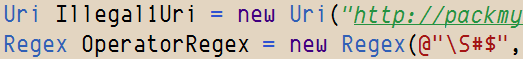
These new box-drawing, shading and symbols make Envy Code R a great font for the command-prompt (Consolas and Lucida Console lack box-drawing completely). To use them you will need to run the included registry file and reboot to operate correctly from a command prompt’s properties dialog.
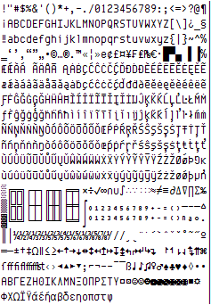
This typeface contains over 550 glyphs providing full complements for DOS, Windows and Mac versions of the US, Western, Central Europe, Turkish, Baltic, Icelandic and Nordic code-pages. This hits several Unicode ranges including Basic Latin, Latin-1 Supplement, Latin Extended A & B, Box Drawing, Block Elements, Letter-like Symbols, Number Forms, Arrows… although not all of these ranges are complete yet.
Additional VS italics hack
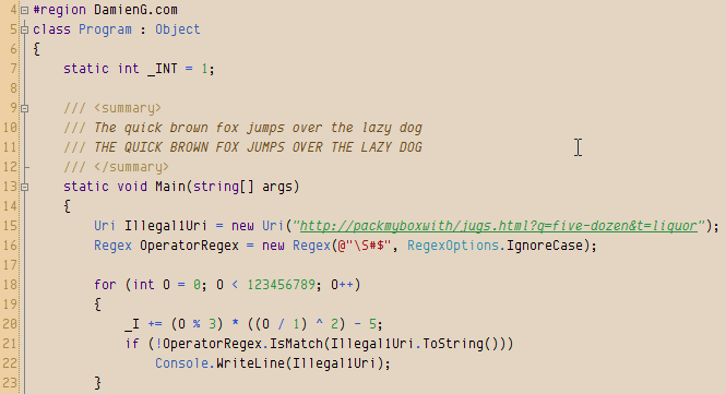
As well as regular and bold variants this version includes a full italic version too and the obligatory italic-as-bold hack to get italic syntax highlighting in Visual Studio as shown here in my favorite 10 point with my Humane theme.
And for those of you that like the font a little larger it now looks good and the odd sizing issues are all gone!
Okay, enough with the teasing, you’ve waited far too long…
Download
- Envy Code R Preview 7.2 (TrueType) (169 KB)
88 responses
Envy Code font is excellent! Thanks! The numbers should leave no room for confusion, and it was great to add a slash to the 0. Similarly, to avoid confusion between the numbers 4 and 9, I suggest replacing the 4 with an inverted "h" with straight lines. Also, to avoid confusion between the digits 1 and 7, I suggest adding a half-height line to the 7. We do this when writing them by hand, and it helps a lot. Regards.
Take a look at the GitHub repo that Damien created for Envy Code R. I noticed it a while ago, and then more recently a license file was added. I absolutely love this font (thanks Damien!) It would be cool to be able to package manager install, or easily get a version patched for Powerline, etc. Anyway, was happy to see this out there even though for some reason not really much external activity from others on the repo. Again, love this font and pretty much my go-to for a monospaced font, and has been for many years.
Still a nice font in 2023! Thanks for your work on this. 👍
Looking forward to licensing this under an open license, even if it hasn't reached the 1.0 milestone. Current license doesn't even allow redistribution… :-/
I still think the number "1" and lowercase "L" are waaaay too similar. Can you fix that?
Perhaps on the "1" you could make the top angle sharper...and/or on the "L" you could add a bit of a curving "tail" off to the right?
This is an amazing font! Slightly tall but not too much and perfectly readable with still retaining its own personality. Thank you!
I'm not quite sure how I stumbled upon this now, noticing the last comment was almost 9 years ago. I thought I'd go out and look for a new font for VS/Putty and I absolutely love this one. It's definitely my go-to now and I think it's going to replace all of my monospace dev/terminal needs. Cheers!
Love the font. One request for next version is to fill in two codepoints, UTF-8 E2,80,90 and E2,8E,AA.
The use of U+2010 (hyphen) makes at least typographical sense. I'm at a complete loss to explain U+23AA, other than perhaps the authors of GNU groff had a font that didn't contain box-drawing characters. (The irony here is that the horizontal lines in the boxes it draws are simple U+00AD "hyphen minus"es.)
Hello. Nice font. Nice horizontal density. 200 characters wide on my display.
But only 60 lines.
Using Lucida Console, I get 175x77
So, is there a way to reduce the gap between the lines?
Bitstream Vera Sans Mono / DejaVu Sans Mono (175x65).
I tend to code with a lot of white space, which is great for printing and then adding notes, but on screen too much whitespace means less code is visible.
Regards,
Richard Quadling.
P.S. Linked to here from http://www.editpadpro.com/fonts.html
Best looking monospace font I've ever seen. I use it in all my coding software and set it to the monospace font in Firefox.
I only have one problem with it: At smaller sizes the 0 (zero) and 8 (eight) characters can look very similar and are difficult to differentiate. Side by side they're easy to tell apart but I keep finding myself looking at one or the other and am unsure as to which it is. I'm not sure if this can be improved upon but I thought I'd mention it anyway.
Anyway, Thanks for the great font and all your hard work!
Great Font. Love it. Thank you.
I can just agree with the most comments here, especially with António Pedro Cunha: This is definitely the best monospace font i know - and yes, i tried much of them...
Biggest congratulations for such a great piece of work!
This is without a doubt the best monospace font I have ever seen... Even though you label it as being a preview version, I can't really imagine how much better it can get.. It just seems perfect already
Congratulations on the best monospace font of the Universe! :)
Hi,
This is ABSOLUTELY FANTASTIC... it has all the characteristics that I have been searching for, and trust me I have been searching for a very, very, very long time. Thank you.
Nice, but it is possible to add cyrillic (russian, ukrainian etc.) symbols?
This font is awesome. I'm showing it off alongside a Netbeans IDE theme that I created. Thanks!
I like your cencept and the basic look. I totally agree with Richard Quadling above, though. There's just too much vertical space eaten up when that's my main goal - LINES OF CODE :)
I see that you are matching Courier New 8pt almost exactly with your 8pt (in my TextPad). If you ever do a version without the extra space, and closer to the overall lines displayed from Lucida Console, I would LOVE to switch to this font. I like how much time you spent on distinguishing the characters. And, I would really really like having a bit of extra horizontal space since I like to write long comments at times.. ahem :)
Well it's definitely official. I have been using Envy Code R for all my coding (and other monospace-ed) endeavors for about 14 months now. It is now one of the first 6-7 items that get installed on a new machine. I was a long time Lucida Console user - Envy Code R is just so pleasant to look at. Great work Damien!
Hi, just wanted to say thanks for Envy Code R, this is my favorite ttf monospaced font so far! Works quite well both with or without cleartype :) I'll try it on linux soon, as of now it's my font of choice for Emacs in Windows. I have one question though, why do the italic A/a look so different? Just wondering :)
I especially like the curly braces!
One request for those like me whose eyesight is not as good as Tiger Woods: please increase the gap between the 2 lines that make up the Equals Sign. Even at 12 pt, they blur together more than is comfortable. (And yes, I have had a recent eye test and upgraded my prescription lenses.) The Equals Sign is much more obvious in Consolas font.
Thanks!
Great font - it's filled a much felt need for a good monospaced font. I'm already using it all over and like it better than Consolas. Now that VS10 doesn't allow bitmapped fonts, I have had to discard them in favor of Envy Code R. Some suggestions to make it a better programming font:
A far-out suggestion: a serif version?
Contact me for samples of (bitmapped) fonts that I really like for programming.
Cheers,
TG
Yo Deadly D
Slick font! £81 for Pragmata? Jog on, m8..
I'm currently using Envy in Windro$$ Vista / OpenOffice Writer - size 12, no Cleartype and Standard smoothing. And it looks teh shizz.
Two things: The bottom of the 't' sticks out too much past the top bar. This bugs me. And the bolds are way too bold - they clog up on the page. Shave a third off perhaps?
Take it easy, and well done
Henry
ps. Warlock Of Firetop Mountain on a ZX48k = a tiny taste of retro gaming bliss.
Envy Code R is really great. It looks very clear, smooth, easy to read at size 10. It is the first choice for my code. The only small issue I meet is that when using bold style at size 10, two chars "w" and "r" seem too close (in normal style, they look good). Could you provide another Envy version that is more suitable for bold style? Thanks for your awesome fonts!
Thank you SO much for this font. It looks awesome in KDE's Konsole. Clearly legible even when smoothed. Great job!
Fantastic font.
It's been a year now. Any plan on finalizing the font ?
My new favorite at work and at home (essentially work with a liquor cabinet).
Was using Deja Vú but this blows it out of the water, awesome font thanks!
Damien, absolutely great font for VS. My favorite.
However, I liked small y and curved braces from 0.6 version. In 0.7 those look too curvy, not in that mechanical overall style. From 0.7 version, I like comma (it is more obvoius now).
Keep up the great work!
Absolutely fabulous!!!! Thank you for your hard work on this font. It has so changed my coding experience. I have use Lucinda Console for years as it is far easier to read, but yours takes the cake. I also appreciate the color schemes and links for Visual Studio and from there SQL Server Management Studio. I code all day long and my eyes hurt so much less without the constant white background. Your font has "infected" almost any program I have font control on, Firefox, Windows Environment, etc. It is great!!!!! Thank you again.
Hi Damien,
wont go on and on about the great font... been using it for a while now. However, quick question... any progress on the Greek char support?
Thanks again
Awesome font, Damien!!! I'm using it everywhere I can. The only one issue I have is that in VS2005 and VS2008 the underscore _ isn't visible on the bold version of the font. It looks like a regular whitespace. I'm using the values / settings from the Humane theme.
With antialiased on, IMHO, Consolas is better in Idea 8.0.1 in Windows, but Consolas is worse than Bitstream in Jaunty. I'll try this font in Jaunty tonight.
Thank you Damien. I love Envy Code R and use it for my shell and Eclipse, both at home and work!
Thank you for your working.
this is my vs style. http://netframework.wik.is/User:Admin/Visual_Studio_Setting
Hi,
Just to let you know that your font, at size 13 in IntelliJ IDEA 8.0 on OS X 10.5 is perfect - coming from Windows to OSX, the fuzzy fonts haven driven me perpetually nuts, and Envy Code R is the clearest font I've used, having discarded all my previous favourites - the fuzziness is inherently distracting.
So thank you very much. :)
Hey, I just tried out Envy Code R on my Mac in X Code and looks sadly fuzzy (or heavy or something..). Check out the screen shot
That's Envy Code R, Regular, 13 via X Code settings. To install the fonts I just double clicked the ttf files and clicked Install Font in the dialog that popped up. And to my knowledge I have changed any of the font rendering settings on this Mac or in X Code.
The screen shot from VS looks great. I'll have to give this another shot on my PC. Look forward to solid Mac support =]
@Paul DOS and CP/M are gone, let em go and embrace proper filenames ;-)
Now if you could act like a real geek and not put spaces in filenames......
Great work! I really, really like this font, a lot. I was using Terminus and Droid Sans Mono, but I had to switch. It has this wonderful ancient, mystic-like quality that makes my code look godly. I can't wait for you to finish, although I don't know how much more you could do.
Excellent! My only suggestion would be bolder punctuation. Maybe my eyes are failing, but I sometimes have problems distinguishing '.' from ',' and ':' from ';' . Also a bolder '!' is in keeping with the connotations of that character. Punctuation is a serious matter in code -- it deserves emphasis.
Looks very nice. Been trying to find something better for Zend on SUSE for PHP/MySQL work.
Noticed a small error in the readme. Figured I'd point it out. Where it says "There are three variants including in the archive".. it should be included, not "ing".
I think you overstate the risk of opening the license now, as distributors are pretty good at propagating updates (better at least than me at answering replies in blogs:)). Also they have bug trackers so problems and fixes can be traced.
But that's your choice as font designer and anyone honest will respect it.
Thank you for considering open licensing!
I've been happily using Envy Code R (@ 13pt) for a while now, but recently noticed that italics are causing me fits. NetBeans started using bold italics for the names of static methods, and now the show up as a mess of unicode symbols.
If I switch to just italics, it's still garbled. Bold works ducky.
Seems to be just NetBeans (or perhaps Java), as I can do bold italics in Word 2003 just fine.
This is on Windows (obviously).
Consolas and DejaVu Mono Sans work fine in NetBeans.
The font will very likely be open licensed once it reaches the 1.0 release but I didn't want multiple versions hosted or distributed while the font is still very much a work in progress. This would give support issues and also people with older versions would be put off by the quality and perhaps not try newer versions. (This problem already exists to some extent because of the screen-shots of older versions currently online).
Also, given the specialist nature of monospaced fonts, I'm sure people who are interested in changing their programming font will come across is soon enough via the search engines until that time.
I see the font is marked as "Free to use but redistribution prohibited."
Unfortunately that will make it unavailable to all the users that do not spend their time combing the internet for new fonts and rely on third parties to select a font bundle for them.
Could you take a look at https://fedoraproject.org/wiki/Legal_considerations_for_fonts
and check if the OFL or the GPL with font exception is not suitable for your needs?
This is not to fork the font, or claim it's not yours, or make a boatload of money with "free" font cds, just to make it possible to distribute it with Linux systems or on the OLPC.
Great font. This is my new favorite. Looks good at many different sizes. Im using it all over the place, console, npp, visual studio. Thanks so much.
Hi. Great font! I prefer it over Consolas for coding in VS. Very clear and complete.
Good work. Thanks.
Thanks for the heads up Damien... I ended up using the VS version which seems to work a-ok as well ;-)
There is a bug in the Command Prompt application that causes it to take the first style it finds with the matching name.
The solution is to remove Envy Code R and add the regular versions first. Then add the bold and italics. This should cause the fonts to be enumerated in the right order - this trick should also work for using Courier as the Console font.
I've been trying to adopt Envy R all the way through. Here's a question however:
When I set it as my console's font (Vista) the font always shows italic... what's the deal? Anyone else having the same issue?
Thanks for the great ttf!
Damien,
Do you have a VS 2008 version of the Humane Studio settings? Or perhaps am I doing something wrong, because I import the settings from your zip, my IDE doesn't change it's fonts and colors. I noticed in the file that the version was "8.0" I tried changing it to "9.0", but no success.
Thanks for any thoughts,
The best programming font I've ever seen, on size 10. I really prefer to use size 8, but I liked this font so much I switched to 10. The problems with size 8:
{}character is really weird.*character looks like something else ;)Since I code in C++ in linux, please keep in mind this is true for ubuntu linux with 96 points and in the Eclipse Ganymede editor.
Just trying to help, thanks a lot for your work on this font. Will keep using it!
The FontBook collections are all manually maintained as far as I know.
I wrote in my Snow Leopard wish-list that they'd include the font equivalent of smart playlists so you could have effectively queried collections such as Fixed Width/Monospaced that would scan for that flag :)
Great bunch of screenshots George, thanks.
What Fixed Width section of the Font Chooser are you referring to? Can you post a screenshot as I have nothing like that on mine.
The guys behind DejaVu are probably professional font designers who understand what they are doing with hinting and not an amateur working on his first ever scalable font somewhat in the dark hence why it looks more consistent ;-)
First of all, thanks for your hard work.
Envy Code R looks great on Windows, and pretty good on Ubuntu if you follow Tomas Restrepo's advice at http://www.winterdom.com/weblog/2008/08/18/ImprovingFontRenderingInUbuntu.aspx.
But I find it disappointingly fuzzy on Macs, whereas I find DejaVu Sans Mono to be much more consistent across the three platforms and
I put up a set of screenshots at http://flickr.com/photos/george_v_reilly/sets/72157606825244117/detail/
BTW, shouldn't Envy Code R show up in the Fixed Width section of the Mac Font Chooser dialog?
Very nice VS Theme. I use it at work and home. Also cool that it works in VS2005 and VS2008. The only thing that annoys me is how some of the letters looks when italics (v is the one that really stands out). Might have to remove the italics :-).
@ash: I actually use this for my email, text editors and is set to my fixed width font in my browsers on OS X and Windows in the interests of dogfooding ;-)
It does look mechanical yes, the basic idea behind the font was that 10 point on Windows would look like a pixel font but with smooth corners hence this style.
There is a lot of vertical whitespace because it supports the full set of ascenders and descenders used in various languages. I will likely produce a more compact ASCII-only version at some point for those that don't need the languages but want more lines per inch.
What operating system/tools are you using? It is optimized for 10 point on Windows but the Mac has a different DPI so needs around 13 to look best.
Hey there. I'm also a big fan of Bitstream Vera Sans, but I've been giving this a go to see if I can get used to it.
Thing I notice immediately that I'm not so much a fan of:
Other than that, keep up the work. After two days use, it's definitely growing on me. It feels a lot like Silkscreen would if it were opentyped. >_>
Looks like a nice fixed-width typeface. I'm a big fan of Bitstream Vera Sans Mono (and DejaVu Sans Mono) which I use on my Mac. Unfortunately, Windows handles the TTF terribly, or it was poorly engineered for Windows, so I'll look at this as a potential Courier New replacement at the office.
I just found this font and almost switched from Consolas. Where Envy differs from Pragmata, I almost always prefer your choices. They seem to show the influence of Terminus. But those curly braces do freaky things at small point sizes. My screen looks like it's littered with dead larvae. If you are bent on keeping the braces that way, could you provide a version with ones like in Pragmata?
Cheers
Thanks for your reply Damien. I'm not sure about reducing the slant, since I think it would look odd in strings like "param1|param2". But hey, you're the fonts guy, and you certainly know better than me. :)
I just noticed another thing by the way. The small 'f' character in italics looks to have a slightly larger angle than other characters such as 'i' and 'l'. In a comment, the word "fill" appears very nice, with the 'i', 'l' and 'l' all having the same angle. But the 'f' seems to have a slightly larger angle.
I am using font size 12 by the way.
And last but not least, thanks a lot for your efforts! :)
@Hosam: The bar with a gap is actually a different glyph/character altogether so I don't think that's an option.
The alternative might be to reduce the slant of the | so that it can not be mistaken for a backslash or to make it the same as the version in the regular style.
Hello,
Thanks for this nice font (and the nice Humane theme :) ). I had a small note while using it today. I was writing code like this: myString.Split('|');
In italic (as per the Humane theme), the '|' (or operator) character is not very clear, especially when it's alone. I actually got confused today whether it was the or operator or a forward slash.
I might suggest putting the old vertical space in this character, so that it appears as two vertical bars above each other. This would remove the confusion. But of course, this is just a suggestion. You may well have a better idea.
Thank you.
Absolutely fantastic font. Great work!
Once you have extracted the files drag all the TTF files to Control Panel or if you are using Vista, right-click and choose Install from the context menu.
The registry file is only required if you wish to use them for your command prompt and are not necessary for just using within text editors/IDEs.
I love this font, it is really legible, beautifully crafted, now it looks great not only at 10 pt, but also at 9 and 11 pt (even with the freetype's autohinter on Linux). I reluctantly switched from Terminus, and so far I'm happy with it. I love it's crispness and clarity and I wish the bold version would eventualy match that over time. Thanks for a really great font.
Damien, my complements to a well-crafted font. I loaded it using Suitcase, set Visual Studio to use it - and it's my favorite now! I do like the enhanced braces - they now stand out more clearly as distinct from parentheses so I expect I'll be making less of THOSE errors. Thanks.
It would be a huge help for me if your font had the Cyrillic Unicode characters so that I could comment my code for my Russian readers. If you have plans to implement those and would like some help with it, please let me know.
appreciatively,
James Hurst
Great font, started using it today and I am converted (Courier New is UUURGLY). Any chance you could slash the zero for us? The 0 and O are really close.
Hey just wanted to send a thanks out to Damien for makeing a killer font.
I'm now using Envy in Netbeans on OS X (with antialiasing off, thankyouverymuch!). Looks great.
I agree that the braces were much better in v6. They're way too squiggly for my tastes in v7, but it's a small price to pay. :-)
OMG YOU CAN DRAW BOXES!!
builds an ASCII fort
Definitely the best Ive seen so far. 10 years ago I made my own raster font that went through 3 versions, named AUltrafontII it ended up being the best investment I've ever made of my time, since its been the font I use for all my coding. Is too bad some editors won't take a raster font, which is why I search - and have always been disappointed, till now. Again, very nice job.
mrobbinsassoc.com/aultrafontii.jpg would be a comparison between the two, along with some tips you might consider in case you do another version.
It has only one pt size which approximates 8pt on Envy, and after you look at it just remember I been using it for 10 years and I aint blind yet!
I tried this with a font size of 8, it is was a little hard on the eye. Upped the font size to 10, and it does look very nice!
For anyone wanting to try it out in an xterm, sling the .ttf files into your font directory (/usr/share/fonts/ or similar), then launch a new xterm with
Very nice, definitely gonna give this a spin!
Meh, I've taken the donate link off.
If you like it, blog about it with a screenshot :)
Ehh, nevermind that. A simple restart fixed it. I'm not use to coding in such a thing font, but it seems nice. I'll reply with my thoughts of it after some more extensive testing.
Hey Damien:
Thanks, a Lot, I mean, huge , big thanks
I was looking for a monospaced font and I can'not install microsoft's consola font so, I keep searching and I found this website, I need to re design some reports and this font is the best so far for my purposes. I live in Mexico so I apologize for my bad english. Thanks again. crying, you've saved my life
Thanks Damien! You are saving my eyes!
Can i give back to you without being in donations ? Amazon wishlist ?
I am really thankful to your work.
:)
Great font. Shame about the curly braces. The older, not-so-curly flavour was much, much better.
Thank for all your work on this, I already used this in eric4 for python programming and in SSMS2005. Happily, the new verison is even better!
@Damien: And that is the case. That I can fix.
@robert: The only difference in the VS version is that the "bold" font is actually an italic to get round limitations in the Visual Studio syntax highlighter.
It is otherwise identical.
I would imagine SlickEdit render ; and { in bold using your syntax highlighting scheme? They would then come out as italic using the VS font - that's what it does.
@richard: The reason for this is that Envy Code R is taller to allow for the accented characters. It's possible I'll gen a additional version in v0.8 that is pure ASCII + a few symbols and can therefore have tighter vertical spacing.
I prefer the VS version, even though I don't use VS (SlickEdit on xp); the lighter weight is easier. And the { looks better. But there is one oddity: the ; and { come out in italic on SE (there may be others, just those I've seen). I posted on the SE internal forum; their dev said this:
SlickEdit does not choose which glyph to display. SlickEdit lets the OS figure this out. Most of the time, the output of ExtTextOutA is the same as ExtTextOutW but not always.
I've no idea what that means, yet. Other windoze programs don't make italic ; { . Can this be changed, or is it an artifact of VS?
"Envy Code R" has become my second favorite monospace font. Right after Monaco which sucks on Linux, at least with certain applications.
Now that this version works fine with KDE (kate,kwrite,etc), GNOME (gedit,anjuta,scite) and Eclipse, it might just become my overall favorite ;-).
I liked the curly brackets in previous versions better, though. And some symbols could be bigger in my opinion, like + and *.
Thanks a lot, you made my everyday coding much more enjoyable!
If you click where it says "Humane theme" you will be taken to a download page where you can get the complete theme ready to Import Settings... into Visual Studio :)
I really like your font and I installed it in VS straightaway. Could you provide us with the RGB values for your color scheme as well?
Thanks for the offer Nikos, once I get back working on this font after a little break Greek characters are on my list to do and I'll be sending test versions your way.
Hello,
Thanks for the new preview. Now if only I could use greek as well. I am really willing to help if you intend to add full greek support.
Regards,
Nick