Computing history tells us of a mythical place where many of the innovations we take for granted today were either invented or refined to a working level at a single location known as the Xerox’s Palo-Alto Research Center (PARC).
These discoveries form the basis of much of the technology we use today and include the desktop metaphor, the graphical user interface, laser printers, object orientation and Ethernet.
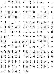
Xerox manufactured a number of high-end machines including the 1973 Xerox Alto which, being GUI based, shipped with a number of proportional bit-mapped fonts.
What is interesting to me however is the mono-spaced font used by the SWAT debugger (but not by the command prompts, they were proportional – ahead of their time!) and so, based on a screen-shot of SWAT, I thought it needed to live again!
I’ve had to make up a few of the symbols and letters that weren’t shown and filled out the symbols for the Windows 1252 Latin-1/ISO-8990-1 code-page and with the absence of any solid information online give it a name so here is Alto Mono!
Download Alto Mono (TrueType, Windows FON, BDF) (30 KB)
When using the TrueType version choose 6 point on Windows and 8 point on Mac OS X.
The Xerox manuals are also fun to browse though with such section headings as “Things the user doesn’t really need to know…” and “How to get out of trouble” and the comments about SWAT’s odd syntax and interface.
Don’t forget to check out my reproduction of the PalmOS system font. Not monospaced but very clear at small sizes – great for the Visual Studio output window ;-)
[)amien
4 responses
@Damien: The Windows Font Manager, and SlickEdit, at least. Both only work from a pure select list (I think, I'll go check now... Font Manager, yes it renders with 12 on up... SlickEdit will take input into box), our Apps never do ComboBoxes, thus not thinking that any exist becomes an Olde Habit. Very much better. I was seduced by the Font Manager.
Very nice! It almost replaced Proggy Tiny as my favourite coding font. There's a little problem with jEdit though; the line height doesn't seem to be right, causing the lines to overlap a pixel or two. Any ideas on how to fix it? I'm using the TTF version on Linux.
@robert: Which application is this? You can normally just type a number into the point size box and then click regular to make it stick.
Alas, the smallest my machine (xp, SP2) renders is 12 point, and it's icky; Ms. Pacman like.