
A series of posts on system fonts:
My love of typography originated in the 80’s with the golden years of 8-bit home computing and their 8×8 pixel monospaced fonts on low-resolution displays.
It’s quite easy to find bitmap copies of these fonts and also scalable traced TTF versions but there’s very little discussion about the fonts themselves. Let’s remedy that by firing up some emulators and investigating the glyphs.
Commodore PET (1977)
Commodore’s first business machine was the PET which came with a built-in monitor and a full character set unlike other machines at the time.
Unusual characteristics
- Primarily sans-serif but serifs present on
BDJa - Slightly stylized
£perhaps created by somebody else
Rationale
The font is good choice for the original PET and its original monitor. It was unfortunately also used on the Vic-20 despite having half the screen resolution where it made a poor choice.
Influences
While not visibly influenced from anything else an almost direct rip of this font appears to have been used in the Apple Lisa debugger.
Technical
Unknown.
Apple ][ (1977)
![Apple ][ system font](https://img.damieng.com/blog/Apple2e.png)
Apple’s first professionally built computer was the Apple ][ which from rev 7 onwards added lower-case letters.
Unusual characteristics
- Uppercase letters can touch descenders on the line above as the full height is used
- Only first 7 columns per glyph otherwise would have been 35×24 text
- Vertical stems for
[]{}are 2 pixels wide (bold) - Very small slashes
/\ - Upper-case is consistent although
Ais very angular,Gunpronounced - Lower-case less consistent:
gfhas soft curves, ‘mw’ square,nhrignore curve ofu - Numbers: unusual
3but96over-extend
Rationale
The font is well suited to the default high-contrast white-on-black (often green-on-black) given the machine was intended for use on their own monitors.
Influences
The upper-case, numbers and symbols were copied from the Signetics 64×8×5 character generator 2513 chip used in the Apple I and II in revision 0 to 6.
The later Texas Instruments TMS9918 Video Controller Chip used on Sega, Nintendo, Colecovision and TI/99 machines re-used this font with only a couple of pixels changed.
Technical
Changing the font requires replacing the 2KB 2716 pin-out ROM with your own EPROM or alternate ROM.
Atari 400/800 (1979)

Atari’s entry into the home computing market put out some very capable machines with all sorts of hardware tricks (the creative geniuses behind it would go on to form Amiga). The same font was used on all Atari 8-bit models from the original 400/800 to the XL and XE models in the late 80’s.
Unusual characteristics
- 6 pixels uppercase causes some vertical imbalance especially on
9 - Braces are overly bold being 3 pixels wide.
- Less than and greater than symbols are too tall.
MWwmake great use of width to nice effect- Bar on
Gtoo low,Uovertly square,Xvery blocky,Sdoes not extend enough
Rationale
The machine boots in a low-contrast blue-on-blue and is designed for use with TV’s which explains some of the odd characteristics above like the square U to distinguish it from the V. It is likely the 6-pixel choice is to allow the letters to be centered when using inverse letter mode.
Influences
Designed by Scott Scheiman (Source)
Technical
One byte per row, 8 sequential bytes making one glyph. You can reprogram this by poking address 756 with the page number of the new font (default of 226 for ROM location 0xE000).
POKE 756, 226
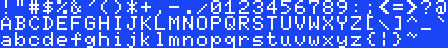
Acorn BBC Micro (1981)

The Beeb, as it was affectionately known, has its own font which could display in three different modes (one wider and one narrower) but many users might not recognize it all as it booted into ‘Mode 7’ utilizing a Videotex chip (used in the UK for text-on-TV and travel agents as well as in France for Minitel) that had a different font of its own.
Unusual characteristics
- Drops bold in tight spaces e.g
$&@ - Outlines the tail on the
Qto make it much clearer - Unique and beautiful
* - Does not extend low bar on
eas much as expected andfseems to wide - Vertically squished
? - Style of single-quote
'is inconsistent with comma
Rationale
The machine generally shipped with good quality monitors and the combination of high-contrast colors and this bold font made it very readable.
Influences
It’s quite likely it was influenced by the Atari 8-bit font but with larger capitals and ascenders and a much more consistent look.
Technical
The system font is stored at 0xC000-0xC2FF with each character being represented by 8 sequential bytes (left pixel is high bit).
You can replace the font used by system text routine OSWRCH (0xFFEE) using the VDU command 23 followed by the ASCII code and then 8 rows of data, e.g.
VDU 23,65,11,22,33,44,55,66,77,88
Sinclair ZX Spectrum (1982)

Sinclair’s successor to the ZX81 added color and lower-case letters, again preserving the uppercase and numbers from its predecessor but finally mapping them to ASCII. This font was re-used on Jupiter Ace and Timex machines but the ZX Spectrum was the most popular.
Unusual characteristics
- 6 pixels uppercase leaves many unevenly balanced
BEFSandXwith ugly 2×2 center - Full stop is 2×2 pixels (bold) but colon, semi-colon and comma are not
- Capital
MWare very slight with latter hard to distinguish fromV - Uneven styling
comits curves,eis softgis not,fandkare thin - Only the copyright symbol the top row of pixels
Rationale
While the machine has a default high-contrast scheme the video output was poor because of the quality of the RF modulator and home TVs it was connected to. It looks like the designer decided to increase spacing between letters after the ZX80 from one to two pixels which greatly limited what could be done with the letters themselves. This was likely done for the same reasons it was done on the Atari 8-bit, namely to allow the letters to be centered when using inverse text modes.
Influences
The font was mostly inherited from the ZX80. I was not involved with that, so I don’t know who did it. Probably it was a combination of John Grant, Jim Westwood and Rick Dickinson. It’s possible we added lower case for the ZX81 or Spectrum (I can’t remember without checking), and I do remember discussions about how “mostly moistly” would appear.Steve Vickers, email, 2nd February 2001
Technical
The system font is stored at 0x3D00-0x3FFF with each character being represented by 8 sequential bytes (left pixel is high bit). You can replace the system text routine (RST 10) by poking the new fonts memory address into the system memory map at 23606/23607 minus 256 bytes (the first 32 characters are non-printable, 32×8 = 256)
LOAD "newfont" CODE 49152, 768: POKE 23606, 0: POKE 23607, 191
Commodore 64 (1982)

Commodore took to take their success with the PET and applied it to the home first with the VIC 20 and then later with the wildly successful Commodore 64.
Unusual characteristics
- Inconsistent shapes/style across
147,&<>@Q - 2×2 pixel of
.is not carried through to;:! - Ascenders are not as tall as capital letters
Rationale
The bold font was essential for the low-quality TV’s Commodore were aiming at. The inconsistencies across the font may have been intentional to help make the letters look different (A vs 4, 1 vs I, 7 vs T) given the limitations of the displays or just poorly implemented (see below).
Influences
Lower-case is identical to the Atari 8-bit font and likely copied wholesale as they do not match the upper-case well. Symbols, numbers and upper-case are a bolded version of the PET font that looses the serifs and also could explain the odd reproductions of 1, 2, 7 & 4.
Technical
See comment from Paolo below for details!
Amstrad CPC (1984)

Alan Sugar’s foray into the UK market came a little later than the other 8-bits in 1984 with the Amstrad CPC series.
Unusual characteristics
- Full use of 7 pixels for upper and 1 pixel for lower means glyphs can touch
- Serif choice is unusual and not consistently applied because of space constraints
0is wider than would be expected (copied from CGA font)- Very distinctive curves on
CGOQ Xlooks like a different style because of high mid-point
Rationale
Sugar wanted the machine to look more professional than other home computers at the time. The choice of a serif based font to look like PCs which also featured serifs (at a higher resolution) reflects that desire.
Influences
Very similar to the IBM CGA font with some adjustments (fixes) to the horizontal positioning of some symbols. Many characters completely identical and some bearing style similarities too (wider 0, X choosing one side to be longer than the other). Some other characters bear similarity to the BBC Micro (Q uses the same trick to keep it distinguished) and a number of symbols and lower-case letters being the same where serifs would not fit.
The Amstrad CPC manual shows the system font but is different in some areas. It is possible it is a transcription problem (z is shifted up one pixel, missing pixels on 37PRz~ and extra pixels on #b ) although it could have been an earlier version from the designer as rG? are subtly different.
Technical
Redefine using the Amstrad BASIC command SYMBOL that takes an ASCII code and then 8 comma-separated values one-per-row in much the same way as the BBC with the VDU 23 command. SYMBOL AFTER must be set first e.g.
SYMBOL AFTER 32
SYMBOL 65,11,22,33,44,55,66,77,88
MSX (1983)
The MSX differs from the other machines here in that it was a standard rather than a specific machine. It was very popular in Japan and did hit UK shores although I only knew a single person that had one apart from our school which had acquired several Yamaha models to control MIDI keyboards. Given the multiple manufacturers, it’s not surprising that some models had slightly tweaked fonts but the one shown here seems to be the most popular.
Unusual characteristics
- Full use of 7 pixels for upper and 1 pixel for lower means glyphs can touch
- Only 5 pixels wide for the letters
- Pixels touching on the curves of ‘db’ etc. look quite ugly
- Very angular curves on ‘5’
Rationale
An unusual choice that feels very quirky.
Influences
Most likely influenced by the Apple ][e.
Technical
Unknown.
47 responses
https://csdb.dk/search/?seinsel=all&search=chargen&Go.x=0&Go.y=0
Just here again inviting you to visit http://www.zimmers.net/anonftp/pub/cbm/firmware/characters/ , where several international character sets are available to download for Commodore computers. Also, I remembered that the MSX system got imported an released to Persian Gulf countries as MSX Sakhr, with arabic support. There is a ROM dump here for you to get that charset: http://www.nightfallcrew.com/03/11/2014/yamaha-ax-200m-msx-arabic-rom-dump/
Hi, Damieng. I found this site because I was trying to get information about "Zan-64", a software system for the Commodore 64 made by "Zanine Computer Development". What is really, really unusual about this is that it's a bilingual arabic/english system, so it has arabic characters in a Commodore 64.
If you are interested, you can join our facebook group "Commodore International Historical Society", where one of our members posted about that software. (https://commodore.international will redirect)
Another member of the group has a Commodore 64 officially released in Japan with katakana character set. You can see pictures of it and a screenshot here: http://www.zimmers.net/cbmpics/c64js.html
Hi Damien, Great article that brings back so many memories - thank you. I have to say, I always saw the BBC Micro and Electron font as "bold" on TVs/CUB monitors back in the 80s.
'The Osbourne-1 was surprisingly okay: https://github.com/phooky/PROM/tree/master/Osbourne%201'
The TI-99/4a is covered in one of my follow-ups
The TI-99/4a had a 16 bit CPU, this article is about fonts on 8-bit micros.
You forgot TI-99/4a
Here is the Radio Shack TRS-80 Model III font, from 1981: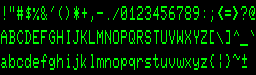 Aside from the different aspect ratio of the display, it is nearly identical to the Commodore PET font, including the odd 2x2 pixel blocks in the middle of M and W.
In 1984 at PDI I wrote an SAT practice program for Atari, Apple ][, and C64. It drew text and figures on the hi-res screen. On the Apple that resulted in wild artifact colors so I used Atari's character set there instead of Apple's. Feedback from Sales was that Apple users hated the look!
Well done. Beautiful sets of fonts in one place. Maybe yet latin from NES :)
I trying find fonts arabic, devanagari and japanese kana from 8bit computers. Anyone have idea where I should look for enough good quality picture to see all pixels and all characters?
The default video-mode on the BBC was Mode 7 - that was indeed not bold as it is generated by the Mullard SAA5050 video generator. The Mode 1 font however definitely is bold. It might have been the intent to combat the limitations of video but the BBC saw the most success in schools combined with Microvitec monitors.
An important machine that is missing is the Terak P-System.
It was one of the first early micros that both had a relatively high resolution font system (I forget how large but certainly more than 8x8 - it looked great!) and which allowed users to define their own fonts.
The BBC Micro font was not specifically a bold font. What was done was to make vertical lines 2 pixels wide, because when displayed on a television, the video timing caused 1 pixel wide vertical lines to almost disappear. So by having 2-pixel verticals, it actually displayed as a normal font. This is lost on a modern display or LCD which is pixel perfect - a more realistic rendition would be if the font were redesigned as one pixel plus anti-aliasing so simulate the smearing of the video signal. (I worked at Acorn and heard the 2-pixel vertical explanation first-hand from the font designer)
I used to customise the character set on my CPC464 to fit in with whatever I was programming in basic (usually text-based adventure games or sci-fi film style display effects).
Thanks for this post, it brings back happy thoughts. :)
MSX was also quite popular in Brazil. I still own two (with just one being functional).
One oddity was the WordStar CP/M port. It was intended to run on MSX 1.x, which had a 40 column width (in Screen 0). This is too unconfortable for text editing, so it shipped with a 'resident' assembly program that would switch to Screen 2 (one of the graphical models) and draw the caracters itself, using a 6 pixel wide cell. Not all characters used all 6 pixels, so readability was not great, specially on a television with RF inputs. But it did manage to squeeze 64 characters per line, and the drawing was not that slow, for the standards of the time.
You could also use it directly on MSX-DOS, without WordStar. I had some fun with that.
A ROM is just a sequence of bytes and given that nature it is trivially easy to copy data out without MOS Technologies help. Given that they'd need to be developing the machine long before a real ROM was produced I consider it unlikely MOS were involved.
@Jack It's possible that was the case when the original arcade font was designed. I have it on good authority (ex Atari employee) that the home computer font was adapted from that.
A technical note for the Atari font: The strokes are two pixels wide in order to avoid color fringing effects when the font is displayed on a NTSC TV.
Commodore engineers have come out and said that the company took part of the Commodore 64's font from Atari. This was before their tenure at the company, of course, so their hands are clean. But, MOS Technologies/Commodore Semiconductor Group made ROM chips for Atari so the ROM was right there.
MOS Technology was producing ROMs for Atari at the time, and they stole the fonts for sure. You can find the story on "Commodore: A Company on the Edge".
Great post! I was thinking it would be interesting to maybe superimpose all glyphs from all the different fonts, to see where they differ. The char maps you show only cover the ascii range, do they? The Atari and C64 have a full set of 256 glyphs, the latter half being graphics symbols. On the Atari, there were actually two sets of the latter 128 glyphs, one with graphics symbols similar to the one on the C64, and one with international (accented) chars. Possible additions: Laser Technology machines (VZ200 etc.), and of course the Sinclair ZX80/81.
The atari 8-bits have an alternate mode for text display using 10 scan lines rather than 8. The last 32 characters which contain all the lowercase letters are displayed shifted down two scan lines allowing better descenders. I saw this used in a few word processors and other productivity software. Yes, this requires using a different font, either an entirely new font or a RAM copy of the default ROM font with the last 32 characters shifted in memory to use the extra scan lines correctly.
Could you extend the concept to the anti-aliased fonts on the Acorn Archimedes/RISC OS machines. That technology has rarely been surpassed. What they could achieve with even just a 16 colour palette was amazing!
I believe the PET font was designed by Leonard Tramiel. He told me he did it when we worked together at Atari.
The MSX font characters are stored in the ROM as 8x8 cells. The characters are only 5 pixels wide and are left-aligned in the cells leaving three blank pixels on the right. The graphic characters typically use the full 8 pixels of width.
The MSX video chips have two text modes, screens 0 and 1. In screen 0, only the left 6 pixels of each character is displayed in 40 columns giving a resolution of 240x192. The MSX2 video chip added an 80 column mode giving a resolution of 480x192. In screen 1, all 8 pixels are displayed in 32 columns giving a resolution of 256x192. The left-aligned, 5 pixel wide font displays properly in both screen modes but obviously the apparent spacing between characters changes. The graphic characters are truncated in screen 0 mode. Some survive this truncation quite well while others do not.
The text modes all have 24 rows (192 pixels) via BASIC although the MSX2 and later video chips were capable of displaying up to 26.5 lines (212 pixels).
I believe you have mistakenly stated the height of capital letters as 6 instead of 7 for the MSX, C64 and Amstrad CPC entries.
I did a conversion of the font used in later models of the TRS-80 Color Computer 2 as well as the CoCo 3. Earlier versions of the CoCo 2, as well as its trans-Atlantic cousin the Dragon 64, used a slightly different font with a non-slashed zero, a square "O", and no lowercase.
https://fontstruct.com/fontstructions/show/trash_eighties
It's great to see the Atari fonts again. Thank you!
@goto80 I just checked asciiarena.com. You make a good point. It is a cute site though. Scary colors!
I think Sinclair ZX Spectrum is the most elegant of the lot here. This was a wonderful post, Damien. One question on the Sinclair ZX Spectrum: You said
Damien, I love when someone fills a hole in the world by sharing knowledge like this! Must-read article about early computer fonts… mmm, crunchy.
It's so funny because as I was reading it, I thought the maker of Cathode would like seeing this — only to see your line at the bottom, ahhh!
Thank you for sharing, and if Amiga is legit to include, I'd sure like to see it as well.
Big vote up for the C64 PETSCII as goto80 mentioned, I loved seeing those graphics used in games, BBSes, and when I printed party invitations on my old dot matrix.
The Amiga fonts were monospaced. Otherwise the ASCII wouldn't look so good! (check asciiarena.com)
If I could dream, it would be great to see the full fonts here - with all the special characters. The C64's PETSCII is amazing to work with. Truly special.
Nevertheless, good post, thanks!
A little info on MSX's narrow characters: The MSX had two text modes, a 40x24 "text mode" with 6x8 characters and a 32x24 "graphical mode" with 8x8 characters and extended color options. The character table was the same for both modes, so graphical characters would lose their last two columns in the 40x24 mode, and text characters would be oddly spaced in the 32x24 mode.
I believe the Atari 400/800 fonts were influenced by the coin-op font originally developed by Lyle Rains for Sprint (1976), and adopted fairly faithfully by most arcade games shortly thereafter. That was a 7x7 in 8x8, and originally upper-case only, so some compromises were made, e.g. to accommodate the 400/800 team's desire for fully boxed inverse-video characters.
Lyle created a number of very nice fonts for later games and for use with X. IIRC, he also helped me out a bit with my 3x5 (in 4x6) font for my 80-column VT-100 terminal emulator (400/800).
Disclaimer: I was not in the room when this decision was made, but I was down the hall :-)
Thank you very much! It's indeed the screen 0 font as I remember it. Let's see if I can set it as console font.
@RupertG So I can put you down as the font designer for the Spectrum?
@Wladimir I've added the MSX!
@Maurice Thanks, now corrected!
The screensize on the original PET was 320x200, the characters were in an 8x8 grid.
Nice overview, very nostalgic! I miss the MSX though, that's the machine I grew up with.
I was a font designer for Sinclair Research... actually, I was about the lowest of the low in the software engineering pecking order and happened to be doing the screen handling software for a new product, so I got to do the font as well. (The product, Pandora, was a portable 8-bit computer that never got made.)
I can't speak for any of the other companies, but 'font design' is perhaps the wrong term for the process. Much faffing with graph paper, lots of over-the-shoulder critiquing from other software engineers, but not a high priority nor something that was seen as needing any particular graphic or typographic skills.
If anything, Pandora got more attention in the font area than normal - it had a very baroque screen technology with a weird aspect ratio and, ah, readability issues. So we had proper proportional spacing, not a fixed width font, which was quite challenging to code for on an 8-bit CPU with no hardware graphics acceleration.
You can get the TRS-80 Color Computer and Dragon 32/64 font from XRoar
I've added the Commodore PET/Vic-20 font.
The TRS-80 and co seems to have had several and it's not clear which models had which - I need to get a few working emulators!
This is great. You've got a good list there for the most popular machines. I would love to also see the MSX, TI-99/A, Commodore PET, TRS-80 Model I and Color Computer fonts reviewed.
Needs more Oric-1/Atmos love!
The Amiga was 16-bit and also not monospaced... That would be another article :)
Hey this is really awesome! But where are the Amiga-/Workbench-Fonts? ;)
I grew up with the zx81 and commodore 64. Wow! It's only when we look back that we see how far we've come, it's a bit like looking at an old family photo though, it's changed a lot but you still see the same characteristics of that never change.
Mmm, I'm sat here now trying to find a reason to use one of them.
No love for the 1981 IBM CGA font? It's aso a serif font and somewhat iconic...
To change the font in the c64 you have to change bits 1-3 of location $d018. These give bits 11-13 of the font address. Bits 14-15 are provided by the c64's I/O chips: they are thus given by bits 0-1 of $dd00 (but inverted: so 11 there means bits 14-15 are 00).
The default font is obtained if bits 11-15 point to $1000 (00010) or $9000 (10010), because the VIC does not see RAM at $1000-17FF and $9000-97FF, and sees the ROM for the default font instead.