Google have switched system font for Android’s latest release (known as Ice Cream Sandwich) from the Droid Family to a new typeface known as Roboto.
Typographica opened today with a critique of the Roboto font which boils down to this:
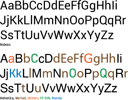
The similarity to Helvetica is obvious but that similarity can be drawn with many modern typefaces – the other comparisons are tenuous indeed:
- FF DIN has little resemblance other than having straight edges on rounded letters. Lots of faces do that. Envy Code R does extensively :)
- Myriad is more open in its whitespace, ends
twith a slant and features a different approach to shoulders onmnpqr - Ronnia only shares the single horizontal stem which is also present in many monospace bitmap fonts
Yes, some of these differences are subtle when you put them side by side but subtleties are what give the typeface its character.
There are only so many ways to draw letters with consistency and readability especially if you want a modern sans look. That’s exactly why copyright refuses to cover letter-forms in the USA.
So coming to the font itself at first glance, yes, on my laptop it doesn’t look as pretty as Helvetica when blown up for comparison but here’s something you should consider.
Typefaces are designed for a specific environment
Consider the following typefaces:
- Bell Gothic has big counters and deep ink-traps so that high-speed printing on cheap paper retains the form
- ClearView Highway is designed to be quickly readable with headlight glare
- Cambria has many little flourishes that only look good with sub-pixel positioning
Use a typeface outside its intended environment and you’ll easily believe it’s a bad design, ugly or unrefined as those very characteristics that made it great for that environments completely fail to fit new surroundings.
Even the famous Helvetica has an environment of white-space, bold colors and clean-lines where it shines. That makes it a top choice for corporate logos.
Roboto is the work of independent type designer Christian Robertson and until I see it on a Droid device I’ll cut him and Google some slack – from the screenshots I’ve seen online it looks like a good fit.
You have to at least respect Google for continuing to improve typography by commission fonts. Microsoft are the only other major UI player doing this as Apple’s sole contribution to typefaces in the last 10 years has been a hack-job on the open-source Deja-Vu Mono to rename it Menlo, move some bars around and to trash the hinting in the process so they have something to replace the aging Monaco with.
If you want to download the font yourself here is a complete set of the files taken from the SDK (unlike the other zip floating around this one has all variants + the license).
Download Roboto (2015) Font Family (ZIP of TTF) (1.2 MB)
[)amien
8 responses
I remember whan Segoe was released. The very same criticism came. “It’s exactly like Frutiger! Aaaagh!”
Your post mentions that the download contains a license, but didn't see one. Can you clarify what it is?
Yes, the new Ubuntu font family is very nice as was the RedHat sponsored Liberation font by Steve Matteson (who also did the Droid font and Segoe).
Canonical Ltd. commissioned Ubuntu font family. It's nice, no serif though.
I'm using Kabel on 2.3 and really enjoying it. It makes the UI stylish without destroying readability.
Join us at the next meetup: https://www.typesf.org
@Stephen I agree that it's an odd mix of styles - just not that any particular characters look that similar to other typefaces outside of Helvetica.
Download link should be up now - my CDN isn't replicating :(
I see you're in the bay area too - I must find out if there are any cool events down here like the Type Americana in Seattle last year!
Maybe you read my post too quickly. My intent wasn’t to show which fonts specifically are copied, but how Roboto is cobbled together from unrelated styles. The typefaces in my graphic are simply well known prototypical faces from each genre.
Great to see a more complete set of the fonts. Unfortunately the download link fails.