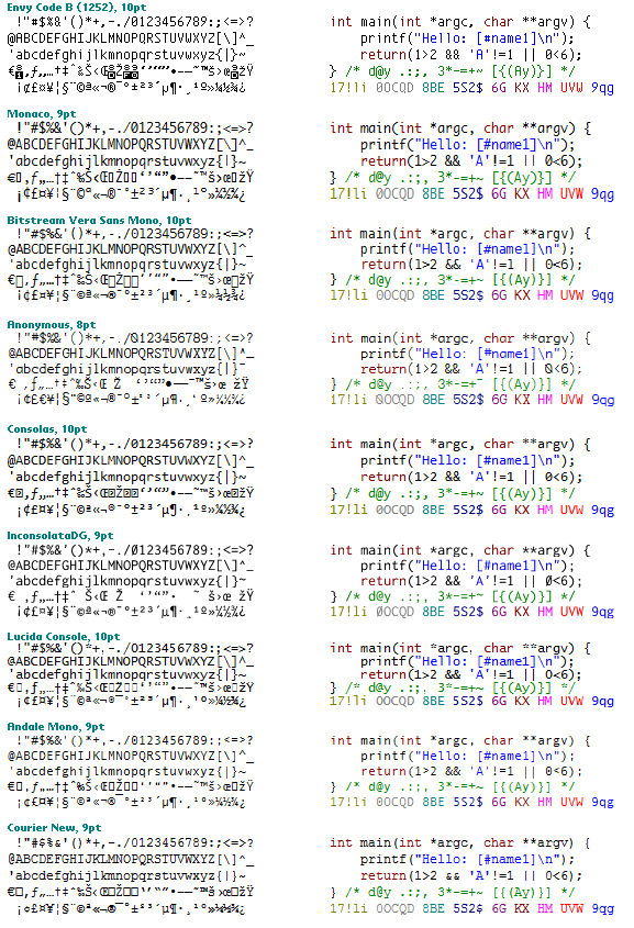
The blogging about favorite programming fonts doesn’t seem to want to truly die down so here’s how I rate the most popular fonts for programming in descending order with my own Envy Code B which I use all the time, but now desperately needs the ClearType treatment.
If you click the image you’ll see red boxes highlighting what I feel are the various problem characters/positioning with each font.
Comments are welcome apart from people suggesting proportional fonts. Tried Tahoma, Verdana and a few others but I just plain don’t like proportional fonts for programming.
It seems many people are raving over Consolas but the x-y proportion just seems wrong to me; I prefer taller thinner characters for the odd longer line. Don’t get me started on the ugly lower-case g and ? or the fact that numbers are smaller than capital letters.
[)amien
11 responses
The ratio is one of a personal preference I guess but square letters like those in Consolas have never appealed to me.
The Euro sign was improved in the ClearType replacement for Envy Code B which is imaginatively named Envy Code R that you could check out.
I find Envy Code too slim/tall and the Euro sign is just awful. I really prefer Consolas. You don't seem to like the g, but it is very good at small sizes, because it can't be confused with the q. Wonderful blog. All the best.
Somebody called Nick Gravgaard came up with a technique known as Elastic Tabs which would seem to solve the issue but until they turn up in Visual Studio they're no good to me ;-)
I program in C and Assembler and both these languages really need mono-spaced fonts because I look at and think about code in blocks, not single statements. That includes comments off to the right.
Like everybody else, I need to have patterns to make sense of the world, and of code. I've been coding for 22 years and never once have I wished for anything other than an easy to read mono-spaced font. Those who go on about using proportional fonts probably don't actually write a lot of code. And no doubt they secretly wish that just sometimes the code would line up nicely in columns - however, they swear by their sentenced code that reads like a book which code is not and never can be.
But what if a compiler could read Word documents? Then I could set tabs and have my proportional font too! Still, there will be situations when easy this won't look right on the screen. The text editor that Parallax have created for their Propeller uC IDE does have a special editing mode that may allow use of proportional fonts. But I haven't personally checked this out.
And the argument rages on.
My Visual Studio colors
Courier for me is no good - the serifs at that point size are distracting.
That reminds me, I need to try that keyboard you brought ;-)
Guess I'm just used to recognising my patterns in Courier by now, I find other fonts distracting. Plus I don't like ClearType - never got into the whole soft-focus look, gimme pure saturated pixels any day.
I do agree on proportional fonts being pure insanity for coding thoug.
Pretty Cool, Damien; thanks for showing the complete comparison. it would be interesting to see it in larger sizes, though, to see the differences more clearly.
Well, that, and the fact that it was Scott Hanselman that got me used to working with big fonts (lots of less headaches now). Besides, a 10pt font at 1920x1200 is not very readable at all :)
Short: My Visual Studio Color Settings
For me I find the right font makes a world of difference.
It becomes easier to scan the text and recognise distinct patterns and I find programming more of pleasure.
Much like having a good keyboard.
Am I the only person who doesn't care about this enough to change the default? Maybe it's because I don't use ClearType, the zeroes in particular are much different when using that.