Envy Code R has been updated since this post.
My last post got me thinking: if I’m so happy with Envy Code B bar it’s ability to scale or take advantage of ClearType then there is only one real option. I reached for the pixelated TrueType conversion of Envy Code B and five hours later had a rough version of my first ever vector font, Envy Code R.
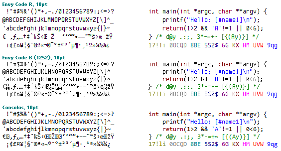
It’s unlikely I’ll be able to work on this before I get back from Japan so it will have to wait but here’s a sneak preview of it stacking up against Envy Code B and the current cool kid on the block Consolas.
The new font will try and be as much like Envy Code B at point size 10 while taking advantage of ClearType and hinting where possible. There is still a lot of work to do on the unusual symbols, foreign characters and increasing the curve emphasis while not destroying the scaled letter-form versions.
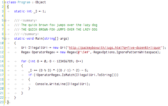
Here’s a preview inside Visual Studio 2005:
I promise that’s all the font posts for a little while…
[)amien
10 responses
More programming fonts
Looking great! I'm not too keen on those curly brackets, though. They seem too wide to me, with the middle point too pronounced. The tilde and some other symbols also look better on "Envy Code B" in my opinion, but I guess you're working on that.
Great job!
I know I shouldn't complain at being one of the select few to be using a very advanced preview of Envy Code R but I've noticed another error with it.
You've probably already fixed it but in the version I'm running the f (lower case) is slightly norrower than the other letters.
Hope you're enjoying your holiday!
I'm not sure what is involved with making the bold the same width but it's certainly on my list to make sure bold characters are the same width.
Thanks for the positive feedback! :)
I've never liked Consolas personally -- looks blurry to me, and my eyes keep trying to focus on it, and this causes strain. But I've been using your Envy Code B for a while in Eclipse and really like it. As long as bold characters won't screw up the monospaced-ness (one of the big pluses for Envy Code A and B in my book), it looks like you've got another winner here!
This is a very nice font - can't wait to try it. Any chance of getting the preview?
I like how it is sharper than Consolas with cleartype.
it is not nicer than consolas, but it is close.
Wow, it's nicer than Consolas. Fantastic!
Looks cool. Definitely look forward to seeing the end result!
Fantastic!