Envy Code R has been updated since this post.
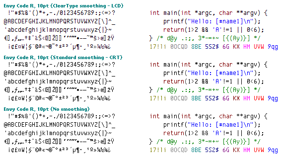
Here is the Envy Code R programming font I’ve been working on as it currently stands:

As you can see it looks great at 10pt regardless of what smoothing (or not) you are using. While you can use it at other sizes and it will scale without turning into big pixels there are plenty of other fonts around that will look better at larger sizes/in print.
It is missing a number of foreign symbols and characters, there is no width-preserving bold version to accompany it just yet and there are still issues with the full-widths of @©® symbols as the Windows ClearType renderer insists on squashing them rather than let them potentially touch another character.
I will attempt to address these as best I can as time goes by as well as trying to shave a pixel off the vertical height. It also doesn’t look too great on the Mac but if you want to try anyway use 13pt and be prepared to set the height in terminal to just above 1.0 to stop the letters being cut-off.
Comments are welcome but please bear in mind that Envy Code R is designed to look very close to Envy Code B so deviating from that further is unlikely right now.
Finally please bear in mind that while Envy Code R is free-for-use it is copyrighted and as such it must not be redistributed, bundled or modified without permission at this time. Once all the issues are addressed I’ll likely release the whole thing under a free/open license.
This is simply because I do not wish people looking for this font in the future to be downloading older preview versions.
If you were wondering what it does look like large:

Update
I have updated the preview font to fix vertical problems on the capital E as well as add a bunch of symbols not yet done (e.g. fractions) and also stuck in a bit-mapped 9pt version for those not using smoothing.
[)amien
21 responses
Just wanted to say I like the chunky, very visible punctuation! Every coding font should follow that convention. I do agree with the other commenter that I'd like to see the asterisk on the same level as the other operators; aesthetics do enter into it for me, but I'm not complaining, mind you.
Cheers, and Thanks!
i like the old braces better, too. and for the asterisk thingy: *: asterisk ∗: asterisk operator (this is what you want) ⁎: low asterisk ⁑: two verically aligned asterisks ⁂: asterism (https://en.wikipedia.org/wiki/Asterisk#Encodings) the * is supposed to be where it is ;)
Thank you for this brilliant font; I've been stuck with Courier New for quite some time.
My only issue is the braces -- I prefer the ones in your earlier preview, personally.
It's a very nice font, unfortunatelly it lacks ISO8859-2 accents (like ? ? ? î â).
You couldn't increase the spacing between the lines of the m without making the letter wider and if you do that then every single other letter would also be wider - that is one of the compromises you have to make with a monospaced font.
At the moment there is no released bold version so when you select bold Windows is attempting to create one on the fly, with bad results.
I have a bold version here which is a little better but it needs a bit of a tidy-up.
Nice font; however, I don't care for the 'm'. The lines are really close, and bolding it makes it a blob.
looks so cool,thanks
It's pretty funky on Eclipse under GNU/Linux as well...lots of characters running over one another at size 10. It does seem to not have this problem at size 11, however...
I just tried in on TextMate on my Powerbook and it was fairly unreadable.
I am now using this typeface on Mac OS X 10.4 with Textmate. I like the font although there are some very odd rendering peculiarities when the font-size is 10, 12, or 13 points (I suspect Textmate is the culprit as there are no rendering issues within the font dialog).
Excellent font; thanks for the effort.
java probably does have its own renderer. I like to be able to read my code, and everyone seems to product 8+10pt bitmap programmer fonts. Thats way too much eyestrain to me when staring at it all day long.
I think consolas looks like a dog, and most people who gush over it are microsoft users who have only ever used courier new. (andale mono is my backup to monaco so I wont bash it too much;)
good luck with the font work
It would appear jEdit is not using Windows to render it's text - I assume it is either using a feature of Java or some library for rendering the text.
This gives us so far Windows, Mac, FreeType and jEdit/Java renderers all of which can operate in a variety of modes!
I'll see what I can do - I think the hints will solve the height issues and I want to address the lower-case X anyway.
It may well be that Code R stays as optimized for Windows/10pt and the next font I do tries to be an all-purpose all-systems alternative to the likes of Monaco/Consolas/Andale Mono.
I was running it at 18pt (which comes out at the same size as monaco 16pt).
here is a side by side of monaco 16pt with envy code r 18pt with some nice roguelike code hacking going in with SAP deployment code in the background.
Yes, at some point sizes there are height issues between the characters - I'm trying to find out why and the solution may well be hinting which I'm currently getting to grips with.
What size were you using it at?
Running it as a test in jEdit,
'h' +'d' arch is not as high as other letters and looks a bit disconcerting. I also dont like the lowercase 'x'. subpixel rendering makes it look a bit off. I think some more differentiation of lowercase L and number 1
Im also not sure I like that lowercase is nearly same height as uppercase.
For the moment I'll stick to monaco and try this again later.
For now Code R will stick to Code B and have the '*' but if you send me an email to [email protected] I'll send you an individual version with the * there ;-)
Great font! However, I would prefer having the '*' character be on the same height as the other operators.
I have just downloaded and set my Visual Studio Font to this and I like it very much!
It works great. Thanks a bunch.
Brad Wilson looks at Envy Code R
Looks good; thanks for releasing this.