Jeff Atwood asked What’s Wrong With Apple’s Font Rendering? and as I answered in the comments it comes down to philosophy:
The primary difference is that Microsoft try to align everything to whole pixels vertically and sub-pixels horizontally.
Apple just scale the font naturally – sometimes it fits into whole pixels other times it doesn’t.
This means Windows looks sharper at the expense of not actually being a very accurate representation of the text. The Mac with it’s design/DTP background is a much more accurate representation and scales more naturally than Windows which consequently jumps around a lot vertically.
Jeff and Joel both wrote follow up posts agreeing that it is one of philosophy but both are of the opinion that the Windows pixel-grid approach is the better while our displays are only capable of low dots-per-inch (DPI).
What they don’t seem to appreciate is the compromise this causes.
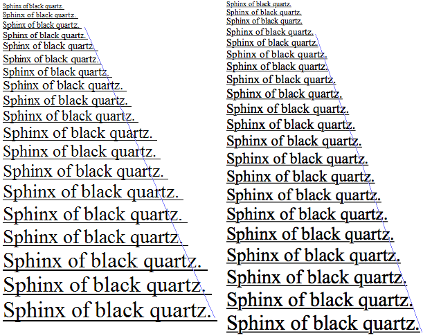
Here is an example of Times New Roman on Windows (left) and Mac OS (right) scaled over whole point sizes with sub-pixel precision:
The two thing to note here arising from this “pixel-grid is king” approach are
- Windows does not scale fonts linearly as the rough line points out
- Windows scales the height and width but not the weight of the font
Neither of these may matter to a casual user but for professionals preparing material destined for high DPI (film or print) then it’s a world of difference. How can you layout a page on-screen and expect the same result on the page when the font isn’t the same width?
The issue is reminiscent of the “I hate black bars on wide-screen films” brigade who believe that the film should be chopped, panned, scaled and otherwise distorted from the artists original intention simply so that it fits better on their display.
Typography has a rich and interesting history developed and honed over centuries. It is a shame to misrepresent typefaces especially as the pixel-grid approach becomes less relevant as displays reach higher resolutions.
Update
Some additional comparisons and a note that the gamma differences between Windows and Mac will affect how you see the “other” systems rendering on your machine.
Further update (21 August 2007)
Thanks to Daring Fireball and ZDNet we’ve had a few more great comments which I’ve summarized here:
George thinks the philosophy idea is wrong because “What percentage of Mac users sit around all day doing nothing but pre-press work?” but as Fred points out Microsoft’s desktop-user optimized rendering ends up on images and videos all over the web, thus escaping the environment for which it was crippled.
George also claims that Vista’s rendering is improved, I can’t vouch for that one way or another but from looking at his screen shots the difference there could simply be the contrast level as adjusted by the ClearType tuner.
Nathaniel believes that it’s not Microsoft’s job to manipulate a typeface and that if you want on-screen readability then choose a font designed for that such as Microsoft’s own Tahoma or Apple’s Lucida Grande.
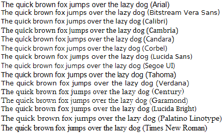
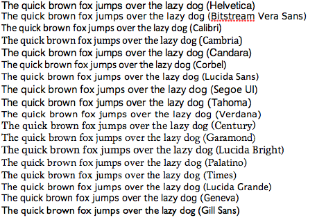
I’d go further and say that Microsoft’s own aggression in sticking to the grid kills font choice at the regular reading size of 10/11 point by optimizing everything to a generic sans or serif look:
Windows XP
Mac OS X
James points to an article called Texts Rasterization Exposures that proposes a combination of using vertical hinting only and calculating horizontally to 256 levels and has some convincing screen-shots showing the benefits. Probably too late for Leopard or Vista SP1 though.
[)amien
54 responses
@Peter I'm sorry, but the whole point of a Retina Screen is that you are NOT able to see the pixels and much less any antialiasing between these microscopic pixels. Type on a Retina MacBook looks like type printed on paper. Any headache is either psychosomatic or has some other reason (like higher screen brightness or reflections on the display).
I tried using a MBA-11 inch for two years. Very impressive except when reading from the screen. Very fuzzy compared to Windows fonts. I bought a Dell 24" Ultra 1920 x 1400. Windows fonts were crisp but OS X - blurred. I had considered moving to a MBP-13" but again, an external monitor would show only fuzzy fonts. I spend most of my time online/coding not printing/publishing so Apples 'font philosphy' doesn't work for me. I'll move to Windows 10 when it's fully released.
I'm very happy to find this article! It cleared out my two year struggle switching from Windows to OS X. All began when my friend brought his 11" air to reinstall OS X. After a short use I liked very much thus machine, the speed the stability were amazing! I decided to buy for my self mac air 13" - after a month of use the neck and back aches began to increase. I was thinking that it's all about screen size. Sold the 13" air and bought 15" mac pro after a more than a year the aches are still persist varying how much time I spend in front of mac. Now I'm very close to sell the mac and get back to windows pc. Regards everyone!
Interesting topic, and I hate to necro-post… but I think I'm in the minority and it's good to have both sides heard.
I just bought a retina MacBook Pro after many years on Windows. I thought I'd love it because I love the way my iPad antialiases type. But after a solid month of headaches, eyestrain, neck and backaches (which all completely abate after a day back on Windows), I think I'm going to have to sell it. I've tried absolutely every intervention known to man to make this thing more readable (and I'm using the same monitor, by the way), but it is just blurry. And I do think the type looks better. Much better. I just can't get used to it and it's making me sick. Any ideas?
I know I'm very late but I'd like to discuss/troll a little on this topic. I personnally think Mac OS X rendering is lousy, and I'll explain why. Firstly, we do read words by recognising individual letters: the “word shape” model is obsolete. The reason why it is easier to read words as opposed to meaningless clusters of glyphs is because, for instance, reading “wor” prepares our mind to follow with “d”, “k” or “n”, easing the decoding of that next glyph. From this, it is clear that making individual letters as readable as possible is important. Secondly, you mention that font weight scales proportionally to size on Mac OS X. This could actually be a flaw! There exists such a thing as “optical scaling” wherein differently sized faces of the same font are optically corrected for even weight, hence the name. Windows is able to do this using the TrueType hinting instructions contained in the font, which Mac OS X ignores. This is also why fonts look so different on both platforms at small sizes. Thirdly, very high DPI-printing doesn't suffer from visible antialiasing artifacts, meaning the Mac OS X approach is far from being as close to paper as you would think. Fourthly, Mac OS X and Windows use different pseudo-gamma correction on the fonts: Windows is more ideally-correct while Mac OS X tries to emulate the smearing of ink on paper. This mixes extremely badly with point 3. In conclusion, the Mac OS X approach manages weight much worse but it does keep the design linear as it accumulates very little to no horizontal error compared to Windows whose approach is still far superior with regards to readability.
BTW, the windows screenshot (on the left) seems to be from Wordpad. The (line) seems to be much straighter in Word 2007, perhaps Word is tweaking Cleartype or font hinting itself.
Great article, and most of the comments are by people who seem to "get it" when it comes to understanding and appreciating the Mac OS X way of font rendering.
I just finished an writing an article that extensively covers Mac vs Windows font rendering if you are still looking for more information even after reading this wonderful article and the sensible replies.
http://dougitdesign.com/blogs/blog_3_6_09_Safari-4.0-web-browser-on-Windows-and-the-Differing-font-rendering-philosophies-between-the-Mac-OS-X-and-Microsoft.html
Modern Linux desktops let you pick where you want to be along this trade-off, and even have an option to do the hinting only along the vertical (not quite what the agg guys describe but based on that idea)
Unfortunately due to patents Linux font rendering does not do sub-pixel kerning (this is a large chunk of the agg article is talking about... and part of why it looks good) (Adobe CoolType does, I don't know about ClearType and Mac).
Freetype in order to get around patents on TrueType bytecodes (only certain ones) has an autohinter so if you turn on the mode that only does hinting vertically ALL fonts will be hinted equally well (that mode only works with the autohinter).
For the MS fonts the autohinter tends not to look so good (MS fonts tend come out FAR to light, probably because they were designed to let the hinting and snapping fix that...)
For the people that say they see colored pixels around anti-aliased fonts (Clear type): do you run your LCDs at their native resolution? I'm curious. I can see the colored pixels only if I come 2 inches from the screen.
Clear type can only be turned on or off at the OS level, but for some strange reason fine tuning of the clear type settings is a web only application (Active X component that runs in the browser) available here:
http://www.microsoft.com/typography/ClearType/tuner/Step1.aspx
This allows you to further tweak the settings and choose the font "lighness" that looks the best to you.
BTW, the windows screenshot (on the left) seems to be from Wordpad. The (line) seems to be much straighter in Word 2007, perhaps Word is tweaking Cleartype or font hinting itself.
Charlie this is already covered in the article:
"George thinks the philosophy idea is wrong because "What percentage of Mac users sit around all day doing nothing but pre-press work?" but as Fred points out Microsoft's desktop-user optimized rendering ends up on images and videos all over the web, thus escaping the environment for which it was crippled."
I understand the reasoning, but a web browser seems to be the wrong place for Apple to use it.
Web browsing is an activity you perform on the computer, so fonts (and font-smoothing) that are easy on the eyes when using a computer should be the top priority. I mean, how often are you going to print out a web page and be disappointed that the font-weight is slightly different than you expected?
When I switched from Windows 2000 and XP to my macBook (both had LCD screens) I simplyfound the text on OSX much easer to read then on Windows.
I really don't like the "professionals preparing type for high-dpi print" argument. It's technically true, but as one of those professionals, I think it's only a small piece of the argument. The reality is, that if I wasn't a designer, and was something else instead, I would still prefer the OSX font rendering. I simply prefer it over Windows rendering. Just like some people prefer the opposite. My point is that I think there are a lot of OSX users that really prefer the OSX rendering regardless of their profession - they just might not be able to put professional words and terms to it. The Mac font rendering may have gotten its foundation because Mac has always been preferred for print preparation, but it's where it's at today because a large group of us (including apple developers) simply think it looks better.
"Neither of these may matter to a casual user but for professionals preparing material destined for high DPI (film or print) then it's a world of difference. How can you layout a page on-screen and expect the same result on the page when the font isn't the same width?"
But don't professional tools handle on-screen typeface's themselves and not use the system. The adobe products I use certainly handle it themselves. Isn't this point a bit of a strawman.
One thing that hasn't been mentioned yet - OS X's font rendering is much more LCD friendly than Window's font rendering for any situations where you need to use non-native resolution display settings. Windows fonts look utterly abysmal under these situations because there is no defined pixel grid for them to align to, whereas OS X's fonts look just as smooth as they did at native resolutions.
I'm also someone who is most definitely in the Mac camp here and I am another person who spends (currently much) more than 8 hours a day on a Windows box. What XP does to Gill Sans, Book Antiqua, etc is a crime against the fonts, IMO.
I find the Mac way much more legible. But I prefer to sit a little farther from the screen and scan text quickly, spending little time pondering over the individual shapes of the letters. On the Mac side, even at small font sizes, "black quartz" looks like black quartz and I don't have to slow my reading down to figure it out. On the Windows side, I have to stop and think about what it is I'm looking at -- all those uneven spaces between letters and funky word alignments get in the way of my ability to simply take in the shape of the word and move on.
Sharp pixel edges only work for rectangles because pixels are rectangular. For everything else, aligning too closely to pixel edges results in combing on the side of diagonal lines and curves that just don't curve right. All of those subtle design features of modern fonts that serve to improve readability are completely lost on Microsoft's approach, as are the careful kerning algorithms that font designers spend ages fine tuning.
Apple's antialiasing approach preserves all of these features, which makes for inherently more readable and elegant text. If people can get over the initial "it looks blurry" reaction, they'll find that they read faster and more accurately, have less eye strain, and can appreciate more of the beauty of typography with the Mac's approach.
I don't understand why people insist that the Windows way is easier to read. I find both equally readable... one just looks better.
In fact I would even argue that Mac OS fonts are easier to read at small point sizes (less than 10).
Word does it's own thing, vis-a-vis font display, completely divorced from OSX.
But how can we explain the fact that the character spacing in MS Word on Mac is so wonky?
this is typical conditioning of PC users who just don't know better typography (anti-aliasing) if it hit them over the head.
Aliased (pixelated) type really degrades good design - AND is harder on the eyes - especially when trying to create a website full of large quantities of information. What you end up with is a lack of 'calm'. The high-contrast of aliased type disturbs a sense of peace that a well designed anti-aliased (smooth) version of the same design displays on a Mac. If seen side by side, you may see crisper type - but it also looks clunkier - like some half baked designer pulled out of Fonts-R-Us. At least on the Mac, it is more WYSIWYG between screen and print.
Just another item in a long line of reasons why the PC really is inferior.
I'd really like to see just for one single time, a win32 solution beating anything from the apple front... anyway, i'm still waiting, and waiting, and waiting...
Of course I meant "jaggy," not "baggy." I'm posting from my iPhone.
What about Adobe Acrobat? Why does the same document that looks so great in Apple's Preview app look so crummy and baggy in Acrobat 8.0? I never use Windows, but based on your examples I'd guess that Windows does a better job than Acrobat.
Thanks for the very clear delineation of approaches the two companies took, Damien. Much more informative than ZDNet's George Ou and his typical inflammatory rantings.
Here's some great analysis of this, and a solution.
Actually, ClearType aligns glyphs to whole pixels horizontally as well: all the sub-pixel
rendering happens inside a glyph so that when ClearType is turned off the length
of any line of text doesn't change.
That's simple. Microsoft Word, for example, handles this by uneven spacing.
Check it out
Notice how Word groups glyphs into clusters. Isn't that disgusting? But it manages
to achieve the same line length both on screen and on paper. Acrobat, on the other
hand, do it with sub-pixel positioning (its own CoolType technology).
In anything else, like WordPad, IE, the lines are much shorter.
If the text is bad for your eyes, change the font, not the way it is rendered.
Apple's approach also works with a wider range of fonts. Microsoft's main fonts have a lot of extra hinting added to them to make them work well with Cleartype. Since their hinting is optimized for Cleartype, Apple's algorithm is going to suffer by comparison. On the other hand, fonts that are not hinted this way look better in Apple's system. At least, this is my feeling about fonts like Gentium, which I have a test page for
To me the Cleartype version looks thin and ragged, especially the italics. The Safari version looks warmer and (to me) more readable. I don't see the Safari version as blurred, although there is some faint blue and orange ghosting.
Anyway, you can fine tune the level of "antialiasing" in the preference pane of Mac OS X.
So if you're bored of Apple's method, change the value.
If you're bored of MS's method... Hmm...
Just a small note from me. (It might be redundant since I haven't read all comments.)
I work on a PC at work and have a Mac at home (both with decent properly set-up LCD-screens), so I make the switch daily. I must say that I find reading on the Windows box using cleartype quite tiring compared to the Mac approach to anti-aliasing.
Most fonts that we see on-screen (using the web for instance) are in the 11 - 13 pt. range. In this range using a normal 100 dpi-screen, cleartype still has to do quite some (horizontal) shifting (or use hinting) because individual characters are still only some 10 or less pixels wide.
My brain percieve these horizontal shifts that disparate characters (within a word) have to undergo to fit in cleartype's pixel grid, as (sometimes very) bad kerning. In other words: the shifts are large enough to break or disturb my word and or word-group recognition, which can seriously slow down my reading speed. I even found that quickly skimming a page of text for a relevant entry is close to impossible on a Windows PC (which is probably why almost everyone in my office prints their important documents, or blows up the fonts to rather ridiculous sizes, word has this format-breaking reading mode, you know).
Anyhow. Because the intended kerning of fonts is much more intact on OS X, I don't (or rarely) experience these problems on my Mac. For me this is as well a productivity booster as it is a tree-saver :)
It may astonish anybody who hasn't taken a Cognitive Psychology 101 class, but we (I mean adults) don't actually read letters, but we read words and even "sentence chunks".
The "letters are blurry" argument is only relevant for school children and when reading unfamiliar words, e.g. "Avaniaish".
The more important part of legibility or rather readability is "how difficult is it for our cognitive system to identify words and groups of words".
This depends an awful lot on "training effects", e.g. how familiar you are with a particular font and way of representing it on the screen.
This is why Mac users read much faster on their "blurry" screens and Windows users read much faster on their "sharp" screens.
Whether Mac users read faster on their Macs than Windows users on their Windows boxes or the other way around is in no way certain and will depend on who those users are.
Clearly the Mac approach is a more faithful rendition of the print medium, so if you read a lot of printed texts (you know books, newspapers, magazines), your cognitive system may well feel more at ease with the much more familiar outline of the words (compare Times Roman on your Mac/WIntel box with your newspaper). If on the other hand, you do most of your reading on MSDN, you will definitely have trouble reading fast on a Mac display.
The whole discussion leaves a few crucial thing out, however..
I don't doubt that Greg from the Microsoft Advanced Reading Technologies Group cares passionately about legibility, but is anybody at Microsoft listening to him? Sure he got ClearType in (which he believes is the best way of doing things and who am I to argue), but doesn't he think that the on-screen text in Windows is:
* the text color and text background combinations could be optimized a bit for contrast?
Just look at the Microsoft home page right now and tell me how good the legibility is:
* small dark text on the same background (slightly better, but still far from good)
* the headers are even worse: LIGHT GREY on the same light blue gradient
* darkish grey text on only slightly lighter grey background ("powered by Live Search")
* the text anti-aliasing on the pictures too is fairly awful
Let us not even start on the bizarre use of text and text backgrounds in Vista..
Legibility clearly is not everything, neither at Apple nor at Microsoft. Emotional engagement and design are both important factors too, perhaps especially on a home page (the "new" Apple home page navigation bar certainly isn't about legibility either), but let us not kid ourselves: the Mac world has typography in its DNA, whereas the Microsoft world clearly does not.
Engineers (I count myself amongst you) may argue for hours about legibility, but typography and legibility are about far more than sub-pixel rendering strategies.
If it is legibility that you are after:
As a designer:
* large font sizes (12pt and up)
* black (or dark gray) text on white (or very light colored) background
As a user:
* calibrate the display properly
* choose a readable Windows theme
Of course if you bought a Mac from Apple, you have all of the above for the user interface, and at least the decent screen and proper calibration for the non-Mac internet. Minus of course the wonders of ClearType :-)
Greg, you state that we "...need to first ask; what is the purpose of text on the computer screen? Microsoft believes that the primary use of text on the screen is to read, and therefore the text must be designed and/or hinted for the best reading on that medium", but that is precisely the reason why different fonts were created.
Typography is an art but it has parts of a science. Different fonts were created for different purposes, like big letters for your business facade or others for reading newspapers. In this case it should be the same. You should use fonts for computer reading created to look best in that medium, that are hinted and have tracking and kerning information developed to look good in that medium.
As monitor resolutions grow bigger things may change a bit, but still you should use a font meant for reading when writing a paragraph and a font meant for visibility when writing a big heading. Each one was created for different purposes and more resolution won't change that purpose.
Sir,
My Multi lingual Fonts ( Using in OS 9.2 )and and windows Unicode Foonts are not compatible with OS X 10.4.10 This fonts I am using in Page Maker 6.5. Same fonts will appear as it is in Adobe Indesign versions. Except Keying in material every thing is possible.
How I have make make it compatible?
Regrads
For me the real test is large text, 120pt 'a' in Arial (Can't use Helvetica because it never looks good in windows so thats not fair)
On MacOS X you will get a beautiful letter that is close to a printed page.
In Windows the bowl will have sharp pixel steps, only the x-axis will be anti-aliased.
No contest
"The primary difference is that Microsoft try to align everything to whole pixels vertically and sub-pixels horizontally."
Although there's a good argument not to do it this way in on-the-fly rendering in DTP programs or even in a Web browser, this is how designers properly prepare image art containing fonts and letterforms. By aligning the top and bottom edges of letters with the pixel grid, things like logos look much crisper.
Here's a step by step for Web era designers (in the CD-ROM age, every designer knew this stuff):
-- Determine if your text will all uppercase or upper- and lowercase.
-- In Adobe Illustrator open a new file at 100 percent, draw a box, copy it, convert it to crop marks, paste the clipboard in, and convert it to guides.
-- Keep the magnification at 100 percent throughout this process. This ensures baselines are on-grid throughout.
-- set a 100-point E (for uppercase) or x (for U&lc).
-- Convert it to outline.
-- Using the ruler tool measure the vertical distance from a point on the baseline of the E/x to a point on the top of the E/x. Adobe will return a value to the fourth decimal. For example, you might get 54.3874 points for an x.
-- Divide to get your E height or x height: 54.3874 percent in our example.
-- Set the text you want to set and size it about how big you want it. Convert to outlines and measure the x height or E height as appropriate, in points. Let's say you want an 8-point lowercase letter.
-- Round up or down to an even number of points. This is how high you want your lowercase or uppercase letters to be. Let's say you want an 8-point lowercase letter.
-- Divide the size thus derived by the x height (in this case for lowercase) and round to the fourth decimal: 8 / 0.543874 = 14.7093.
-- In the font size box for the type you are using in your image, enter 14.7093 for the point size.
-- When you rasterize into Photoshop, the area within the crop marks will show up, and the lowercase letters should be crisply rendered. The uppercase letters in this example will have a bit of antialiasing at the top. In this case lowercase is more important, visually (try it both ways to see this).
-- You should confirm that the bottommost pixels in the lowercase letters are 255 and the pixel row below is 0, and likewise that the topmost pixels and the row above are 255/0. If not, something went wrong. Letters that are not supposed to rest on the baseline or go above the x line will be antialiased, like lowercase o's or letters like v's in a lighter weight Futura. (Quick letterform/type design lesson: Letters are supposed to "look" the same height, not actually be the same height. O's are taller than E's. A sharp-bottomed V will extend below the baseline. You're looking to compare letters that have clean horizontal ends on the baseline and x line.)
If "we read best what we read most" is true, then why do I much prefer reading text off my Mac at home when I spend 8 hours/day at work looking at Windows' jaggedy, crappy typography?
To my eyes, there is no comparison when it comes to the overall quality of the Apple solution to typography. I have spent many more years reading text perfectly rendered in print than I have reading text on screens, so my eyes are used to looking for accurate representations of what they have seen for decades. My eyes are not used to Windows' "the grid is everything" approach.
When it comes to detail and nuance, Apple almost always wins vs. MS. And it is so typical that MS thinks they know best when it comes to readability, just as Word "knows" what I want to do when I am writing. Yeah, right.
I don't want to mention the cliché, but I think that the relative ease of reading on a particular platform has a lot to do with the "we read best what we read most" factor. Mac users will prefer Mac font rendering, Windows users prefer Windows, and so forth.
And BTW, vanni, Mr. Gill would obviously root for Linux :)
I created a set of Courier fonts for the Final Draft screenwriting program and had to custom hint (instruct) them using the Microsoft Visual TrueType method. Basically what you're doing is hinting the fonts so that they look like they're using embedded bitmaps by deliberately deforming the letterforms at small sizes to make them fit the pixel grid. When you combine a font hinted this way with ClearType sub-pixel anti-aliasing, only a very small amount of anti-aliasing is actually applied to the font because of the way the pixels are already perfectly grid-aligned. The result is sharp but ugly. Personally I greatly prefer the look of Apple's anti-aliasing and don't like the way that my Courier fonts look in Final Draft, but to each his own. I think that crisp bitmaps are often misinterpreted as being readable when in reality they're very harsh-looking. I'd much rather have soft anti-aliasing that preserves the letterforms and just view the text at a larger zoom ratio.
There's a flaw in the thinking that MS letters are easier to read because the letters themselves adhere to the pixels, and thus are individually easier to distinguish.
We don't look at individual letters when we read - we look at the shape of the word. The ascenders, descenders, and spacing between letters are key in this regard. By respecting the shape of the designer's intended look and feel it actually makes the words easier to read, and is lest tiring to the eyes.
As Greg correctly points out, text meant to be read onscreen should be very legible.
The flaw in Microsoft's thinking is that they assume it is their job to then go through all of your fonts and forcibly change them into other, more legible fonts, when they are displayed.
Apple's philosophy is that if you want an easy-to-read screen font, you should simply use an easy-to-read screen font. They aren't going to go around changing your Garamond into Tahoma simply because it's easier to read on-screen that way.
The irony of these philosophies is that Microsoft, of course, developed and distributed the most well-designed screen fonts made since the original Mac OS hand-drawn pixel fonts. If web designers want to use Tahoma or Georgia because they're easier to read on the typical 96ppi monitor, then they absolutely should do it. That's an excellent design choice. If you're designing a web page for the iPhone, using Helvetica is a better choice.
Designing all your pages in Times New Roman and then complaining that it's hard to read is simply absurd. MS's position seems to be that it will protect us from poor type design choices, while Apple's position is to assume that design choices should be respected regardless of whether they were wise or not.
I know which position I agree with. I also know I'd like to be able to tone down the antialiasing on Apple displays because I think it's too aggressive, but the last thing I would want is for them to go around changing the basic shape and color of all my letters the way MS does.
A very informative article. Many thanks fro the review.
I'm pretty sure on which side of the issue Eric Gill would weigh in on....
Does anyone else hate the color fringing that ClearType creates on black text? Yuck.
I think I'm of the opinion that trying to make a font look like it was intended to look as much as one can is perhaps better for "readability". (That is a dangerously vague statement, I know.) After all, should we not trust the font designer to make a font that's well suited to a particular purpose? If a font was meant to be read easily, doesn't it make sense to try and make the font appear as intended? I'm just ASSUMING this is Apple's particular goal with their font rendering. The article's visual aid and my idea of Apple's attitude seems to hint at that.
I just don't understand why the pixel grid is so important. People defending font rendering on Windows seem to bring this up a fair bit, saying that there's more attention paid to it, but what is it about the pixel grid itself that's so great? Just the fact that a straight black line right on the pixel grid has less chance of blurring, and is therefore clearer? As in "ClearType"?
The real issue I have with font rendering on Windows is how the shapes of adjacent letters interact with one another... the way letters are spaced always looks kind of awkward to me. I could be wrong, but it feels like this is part of the adherence to the pixel grid? So I agree with Michael Boyle above... it definitely seems to me that the SHAPE of the letters is really what's important. It does seem that shape is perhaps less easily quantifiable than alignment with the pixel grid.
What would be really great to have is some sort of font-rendering test tool, where one could tweak the various considerations involved in drawing the font. Like a slider for how much pixel-alignment you want etc.
There is no excuse for the Microsoft method, because the shitty text rendering ends up burned into images and posted on the Web, it ends up burned into video clips, it is not confined to the Windows Desktop. It's like a trap for Microsoft's users, it's a kick me design on the back of a T-shirt.
The only good thing I can say about Windows text rendering is when I see it in somebody's work the interview is over and you didn't get the job. It's a bozo detector in other words.
I'm 60 years old, so if I sit close to a monitor everything is a blur anyway. The color fringes on the Microsoft examples don't bother me because I can't see them. I used CRTs for years, so I'm used to that anyway.
I still use a CRT as a second monitor on my main Mac, and I find text somewhat clearer on the LCD next to it.
Legibility is a whole complex subject in itself. If one is reading paragraphs of text, then unevenness in spacing and such are much more disruptive and tiring than a small amount of unsharpness in the individual letters. Line length relative to type size is important, too.
Perhaps it's my (relatively) young eyes, or just how I read text, but I've never been able to understand why people feel that the ClearType pixel grid approach (or even no antialiasing at all) is more readable.
When I read text I see the overall shape of the text, therefore even if there is a decrease in contrast as a result, antialiasing which makes the text appear closer to the correct shape increases the readability for me. This is especially true with very small text, where I often see the pixel grid aligned or non-antialiased text as a mess sharply contrasting pixels that I have to stare at to interpret. With mac antialiasing turned on, I can scan my eye across and read the text by shape, even though it is much blurrier.
I find the jarring contrasts, jagged edges, and uneven spaces in the Microsoft solution much more distracting (and a much higher detriment to readability and eye strain) than the slight fuzzing of the Mac solution. But hey, that's just me.
Great article with a phenomenal visual aid.
I wasn't aware that Microsoft's philosophy caused minute shifts in size when trying to hammer in pixels directly within the pixel boundary.
I thought the only downside of Microsoft's approach was that you don't get to see the true typeface as it was intended.
You live and learn.
@Greg: I understand where Microsoft is coming from and there is little doubt that ClearType does a very good job of making fonts look incredibly clear on an LCD display thanks to the clever pixel-alignment and hinting process.
I have tried (and failed) to work this hinting magic with my own Envy Code R font so appreciate the difficulty involved.
I guess it's one of those things where some people will want clarity and others accuracy. It's a shame neither Microsoft or Apple give their users the choice.
I think as you look at the philosophical differences between Apple and Windows text rendering you need to first ask; what is the purpose of text on the computer screen? Microsoft believes that the primary use of text on the screen is to read, and therefore the text must be designed and/or hinted for the best reading on that medium. Physiologically the eye needs sharp edges to most efficiently decode text and at the same time the character must maintain its essence, e.g. proportions must be reasonably maintained.
The scaling differences you note have no impact on readability; in fact they are a decision related to hinting of the font. With hinting, decisions are made on how to best keep text contrast, maintain appropriate symmetry and keep consistency between characters. Hinting decisions are made by typographers who are skilled knowing how to best represent a glyph on the medium. These typographers are also often either the original typeface creator or people that work with the original designers. It is a significant skill to make text that displays optimally on screen mediums.
The weight differences you noted are, in my opinion, primarily related to the asymmetric scaling used in the Microsoft solution. At low text sizes with low resolutions screens, a symmetric scaling significantly increases the blur. Since this scenario is where most reading occurs, Microsoft felt that was important for their solution. At higher text sizes or higher density screens, that becomes less of an issue, and symmetrical scaling is a better solution. This hybrid approach is used by Microsoft’s WPF graphics, which is used by the New York Times reader.
Viewing distance does play an important role in the perception of text—but one cannot just change the viewing distance and leave everything else static. Efficient reading is in the range of 9-12 point with a peak at 11 point with a 50cm viewing distance—this is because of use of the fovial vision which is required to decode the details of type. Moving further away probably requires increasing the point size of the text.
Greg
Microsoft Advanced Reading Technologies
It is likely a conditioning thing but not just what you are used to but how close you sit to your display.
I used to prefer fonts to be pixel-sharp with no smoothing mostly because of the low-resolution of my screen but also because I was sitting so close that smoothing/ClearType distorted the lovely sharp pixels I could otherwise see so clearly.
With ClearType I found I could sit further back and stop looking at individual pixels and consider the words as a whole.
With Mac OS X's font smoothing I find this even more so. I can sit even further back and read the page as a whole which is good for the eyes and the back.
The Mac ones don't truely scale because they do actually try and align things to the grid a little they just don't make so much of a compromise on the font's weight, style and size in order to achieve it.
You definitely adjust. I used to despise all antialiasing on fonts and had it turned off even on an LCD. I knew ClearType was supposed to make things easier, but it just annoyed me for some reason. Lately I've gotten used to it more.
However I notice in the example the OSX fonts still aren't completely scaling linearly. The Windows ones are varying much more but the OSX ones are still varying, which I thought they wouldn't at all if it was a truly precise scaling?
I think it depends on how big pixels are in your field of view.
Windows users tend to sit much closer to their monitors and hence why like the sharp pixel look.
With larger monitors or a sit-back approach the Mac rendering really shines.
When I'm staring at a screen all day, I want the text to be as easy to read as possible. The less eye strain, the better.
For me, that means that ClearType is the winner, but other people seem to prefer Apple's system. I certainly understand that it makes more sense to use Apple's method for type which will escape the monitor.
I'd like to see both OS X and Windows allow users to make the choice. I know I'm put off using OS X because I find the text hard to read for extended periods and others feel the same about Windows.