Envy Code R has been updated since this post.
I have been experimenting with Envy Code R over the last few months, everything from creating a bold version to delta hinting with Visual TrueType with mixed results.
Part of the problem is that at larger sizes the odd shapes and over-emphasized curves that I drew to make the font look great at 10-point with ClearType on makes it look awkward at larger sizes.
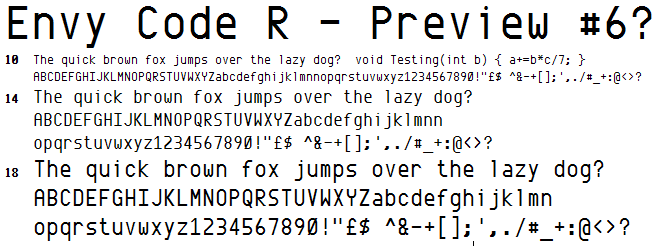
Last weekend, I went back to the drawing board, literally, to try and improve on the shapes without impacting too much on the 10-point size ClearType version. The result is as follows;

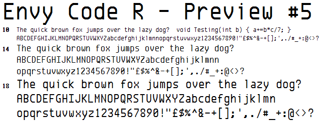
And for comparison, the old version:

Let me know your thoughts in the comments, even if it’s just to say your prefer PR6, Consolas or something else. Be sure to mention what size and whether you have ClearType on (or if you are using a Mac).
[)amien
8 responses
Preview 5 wasn't actually released but preview 4 was which is identical in all important respects. Grab it from the post
FWIW, I actually prefer the more geometric, quirkier look of version 5 to the admittedly smoother, yet more generic look of v 6. Is a copy of v5 still available?
The plan is to include the entire Windows 1250 Central European and MacOS Central Europe code pages within a Unicode font.
will there be any Unicode characters?
with me being swedish i'm mostly thinking of the Å, å, Ä, ä, Ö and ö characters
0 and R have been changed as per the suggestions.
I've been fleshing out a number of additional foreign accented characters, symbols and signs in preperation for a release over the weekend.
Very nice, #6 looks to me a lot clearer. Lets hope it displays in java nicely and no odd heights showing up.
It certainly looks better to me than #5
"R" looks unbalanced to me as if the 'leg' should be coming out of the mid point in horizontal stroke or something rather than at the join.
I like 6, can't wait to try it...
I prefer the v, x, y and z shapes in 6 but the 0 in 5.