For some time I’ve wanted to refresh the design here at damieng.com which evolved out of the Redoable theme with my own tweaks to colors, typography, images and background until it was almost my own.
Almost, but not quite.
As an engineer I prefer incremental improvement over a complete redesign but I was at the point where the code-base (HTML, CSS and PHP) was unworkable. Partly my fault, partly the sheer complexity of a general-purpose theme with wide-ranging plugin support I didn’t need.
These are the steps that helped me get to a clean minimal code-base that did exactly what I wanted and would like to share the experience for friends about to go through a similar process.
1. Decide on a layout
Getting layouts right across browsers can be tricky.
Fortunately, a number of individuals have put together a number of reusable CSS frameworks that provide grid-based approaches to layout, compensating for differences in browser defaults and including some minimalistic styling.
These let you hit the ground running but they are not complete themes unless you’re into minimalistic design.
I’m not a fan of fixed-width sites that contribute to the years of wear on my scrolling mouse finger so settled on the Fluid 960 Grid System which scales a 12 or 16 column grid system out to the full browser width while being incredibly easy to use and tweak.
At this point you’ll want to copy the CSS they provide into your own development folder and take the existing HTML sample page and cut it down to the bare minimum of and its necessary <link…> elements to setup the CSS plus the and any intermediate child elements required to get the basic structure in place.
Now think about how many columns each section needs to cover and whether it should continue taking columns to the right or whether it should start on a new row after the existing section has finished.
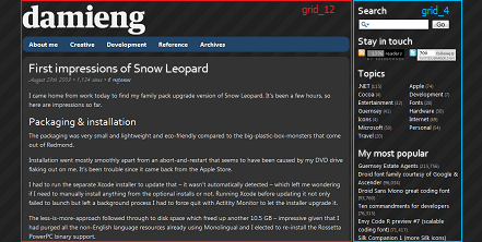
Given I wanted the layout shown above I needed just three containers – the primary left area (red) would span 12 columns and would contain the branding, navigation and actual content. The right area (blue) would span 4 columns and contain the sidebar. As I didn’t want my footer too high on pages with small amounts of content I created another section (not pictured) that also spanned 12 columns but would appear after the content in both sections. Simply:
<body>
  <div class="container_16">
    <div class="grid_12">
      <a href="https://damieng.com/" />
      <ul class="nav" />
      <div id="maincontent" />
    </div>
    <div class="grid_4" id="sidebar" />
    <div class="clear" />
    <div class="grid_12" id="footer" />
  </div>
</body>
2. Add your content
Unless you’re planning on throwing away any of your content (not recommended if you have it), now is the time to drop in actual content, navigation and any chrome. At this stage real static HTML content is best – the combination of PHP, remotely uploading files and hooking in to dynamic content can really slow you down while you are trying to get the basics sorted.
The easiest thing to do here is to just view source a page on your blog and copy out the required blocks. For me this was:
- Two blog posts from the main page, they sit in the
maincontentdiv above, each contained within a new<div class=”article”>so I can provide article-specific styling - A brand new set of nested navigation elements created by hand based on the page structure – initially two levels deep to support the drop-down CSS menus
- My five sidebar elements – Search, Stay in touch, Topics, My most popular and Interesting finds
Bear in mind that you are going to need to keep the structure and content of your existing pages and articles unless you have the time to either go-back and edit each one or apply some bulk-changes via SQL UPDATE statements. For me, this meant keeping my post sub-headings as <h3> and sticking with my class="alert", class="code" and class="download" blocks I use for notifications, code snippets and downloads which required bringing some CSS elements in from the old theme.
3. Style the page
Design inspiration can come from many places – here are some best-of designs, portfolios and showcases to draw from:
- CSS Showcase
- 50 New Beautiful Blog Designs
- 70 Fresh and Inspirational Blog Designs
- 70+ Ultimate Round-Up of Free PSD Website Templates
Now you have some basic HTML and CSS displaying real content it’s easy to see what works and what doesn’t with minimal resistance to experimenting.
I was happy with the existing look and I plan on further tweaks now my code-base is easy to understand so for now took the basic colors, background and icons then adjusted the layout, spacing, positioning, wording and elements like the content metadata. This was also an opportunity to experiment with some CSS techniques available but considering CSS3 browser support is limited right now I kept this to:
@font-facefor headings – Font Squirrel have a great set of @font-face kits including fonts with the CSS snippetstext-shadowfor headings and hyperlink hover-overs to achieve a glow effectborder-radiusfor curved blocks and navigation bar (also used prior to the redesign)- JavaScript to upgrade the search-box from
type="text"totype="search"in Safari
The result is something that looks quite unique on Safari and Chrome yet still looks good on Internet Explorer 7.
4. Convert to a theme
Now our CSS and HTML looks great as a single page we need to create a theme for the blog engine. This consists of several specially-named files to dynamically construct the page as required.
You can build this from scratch but a basic theme like Starkers ‘naked’ WordPress theme is recommended. Merge the layout and style of your theme with the dynamic tags that drop in content, navigation and titles in from the basic theme. A quick start would be to modify:
- header.php with your HTML up to opening your main content div but:
- remove
<link type=”text/css”>elements to the CSS and replace with the one line<link>from the theme - replace the static navigation elements with a call to a function to dynamically build it such as
<?php wp\_list\_pages(‘depth=3&title_li=’); ?> - links for shortcut icons and ensure they point to files that exist, you don’t want to be serving up 404 error pages every time
- meta tags – take the dynamic ones with
<?php ?>elements (content-type, description etc). from the theme and merge them with your sites existing ones if you have any
- remove
- sidebar.php with your HTML from closing the main content div through to closing the sidebar div
- footer.php with your HTML footer div (and in my case the preceding clear div) through to the end of the file
- single.php with your HTML that appears around each article with the necessary tags (like
<?php the_content(); ?>taken from the naked theme) - style.css with relative references to your CSS files and your new metadata, e.g.
/*
Theme Name: DamienGNew
Theme URI: //damieng.com
Description: Minimalistic theme based on Fluid 960 Grid.
Version: 1

Author URI: //damieng.com
*/
@import "css/reset.css";
@import "css/grid.css";
@import "css/damieng.css";
@import "css/navigation.css";
Rename the theme folder and upload it to your blog in the right location – for WordPress this is wp-content/themes.
5. Test drive, tweak, rinse and repeat
Now you want to test the theme without interrupting the existing one so don’t go and set it to be the default just yet.
If you are using WordPress a few tips:
- WP Super Cache enabled sites – check Don’t cache pages for logged in users so you don’t see cached pages in the original theme pages or serve up pre-cached new themed pages for other visitors
- Theme Test Drive – lets you specify a new theme and what access level it applies to (e.g. 10 for admin) so you will see it while you are logged in for testing
- Page templates – leave them to last as WordPress will try to use them in the default theme too
- Keep an eye out for error_log files – they contain details of when pages failed
It’s worth testing your site in popular browser and operating system combinations from your own analytics or you don’t have any of your own stats check out usage share of web browsers at Wikipedia. The major engines are:
- Internet Explorer (Windows)
- WebKit (Safari on OS X, Chrome on Windows & Konqueror on Linux)
- Gecko (Firefox cross-platform & Camino on Mac)
- Opera (cross-platform)
Bear in mind that each browser can behave quite differently between versions – Internet Explorer 6 will likely render quite differently to 7 or 8.
Sites like BrowserShots can help by rendering your page on a multitude of browsers for you and present screen-shots (once the theme is live) to compare. Validating your HTML and CSS is a good idea because the errors and warnings it spots are the likely cause for odd rendering problems.
Now you see a single blog post rendered it’s time to go through the rest of the files and apply the same merging process before you sit back, smile and make your new theme the default.
[)amien
1 response
Nice post (and new theme). I admit I already dug around in your page source to figure out how you were doing the glow, I may steal that idea for future themes :)
BrowserShots is awesome, thanks for that tip especially.