A series of posts on system fonts:
I’ve been wanting to do a follow-up to the popular system fonts posts for some time and recent HackerNews and ArsTechnica traffic reminded me that I’m not the only one nostalgic for chunky pixel fonts of old.
This time I’m focusing on a handful British machines that were much less well known around the globe which all seem to borrow heavily from other machines!
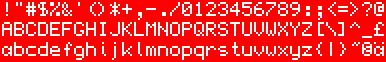
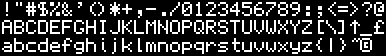
Sinclair QL (1984)
The short-lived Sinclair QL was Sir Clive’s attempt at getting into the business market but the corner cutting on the CPU (a Motorola 68008, the 8-bit data bus version of the 68000) and storage (Microdrives consisting of loops of high-speed tape instead of disc) meant it wasn’t taken seriously. This was a shame as the operating system and software were advanced for its time.
Unusual characteristics
- True descenders making the font effectively 9 pixels tall
- Single story lower case
a - Over-extended
7 - Squished lower-case
f - Aligns braces and brackets to tightly wrap contents
- Soft curves on
gil - Unusual join on
k
Rationale
A tidy condensed font very similar to those used on LCD displays still today. Almost certainly looked good on a monitor although perhaps not using the system default colors shown here. Almost certainly too hard to read on a TV at the time.
Influences
Has similar proportions and characters to much of the Apple ][ font but with various visual improvements such as on the 6,9,2,$ etc.
Memotech MTX512 (1984)
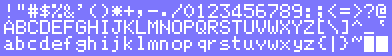
Memotech were a peripheral maker who decided to get in on the action and produce their own machine in the 1984-1985 period that saw a lot of machines and failures. Despite some good specifications it never made a dent and its claim to fame being the computer in the movie Weird Science.
Unusual characteristics
- Some quirky decisions especially in lower-case
- Awful character alignment especially on
q - Uneven descenders on
gy - Mismatched
.,;: - Weird serifs on
adu
Rationale
This quirky font doesn’t look okay on low-quality TVs of the time with oddities lost in the blur. On sharper displays, it looks amateur and unfinished.
Influences
Despite some similarities in the upper-case to the Apple ][ font it doesn’t take many cues from anywhere else.
Amstrad PCW (1985)
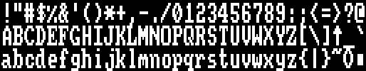
Alan Sugar’s Amstrad didn’t waste any time after the CPC in going after the business market with a range of cheap machines for word processing and other general tasks. In the UK these machines could be found everywhere either paired up with Amstrad’s own daisy-wheel or dot-matrix printers.
Unusual characteristics
- Pixels were actually rectangular (simulated here by doubling the vertical size)
- Distinctive curves on
CGOQ Xlooks like a different style because of high mid-point
Rationale
These machines came with their own monochrome monitors and were high resolution for consumers at the time. The font is not a bad choice and did allow for 90 columns of text but smarter alternatives existed in word processing programs such as Locoscript.
Influences
An almost direct copy of the Amstrad CPC font disguised by the double-height pixels. Actual changes are the 0 taking on the more oval shape, O and Q taking on the boxier shape and the apostrophe losing its slant.
The PCW was not alone in using an existing 8×8 font in a double-height manner. The Atari ST, Commodore Amiga, and Acorn Archimedes all used the same trick.
Acorn Archimedes/A series (1987)
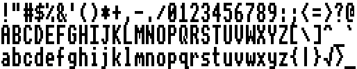
Acorn’s successor to the BBC Micro was a lovely piece of hardware with an all-new 32-bit RISC processor they developed dubbed ARM. While it did well in Acorn’s entrenched education markets it never found a foothold anywhere else. After various models they canceled their upcoming Phoebe workstation (yes, named after the Friends character) and would concentrate on thin-clients before abandoning that and focusing purely on processor design where they had immense success. The ARM design now powers almost all the smart phones on the market today.
Unusual characteristics
- Pixels were actually rectangular (simulated here by doubling the vertical size)
Rationale
These machines came with Acorn’s color monitors and were capable of running VGA-like resolutions. The GUI on these machines really missed an opportunity here to use a specifically designed font and to add proportional text printing and take on the Mac. Instead, these used a scaled fixed-width font like the Amiga and ST despite being a couple of years late to that party. Proportional fonts were supported later as was a strong anti-aliasing system.
Influences
Identical to the BBC font except for ^|
SAM Coupé (1989)
MGT were a third-party producer of expansion products for the Sinclair ZX Spectrum who bet their company on a Spectrum successor using VLSI technology that would ‘rival an Amiga’ at a fraction of the price. While the machine was impressive by 8-bit standards when it finally arrived somewhat late and more expensive than originally touted it failed to make a dent as the market went to the 16-bit machines and it took MGT down with it.
Unusual characteristics
- Ugly
*asterisk - Inconsistent
.,;:set - Inconsistent
'and"
Rationale
A smart font that despite the various inconsistencies looked good on a quality display in both high and low-resolution modes.
Influences
Almost a direct copy of the Sinclair QL font. The upper-case are identical and a most lower case with some exceptions to squeeze the QL’s 9-pixel high font into 8 pixels. This is especially apparent in the over-extended 7, the slashes and the bracket alignments.
[)amien
1 response
I´m missing these two handhelds, that were very popular around 1986: Sharp PC-1401 & especially PC-1403 (with 64kB RAM!!).
So one or the other font might derive from the first LCDs.
Before that we had LED-driven calculators like the TI-30. You were able to "write" two german words with such a calculator, readable when it was turned up-side-down. "ESEL" (german word for donkey) = 7353, and "LIEBE" (german word for love) = 38317. So you were able to flirt at school with your calculator, like today with chat-sites and GHz-hitech...