A series of posts on system fonts:
It’s been a while since I visited the bitmap fonts of old computers (see the bottom of the post for links), there are still some to evaluate!
There are subtle variations here as machines often used an off-the-shelf video chip and then made a few tweaks or had them slightly customized.
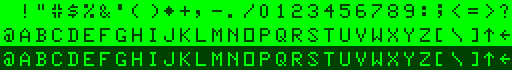
TRS-80 Color Computer & Dragon: custom MC6847 (1982)
The initial model of the TRS 80 Color Computer, affectionately known as CoCo, as well as the UK’s Dragon 32 & 64 computers, used the Motorola MC6847 character generator, and so used the same embedded font.
Unusual characteristics
- No lower-case
- Serifs on B&D
- Over-extended
7 - Asterisk is a diamond!
- Square
O - Cute
@ - Thin
0? - Tight counter on
4 - Unjoined strokes on
#
Rationale
The font has some rough edges although, the softer fuzzier look of a CRT TV almost certainly fuzzed those out like many home computer fonts at the time. The awful dark-green-on-light-green colour scheme wasn’t helping.
Influences
It has similar proportions and glyphs to much of the Apple ][ font but feels like they tried to make the characters more distinguished on low-quality TV’s hence the serifs on B & D and the differentiation between 0 and O.
Technical notes
Motorola offered custom versions of this ROM so, it would have been entirely possible to have an alternative character set.
TRS-80 Color Computer v2+ (1985)
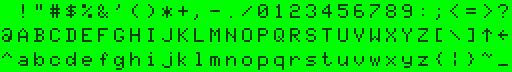
The follow-up v2 model of the TRS 80 Color Computer, also known as the Tandy Color Computer, used an enhanced Motorola MC6847T1 variant.
Unusual characteristics
- Serifs on B&D, over-extended 7 as per v1
- Ugly
@ - Very soft center bar on
3 - Tight counter on
4 - Tight top of
f p,q,gall descend one pixel lower for "9 pixel high" glyphs likely using hardware trick
Rationale
Generally, this font is much-improved over v1. It fixes oddities with the asterisk, O, 0, 3, 4, S, ?, and #, as well as straightening the slashes. It reduces the boldness of comma, colon, semi-colon, and apostrophe. Unfortunately, the @ and 3 are worse than the previous version.
Influences
Based on the previous model, however, lower-case does have some resemblance to Apple and MSX. This font may be a custom version as the spec sheet for the T1 variant has bold versions of ,;:.’ glyphs, shorter descenders on y and g, more curvature on p and q, more pronounced curves on 369, tighter t, semi-broken #.
Technical notes
You can identify CoCo2 models featuring the lower-case as they print Tandy on the screen rather than TRS-80.
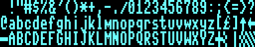
Tatung Einstein (1984)

The Tatung Einstein TC-01 was a British Z80 based machine launched in the UK that never really took off with the public. It enjoyed some success in game development as a compiler and debugger for other, more popular, Z80 systems. This use was likely due to its CP/M compatible OS and disk system (it came with the same oddball 3″ disks used on the Sinclair ZX Spectrum +3 and Amstrad CPC/PCW range).
Unusual characteristics
- Odd missing pixels on
9S - Little flourishes on
aq - Massively tall
* - Chunky joins on
Kv - High counters and bowls on
gpqy
Rationale
Given the 40 column mode, the generous spacing in 32 column mode makes sense, and the font isn’t too bad. Many of the unusual negative characteristics would be lost on a CRT.
Influences
It feels like the Sinclair Spectrum font with some horizontal width sacrifices.
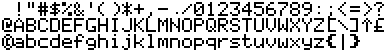
Commodore 128 (1985)
While the follow-up to the Commodore 64 used the exact same font at boot (it had the same VIC-II video chip) but switching it into 80-column mode reveals a new font with double-height pixels powered by the MOS 8563 VDC.
Unusual characteristics
£aligned left not right, thin strokesQfails to take advantage of descender- Cluttered redundant stroke on
7 - Rounded
<>
Rationale
A nice font that probably looked great on any monitor at the time, although TV’s probably struggled to display detail with such fine verticals on some letters.
Influences
Technical
Switching to 80 column mode could be achieved by using the keyboard or the GRAPHIC 5 command.
Texas Instruments TI-99/4A (TMS9918) (1981)

Texas Instruments foray into the home computer market came in 1979 with the TI-99/4 and featured an awkward keyboard and limited expansion. By 1981 the 4A had been released which fixed these and the machine went onto enjoy a few years of success before chasing the technically-inferior VIC 20's price point and eventually discontinuing in 1983 after large losses with much of the failure down to TI's tight control on technical information and discouraging third-party development.
Unusual characteristics
- Lower case is small caps
- Serifs on
BD - Square
O - Poor slope on
N - Bar very tight on
G
Rationale
The lower-case small-caps feel awful and appear to be an attempt to avoid having to deal with descenders. Other fonts brought the bowl up a line. Descenders look a little off, although some machines like the Sinclair QL just left space for them.
Influences
Based on the previous model, however, lower-case does have some resemblance to Apple and MSX.
Oric Atmos (1983)
The follow-up v2 model of the TRS 80 Color Computer, also known as the Tandy Color Computer, used an enhanced Motorola MC6847T1 variant.
Unusual characteristics
- Bold ‘{}’
- Vertical line on
^ - Awkward horizontal stroke on
k - Square
mw
Rationale
Not a terrible choice, although I suspect cheaper TV’s would struggle with the non-bold and tight spacing. The high-contrast black-and-white colour scheme helps mitigate this.
Influences
A complete copy of the Apple II system font with only a few tweaks to remove over-extension of 6 and 9 and un-bolding [ and ] but they forgot { and } weirdly. Additions of ^ and £ don’t fit right.
[)amien
2 responses
Your representation of the C128 font is inaccurate. Uppercase/graphics are identical to the C64, but in C128 mode, b, c, d, e, f, h, i, j, k, l and m are improved (except for m, they're also the same as the Plus/4, and the m just has an inverted crotch between the Plus/4 and C128).
Hi Damien.
Unfortunately, the download link is for the TI99/4A, not for the Oric Atmos.
That's a pity because your fonts are very good!