I originally posted a version of this article on Twitter in April 2020.
When digging through old games and demos, sometimes truly remarkable art and lettering emerges from the pixelated depths—typically hand-plotted with meticulous care in Deluxe Paint.
The Amiga scene was particularly rich with such artistry and here are a few of my favorite finds for you to feast your eyes on.

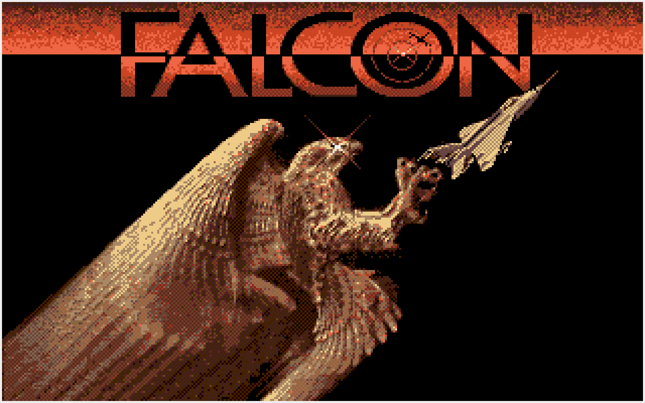
This is the title screen from Falcon, a flight combat simulator by Martin Kenwright, which demonstrates exceptional attention to typographic detail and incredible gold shine effect on the eagle too despite the limited palette.
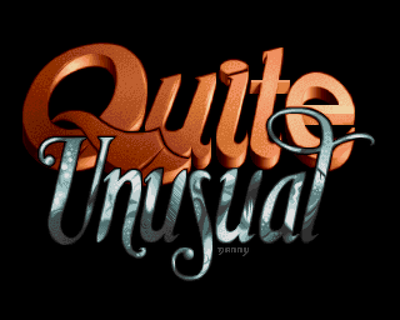
Next, we encounter the Quite Unusual demo logo by Danny, which exemplifies the creative spirit of the demo scene with its thick flowing 3D letters and an abundance of texture.
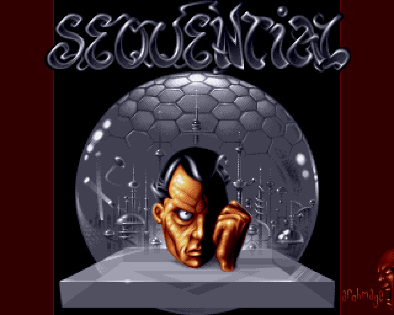
The Sequential logo by Archmage showcases lettering that is gorgeously designed and exquisitely shaded with shining outlines and shadowed gradiented fills all complemented by an unsettling face that adds character to the composition.
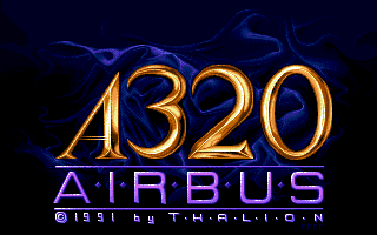
The logo from the title screen of A320 Airbus, crafted by Thorsten Mutschall, shows precision and care evident in both the typography and reflective shine of the gold.

Publisher logos were frequently gorgeously rendered, and it seemed as though every game featured yet another talented artist putting their own spin on drawing or refining previous iterations. Here's one of the slickest executions of the logo for Manchester-based Ocean Software.
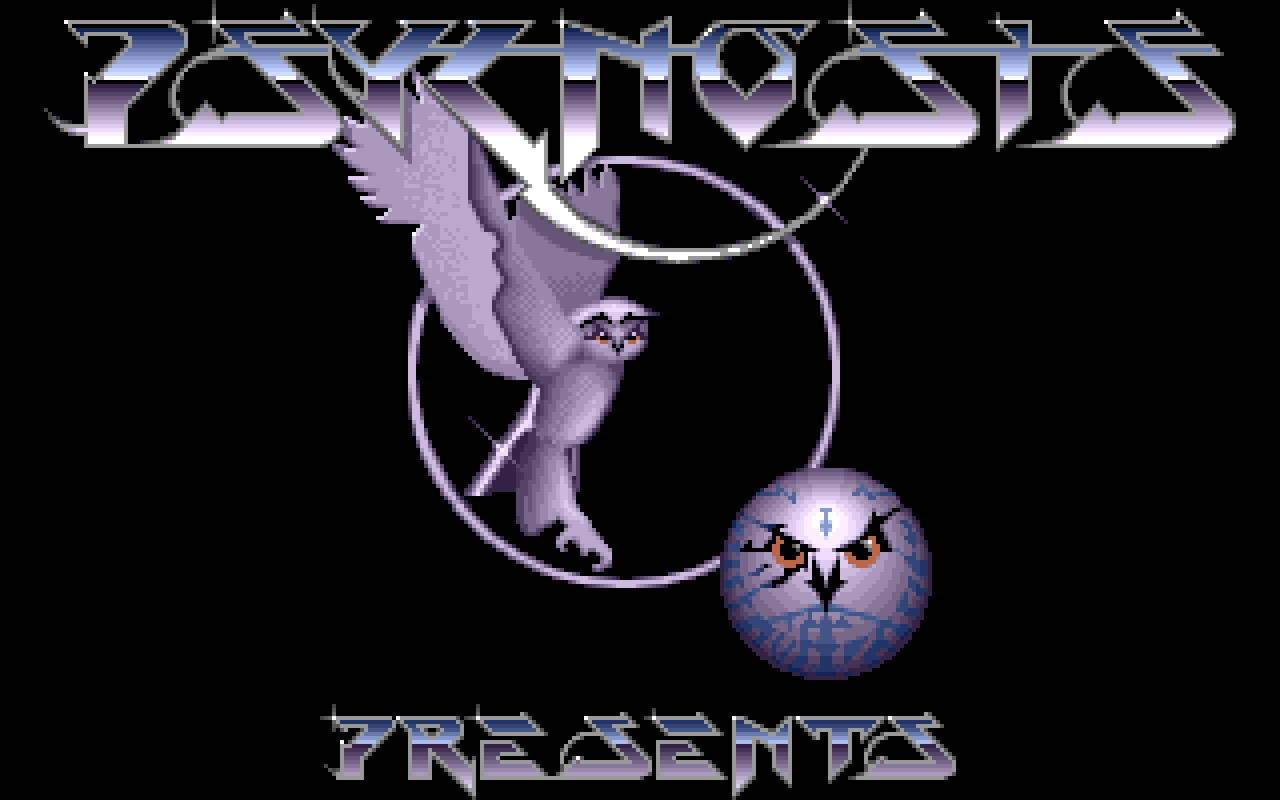
While on the subject of publisher logos, we must highlight one of my all-time favorites: Psygnosis, of Lemmings fame, who would eventually become a Sony subsidiary. Their logo work remains iconic to this day.
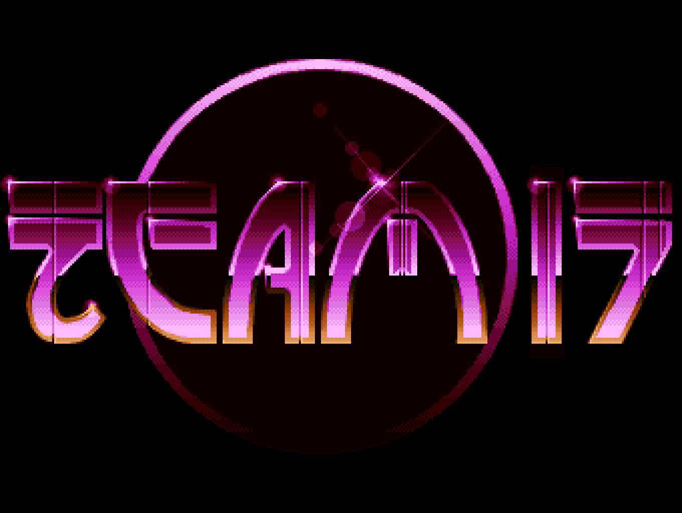
It would be a crime to neglect the tantalizing glow of Team 17, the studio behind Worms, who continue making games to this day. Their logo, crafted by Rico Holmes, exemplifies the luminous aesthetic that defined much of Amiga graphics work.
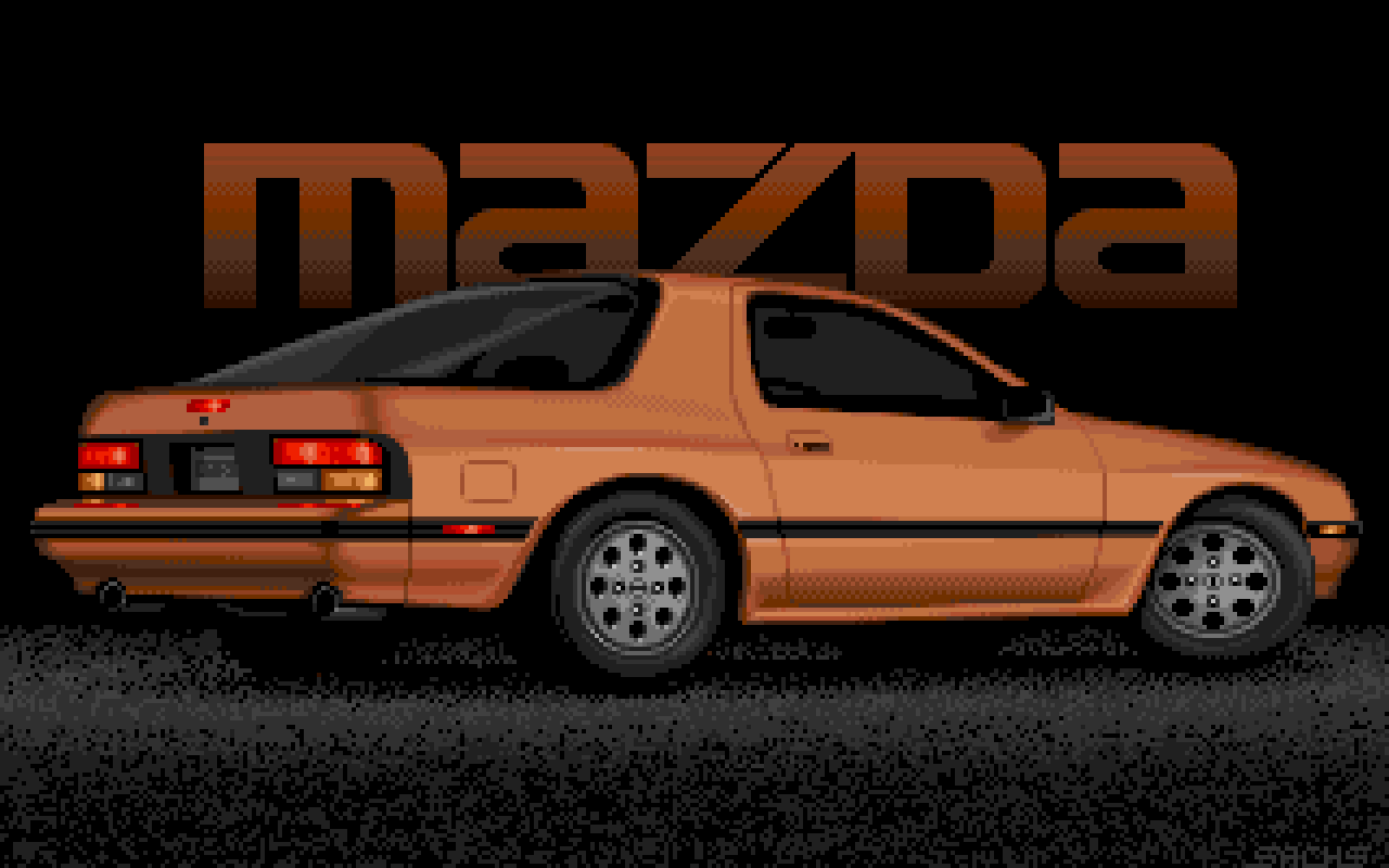
Jim Sachs was an iconic figure in the Amiga scene, instrumental in creating some of the platform's early standout games including Defender of the Crown, Ports of Call, and the CDTV boot screen, along with much of his own distinctive artwork. I have a particular soft spot for the RX-7 piece, which showcases his masterful technique.
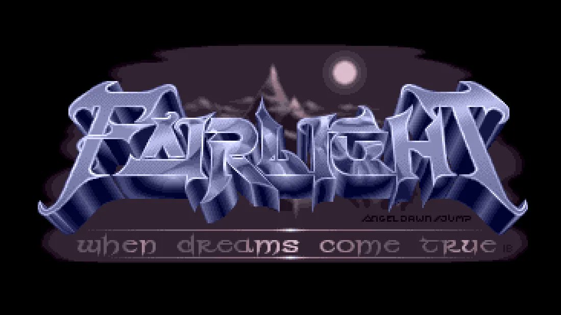
Fairlight was a prolific Amiga demo group, and gorgeous lettering was an integral part of the demo scene's visual language, serving as both branding and artistic expression.
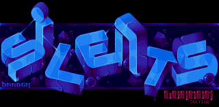
Here's a piece from Barock for The Silents, a group that transitioned from cracking to demo creation, featured in Static Chaos. The lettering demonstrates the sophisticated aesthetic that characterized the demo scene ada.untergrund.net/?p=demo&i….
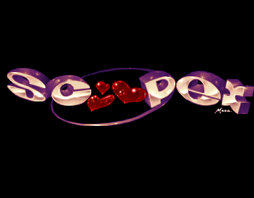
Demo group Scoopex expresses their affection through their logo, designed by Made, which captures the warmth and camaraderie of the scene.
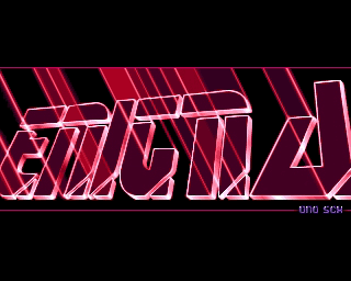
I'll wrap up this section on demos with the Enigma logo by Uno for the Amiga demo Phenomena. The soundtrack is still worth listening to today - I even have an MP3 of it in my playlists!
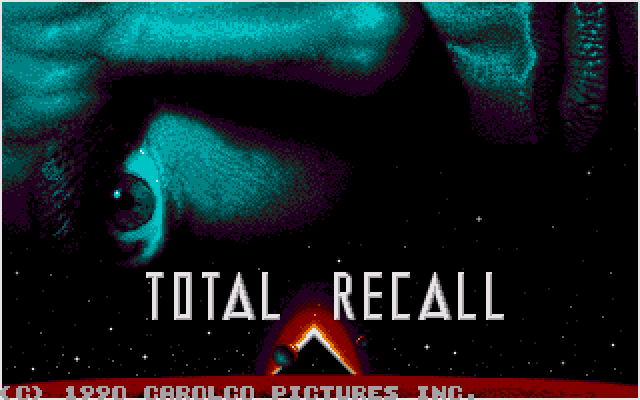
It's easy to forget that these remarkable works were created within severe technical constraints—mostly around 320x200 resolution (some might utilize overscan) with typically just 16 or 32 colors available. The title screen from Total Recall demonstrates what could be achieved within these limitations.
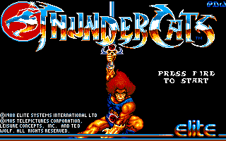
If there's a lettering style that more perfectly encapsulates the 1980s aesthetic than the desert-mirror effect, I have yet to encounter it. This particular visual trope became synonymous with the era's graphic design sensibilities.
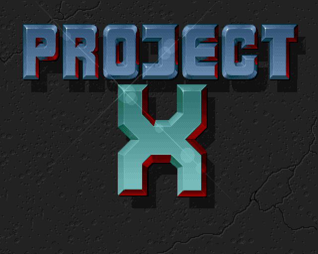
Team 17's Project X wasn't hesitant to showcase beautifully shaded lettering enhanced with hand-drawn lens flare effects. To be fair, this technique was genuinely impressive at the time, before J.J. Abrams's overuse of the effect in film somewhat diminished its impact.
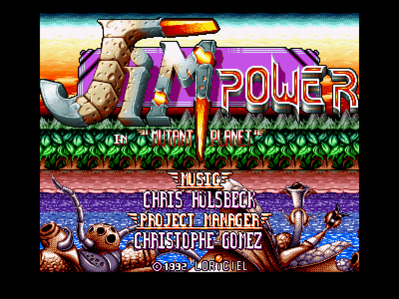
If you design a logo and find yourself unable to settle on a single style, you might end up with something like the Jim Power logo by Guillaume Dubail—a delightful pastiche that embraces multiple typographic approaches simultaneously.
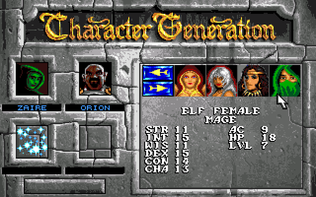
Someone clearly decided to go completely over the top with the "Character Generation" title on Eye of the Beholder 2, and I absolutely adore the result. The sheer exuberance of the design perfectly captures the spirit of the era.
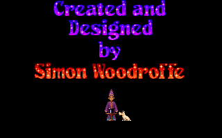
Adventuresoft's Simon the Sorcerer features some gorgeous colour font work that enhances the game's whimsical atmosphere. It remains a delightful point-and-click adventure today.
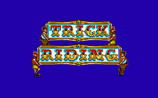
Hand-drawn decorative type crafted by Paul Drummond for Circus Games demonstrates the artistry possible when working directly with pixels, creating letterforms that feel both playful and meticulously executed.
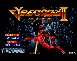
A desert-landscape chrome effect doesn't make sense in space, so why not create an alien landscape version instead? The delightful Cybernoid II, with graphics by Mark K Jones, demonstrates this creative adaptation of the chrome effect trope.

The Frontier logo might not appear particularly impressive at first glance, but in fact, it was rendered in polygons, and players were treated to watching it tilt and fly past—a technique that was unique for its time and demonstrated the technical capabilities of the platform.
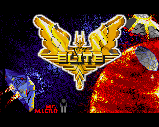
While we're on the subject of Frontier, here's the logo for Elite, which I can see on my shelved BBC Micro boxed version. The word "Elite" extruding from a golden-winged emblem as it flies through space definitely stands out as a memorable piece of game branding.
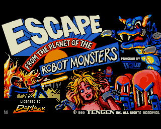
Escape from the Planet of the Robot Monsters surely deserves some kind of award for the sheer number of typographical styles crammed onto a single screen—a veritable typographic showcase that demonstrates the creative possibilities of the medium.
I hope you enjoyed this typographical trip down 16-bit lane!
You can see many more examples of logos and great Amiga art at the Amiga Graphics Archive with additional CRT-like effects to really show how they would have looked back then.
0 responses