My quest for something to replace Envy Code B on my ClearType-enabled systems continues.
It must be obviously scalable, mono-spaced (yes I know you can program with variable-width but I prefer fixed-width), have distinctive characters to help avoid confusion between 1il, o0OQ, $Ss8 at reasonably small font sizes. You know the drill.
So far I’ve tried:
and a whole host of less desirable ones from Keith Deven’s programming font list.
Imagine my surprise when I read on Scott Hanselman’s blog he was using a font I’d never heard of called Inconsolata.
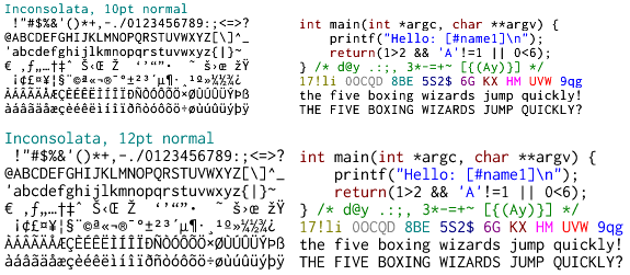
True, the font isn’t perfect but it is very fine. The best news is that it is to be liberally license which means I should be able to make the tweaks I want (there are some Bézier glitches, missing symbols and that zero needs a slash through it) and release a derivative version. I’m also not keen on the micro-serifs but we’ll see.
I’m just getting clarification on the situation from the author as to whether the license applies now or at final release.
[)amien
5 responses
The missing slash (or dot) in the zero is my only qualm with the font -- I'm very pleased with it otherwise. In any case, if you happen to add that feature, could you drop me a line? :)
The lousy hinting in Inconsolata is the deal breaker for me. In fairness, it seems to be primarily designed as a printing font, not a screen font. But I rarely print and I spend all day looking at fixed-width fonts in editors.
A while ago I was also looking for a fixed-glyph font to replace the Courier New and I have tried several monospace fonts but I found Consolas to be one of the best out there.
The sample here was rendered with ClearType enabled in WordPad.
I think the reason you are finding it ugly is that it doesn't feature heavy hinting trying to constrain it to individual whole pixels.
I might be able to clear that up a little with my derived version.
It looks decent on the original site (though it's been rendered at some huge point size) but your version looks terrible.
What did you use to render it? The AA is more like blurring and it's inconsistent - making all the lines look misshapen.
Nice font, though. Perhaps as good as Consolas, which I'm currently using.