OCT
9
2007
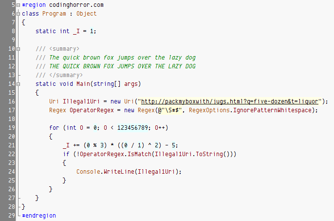
Jeff “Coding Horror” Atwood published a nice round-up of coding fonts he’s been looking at lately in Visual Studio with his own color scheme.
For reasons best known to Jeff he went with 11 point this time (previously his scheme was published with 10 point) and used the older preview of Envy Code R neglecting to mention the italic-as-bold variant to get round the no-italics limitation of Visual Studio’s highlighting syntax editor.
So here is the latest version, at the optimal 10 point utilizing the italic variant and Jeff’s own color scheme modified to show comments in ‘bold’:

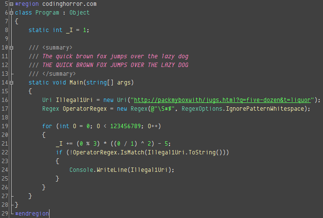
Personally I am using a tweaked version of Thomas Restrepo’s dark theme at work that currently looks like:

[)amien
8 responses
I've thought about creating a smaller version although that was in mind for use in the Output window...
The font looks fantastic at 10 pt, but I need more code! I've been running Consolas at 8pt, and Envy Code R looks pretty bad at 8pt, and is totally illegible at 6pt. I'd give it a whirl if it scaled down better. Nice work, though.
Thanks for the advocacy Eddy and Thomas, it is much appreciated and the referrals show you're convincing lots of people to try it.
You're right Thomas it is your older theme. I thought it was your Nightingale scheme but when I went to check I noticed the colours weren't the same and didn't think to check if you had other themes it might match. Fixed now :)
I can't work on a dark background at all, it reminds me of DOS, something which tore my eyes apart after spending a year working on the command line.
Hey, I've been evangelising Envy Code R since it first came to my attention :-)
You're right, the "1" needs to be a little bit more serif'ed. Otherwise, the rest looks just great.
--Eddy
The second screenshot looks similar to one of my old schemes. FWIW, I've become another fan or Envy Code R (of the VS variant) :). I'm using it right now with very good results even at larger point sizes. So definitely keep up the good work!
Consolas is a great font and I often use it and Inconsolata when doing presentations or demonstrating code as they both look great at large sizes.
When I'm really close to the screen for hours on end and want good code density on screen Envy Code R is what I find relaxing too although there still is a bit of work to do for the next preview - notable improving the 1 the comma, hash sign and curly braces.
Thanks for the comments, it's good to know Envy Code R has some fans otherwise it often feels like I'm talking to myself ;-)
Damien,
I have been using Envy Code R VS for some time now and it is in my opinion the best font for coding. I've tried many fonts, and the issue I've found is that you actually have to spend a few hours with a font to figure out if it is good for you or not. While you certainly could judge fonts by first impressions and how good they look, I care much more about eye fatigue and head aches. So while I think Consolas looks a little better than Envy R at first impression, Envy R has been better for me in the long run.
Great work!
Kim