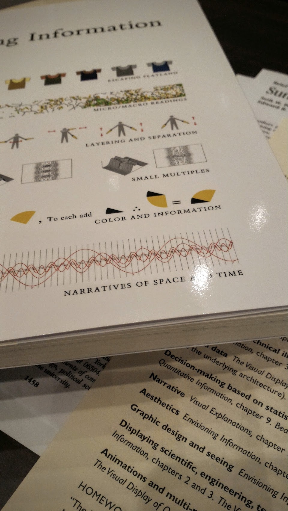

Here are my notes from today’s event by renowned statistician Edward Tufte, author of The Visual Display of Quantitative Information and Envisaging Information primarily for my own reference but perhaps of interest to others.
A dramatic start
No announcement, no preamble. The lights went out, and a visually striking video showing a representation of music started. Conversations were immediately hushed, and devices put away. An effective technique to get attention and signal an absolute start.
Charts and tables
- Sorting: Find a sort for your data that makes sense. Treat it as another axis, and don’t waste it with the alphabet.
- Sparse columns: Remove sparsely populated columns from tables. Special events should be specially annotated.
- Linking lines: Always annotate them to describe the interaction, prefer verbs over nouns from a taxonomy.
Information does not fit in a tree. The web is successful because Tim-Berners Lee understood this and made links the interconnectedness between content. “Vague, but exciting”
Data
Content is not clean. Data that shows behaviour in a perfect way is likely manipulated.
Human beings over-detect clusters and conspiracies. They find links between unrelated events, especially in sequences (serial correlation). Sports commentators, given any series of scores, will develop a false narrative to explain it. They’ll find a reason for 7 wins in a row despite random data producing such sequences.
Self-monitoring is a farce because people can’t keep their score. Once something is measured, it becomes a target to be gamed and fudged as needed.
You can make many models to fit any given data. It may work well for past and current data, but how far it lasts is highly variable. This is referred to as shrinkage; no model lasts forever.
Big data is not a substitute for traditional data collection and analysis. Google famously thought this when they created Google Flu which tried to spot the spread of flu based on search terms. It has been seriously criticized by Forbes and the New York Times.
Conflict
Do not jump to conflict or character assassination. Your motives are likely no better (or worse).
How many nice comments wiped out a bad one? Ten… a hundred?
Evil exists in the world, but it probably does not exist in your day-to-day life.
A deck of slides
A deck is inefficient. It is easy for the presenter but hard for the audience who are waiting for something they can use. “A diamond in the swamp” Slow reveals further reduce the information density, and people will check-out when it gets low.
Prefer spatially adjacent data (a document) over temporally stacked (slides). The often-cited limit of 7±2 items was for temporal retention, so limiting a page to this number of items is the opposite of what that research was telling us. We can cope with much more data if it is all on-page together.
Meetings and presentations
Do not be afraid of paper.
Prepare a document in advance but do not send it and instead spend 30 minutes at the start of the meeting reading it in silence (known as a study hall). People can read faster than you can talk as well as go back and forth as needed, skipping what they already know, and latecomers are less disruptive. Amazon is famously using this with its 6-page narrative memo system.
Never go meta in your presentation. Stick to the content. Respect your audience and do not presume to know them, or you may find yourself pandering or having low expectations. Instead, present the data to the best of your ability. Many complicated things are explained to millions of people all the time. You can’t teach if you have low expectations. Negativity and positivity are self-fulfilling.
Does your audience understand and trust you? Credibility is eroded not just by lying but by cherry-picking. Evidence of cherry-picking includes data too good to be true and hiding the source of the data behind excuses such as copyright, proprietary, or secrets. Why would a conclusion be open when the data needs to be secret? It’s likely a misrepresentation of the data for their own means.
Note a few words when somebody asks you a question to make sure your answer stays on topic. If you don’t know the answer be honest and suggest where you would start looking for the answer. Never heckle or waste time correcting minutiae.
Doctors trip
A trip to the Doctor’s office is a presentation. Write down your list before you go in. Make them listen because they normally interrupt after 22 seconds and consider each item individually. You’ll give up before you reach the end of your list this way, and they may not see the connected pattern of the whole.
Documents
Every document needs an abstract. It should spell out as simply as possible:
- What the problem is
- Who cares
- What the solution is
If you can’t write this, then you’re not saying anything.
Latex
Real scientists use Latex. There are thousands of templates including, official ones for well-known journals. Online tools like Overleaf can reduce the barrier to entry. Latex code appears like this:
\title{My presentation matters}
 \begin{document}
 \section*{Introduction}
 Sample of Latex
R is another alternative considered hard even by people who use Latex.
Reading
We are taught to read to extract facts to pass exams at school. We need to practice reading for enjoyment, reading to spot new information, to extract what we want, to form new opinions and ideas, to loot & hack.
Immediately skip words you don’t understand: there won’t be a test, and you’re not at school.
Design
Design does not belong to ‘other people’. Support thinking with analytical design and do whatever it takes to explain the data.
Why do bird books use illustrations? Because the authors want to help you spot the birds and using art they exaggerate the differences as well as produce a generic version of the bird.
Nature magazine has some of the best-designed visualizations around. Openness, pride and space constraints all help. (DNA only got 1.5 pages) The New York Times also often produces interesting visualizations of data.
User interface
Use the ideas proven by large successful sites on the web. Do not be swayed by arguments that your users won’t understand. Millions of users already do.
Touch is the next generation of user-interface. It allows the chrome (interface junk) to be jettisoned. No more scroll-bars, no buttons, no cursor, no zoom. Pure information experiences came not from academia, finance or medical but consumer space.
The future of interface design… is information design. Edward Tufte, Seattle, August 4 2015
The original UI metaphors at Xerox Parc on the Alto were around a single document. Instead, we have application-owned silos of data. The elegance was lost because companies want to control the content you create with their tools. They isolate your content so they can profit.
Hierarchies are still used for web design because it mimics the organization paying the bill. They see themselves this way and do not focus on how and what their customers need. Famous examples include the Treasury Department burying tax forms 7 levels deep despite being a top user request and the XKCD strip about University web sites. People on the inside have a skewed perspective of what the outside is.
The density of user interfaces is increasing. This allows for richer visualizations, especially when combined with animation or video. It is hard to get right.
[)amien
1 response
Real scientists who prefer highly efficiently outputting of LaTeX write Markdown. They then let Pandoc (http://pandoc.org/) convert the Markdown to LaTeX and/or PDF. (Even R lovers rely on Pandoc for their LaTeX/PDF output).
Side effect: from the same Markdown code same scientists can generate HTML, EPUB, EPUB3, DOCX, ODT or DocBook output. At zero extra cost...