
A series of posts on system fonts:
With the 8-bit system fonts post being so popular I just had to jump right in and look at the system fonts available on the 16-bit machines!
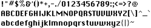
IBM CGA Adapter (1981)

The IBM PC’s first color graphics card was known as the Color Graphics Adapter.
Unusual characteristics
- Mix of serifs and non-serifs depending on space
- Off center
|+: - Squished
Qto avoid using descender - Wide
0 - Bubbly
! - Inconsistent
tpoint and lack of serif onj
Rationale
The large bold letters work well on the low-resolution displays at the time and many of the quirky were unlikely particularly noticeable there.
Influences
Unknown.
Apple Macintosh (1984)
Apple’s second attempt at a GUI (after the Lisa) was the Macintosh. The system font was called Chicago initially as a bitmap font which was replaced with a scalable TrueType version. With Mac OS 8 it was replaced with the similar Charcoal typeface and then dropped entirely in Mac OS X which uses Lucida Grande for the UI.
This font was dusted off again in 2001 and with a few minor tweaks became the system font of the iPod (classic & mini) until the higher resolution color display model.
Unusual characteristics
- Proportional letters not fixed-width
- Some symbols are not bold at all
#%"/\*@^\ - Lovely flourish on
& - Curve on
aactually touches the lower bowl - Designed specifically to avoid diagonal strokes (jaggies) on the Mac’s low-res screen
Rationale
The high-resolution display let the designers really pay attention to detail and even though it was a 1-bit monochrome display it really looks beautiful for the time. It was little wonder that when Jobs went to NeXT they went with incredibly high-resolution monochrome displays again (at least initially and with 2-bit gray-scale).
Influences
It’s unlikely they were digital.
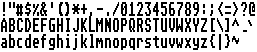
Commodore Amiga 1.x (1985)


The Amiga started with ex-Atari engineers desperate to design a 16-bit machine. It would eventually be purchased by Commodore and offer incredible graphics and sound that put Macs and PCs of the time to shame. Despite shipping with many fonts and supporting proportional text the default system font was a traditional fixed-width font called Topaz/8.
Unusual characteristics
- As well as some letters touching some symbols such as
\/touched horizontally allowing nice ASCII art - Unusual lower-case
gsomewhere between double and single story - Unusual almost comic-like
! - Some non-bold pixels for flourishes on
t& - Pixels missing on some curves
aSespecially obvious in low resolution - Over-extended
rlooks odd in any resolution - Alternate Topaz/9e, 10×9 (2 for descender), modified some glyphs like
gis available from Preferences as "Text 60"
Rationale
The Workbench booted in white-on-blue (shown) and was intended for use either with their own Commodore monitors or home TVs. Despite the choice of a serif font it worked quite well on these displays although interlace was quite unusable without specialized displays.
Influences
Very similar to the IBM CGA system font, very likely to be derived from there.
Technical
The Amiga shipped with it’s own font editor called "Fed" found on the Workbench Extras disk in the Tools folder.
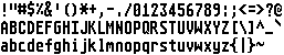
Commodore Amiga 2.x (1991)


Commodore’s update to the Amiga saw all sorts of changes in the ROM and Workbench for the GUI including some revisions to the font and the ability to change what font the workbench used.
Unusual characteristics
- Over-extended top of
1 - Open elements on
%@ - Messy
Qis hard to distinguish - Alternate Topaz/9e, 10×9 (2 for descender), modified some glyphs like
gand available from Preferences as "Text 60"
Rationale
The Workbench booted in black-on-grey (shown) and the new font looked a lot more friendly as well as being a more legible choice for home TVs.
Influences
Obvious modification of the prior 1.x font to remove serifs and improve legibility.
Technical
WBScreen allowed you to choose which font to display in Workbench including some of the proportional fonts included.
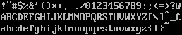
Atari ST Low/Medium Res (1985)

The Atari ST was Atari’s answer to the Commodore Amiga after they failed to purchase back the talent and technology. The machine’s GUI was based on GEM from Digital Research.
Unusual characteristics
- Descenders are cut very short on
pqdespitegynot following this style - Inconsistent positioning between
,and; - Ugly braces
()from the 8-bit font retained
Rationale
The font was very clear and worked well in both square pixel (low resolution) and rectangular pixel (medium resolution) modes.
Influences
Almost identical to the Atari 8-bit font but with the capital letters, symbols and numbers extended a pixel higher (inverse symmetry was no longer a concern) and more consistent/cleaner lowercase letters sj.
Technical
It is possible to change the system fonts used by the GEM desktop using the ST Font Loader.
Atari ST High Res (1985)
The ST was unique in that the high-res mode genuinely used a different font rather than just doubling the pixels of the medium-res font like the Amiga etc. which made a lot of sense given the high-res mode was only available on high-resolution monitors.
The proliferation of the ST in music and DTP would have put this chunky font in front of a lot of professionals.
Unusual characteristics
- Very tall letters; some glyphs 14 pixels high but still only 6-7 pixels wide
- Avoids every trace of a serif except usual
Iilmonospace hack - Short descenders on
pqstill - Inconsistent choices for
candRandw
Rationale
Given that this screen mode was only available on high-resolution monitors it is very rectangular and failed to really take advantage of the unique situation in which it would be used.
Influences
Very likely based on the medium resolution font with some redrawing.
IBM VGA Adapter (1985)
IBM really stepped up their game with the VGA adapter which was a huge leap forward in graphics for the PC. The system font was updated to take advantage of the higher resolution and the ability to display more colors.
Unusual characteristics
- Very tall letters: some glyphs 14 pixels high but still only 6-7 pixels wide
- Top bar of
Tis two pixels thick - Too-high double quotes
”also styled inconsistently - Another bubbly
!like the Amiga’s Topaz 1 - Inconsistent sizing between
,and; - Very large
$even bigger than the capitalS
Rationale
A reasonably nice serif font that gave a serious look if somewhat inconsistent in places.
Influences
Almost certainly based on the original CGA font.
Technical
Can be overridden by tools like fontedit.com.
0 responses