Through December 2022 I again produced a 24-day advent calendar of 8x8 pixel fonts this time primarily on Mastodon.
While many are original designs or significantly-extended and made it into my ZX Origins some were not suitable for inclusion there as they were either straight conversions or needed very little extending.
Those designs needed a home so they are presented here.
- Defender of the Crown
- Tipped
- Millionaire
- DockingBay
- Comic Fans
- Outrunner
- Decor
- Calstone
- The Neverending Story
- Rebound
- Waterlily
- Tatung Einstein
- Cyberwire
- Freespin
- Xcerpt
- Tai Pan
- Track40
- FiveWays
- Treatise
- Gift from the Gods
- Ident
- Simpsons Arcade
- Shakedown
- Pixie
Day 1 - Defender of the Crown
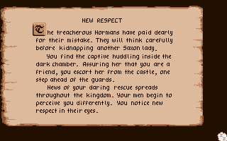
The rather thin yet stylish and unique font from Defender of the Crown by Jim Sachs. The C64, CPC, Mac & NES ports (and sequel) used very different fonts.
This one looks best with a proportional rendering routine.
[Download Defender of the Crown font](https://dl.damieng.com/fonts/conversions/Defender of the Crown.zip)

Day 3 - Millionaire
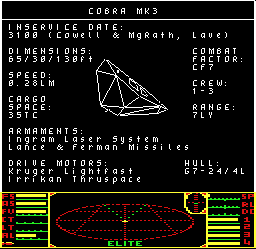
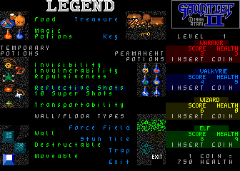
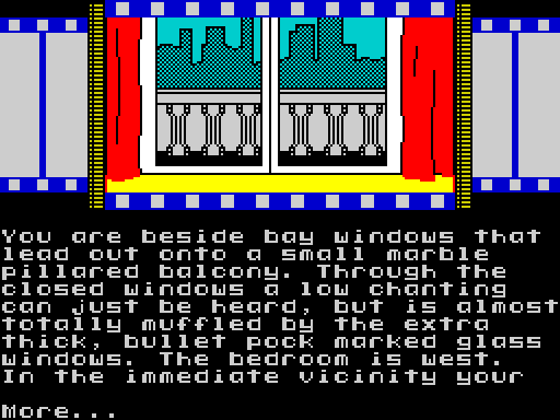
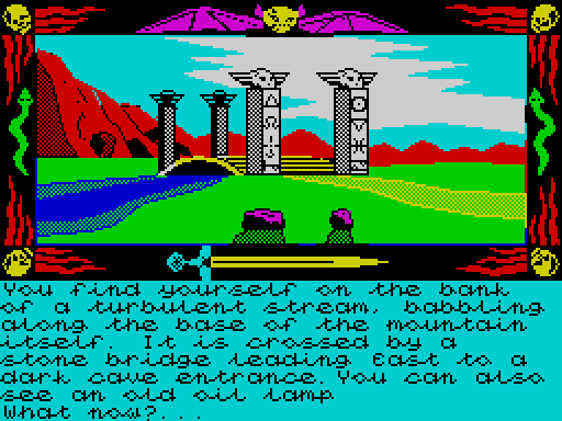
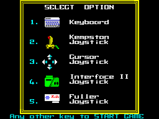
Three fonts from the ZX Spectrum game Millionaire which sees you try to to run a successful games company with a £500 budget.
Despite being released in 1984 this sim, published by Incentive of Driller and GAC fame, used three custom 8x8 fonts, the ROM font and a 16x16 for presentation. The author John Hunt produced four Spectrum games in his short two-year Speccy career.
Day 9 - The Neverending Story
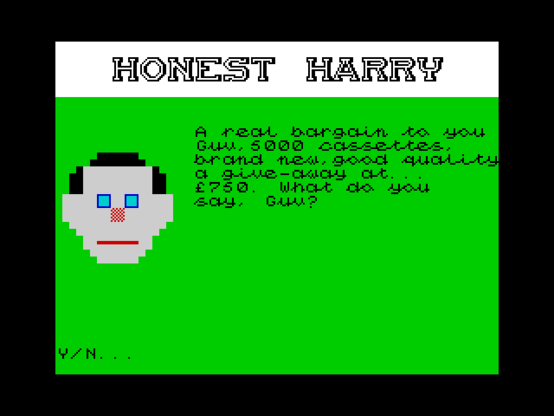
A script full of adventure and swashes! I liked the look of The Neverending Story (especially on the C64) so much it's one of the screenshots I use for my simulator. A conversion seemed to make a lot of sense but it turned itself into a bit of an adventure...
I downloaded a D64, dumped the RAM, Binxelview contents and pixel-by-pixel reproduced it in BASIN only to find out when I finished it didn't look right. So I regenerated the screenshot using my adaptation... and it was wrong. Quite wrong.
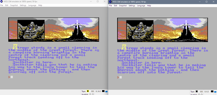
Investigating further it seems that the original C64 release had a variation with a taller lower-case which is what I had converted. So I grabbed another image and tried again. This time it looked better and I decided to include both in the zip (Neverending 1985 is the earlier one).
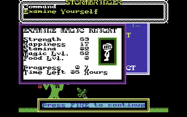
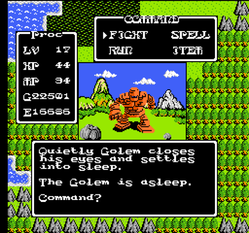
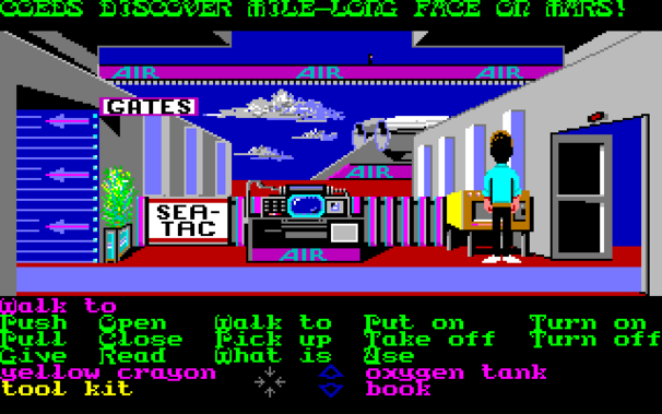
Unusually they then used this revised font on the all the other conversions - Atari 8-bit, Spectrum, Amstrad and Apple.
I considered reaching out to the authors to find out what happened here only to find out that the original programmer Ian Weatherburn passed away in the 90s and graphic artist Steven Cain passed away in 2006 may they rest in peace.
[Download Neverending Story fonts](https://dl.damieng.com/fonts/conversions/Neverending Story.zip)
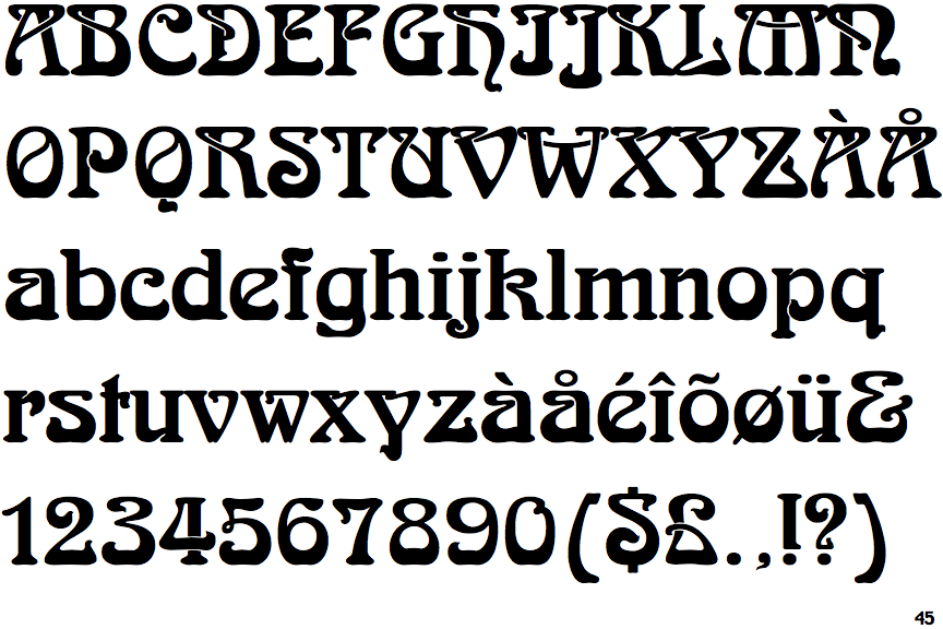
It's a lovely font and even has 16x16 caps for the drop-caps. It is modelled on a typeface called Arnold Böcklin by Otto Weisert published in 1904!
Day 12 - Tatung Einstein
This 1984 machine had limited success in the UK as a dev host for other machines thanks to the familiar Z80 + AY-3-8912 paired with fast Hitachi 3" drives, generous RAM, CP/M & decent IO ports.
This little font meant despite the same 256x192 res text would be 42 columns wide as standard compared to Speccy's 32 columns.
[Download Tatung Einstein font](https://dl.damieng.com/fonts/conversions/Tatung Einstein.zip)
Day 14 - Freespin
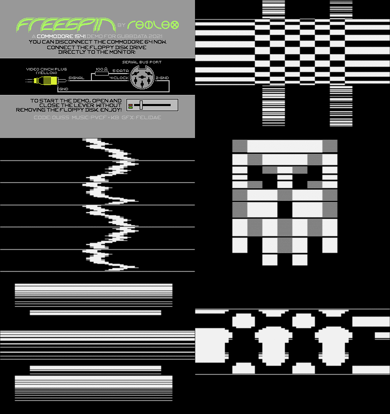
Did you know the Commodore 1541 floppy drive has a 6502 CPU inside?
Matthias Kramm created the Freespin demo running on the drive itself using the stepper-motor for sound & bit-banging serial data+clock for gfx over composite! It doesn't need the C64! Crazy.
Felidae's sharp font that appears on C64 host today gets a symbol+lower supplemented version.
Day 16 - Tai Pan
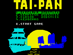
Ocean's 1987 adaptation of James Clavell's book sees you taking to the streets of 1800's China in an attempt to make your fortune. The graphics are bright and colourful and once again all formats used this rather nice capitals-only font.
I've extended it here with my idea of a lower-case set and an alternative small-caps variant for you to enjoy!
Day 18 - FiveWays
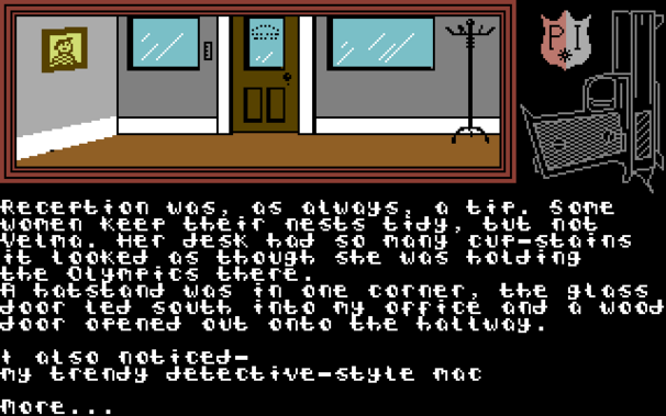
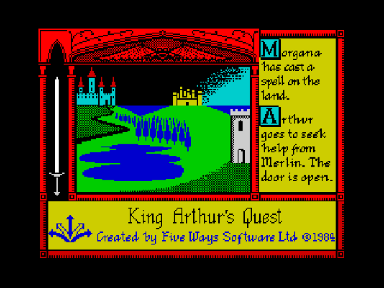
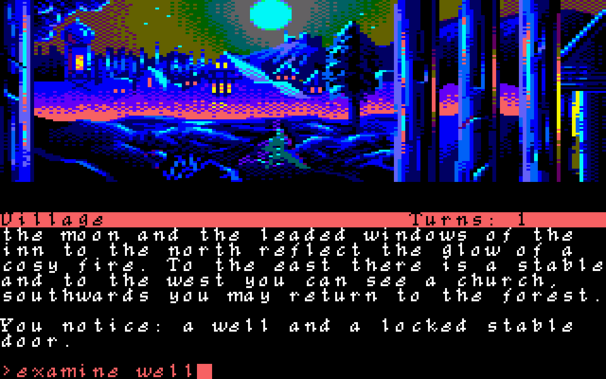
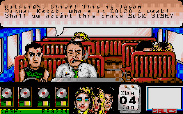
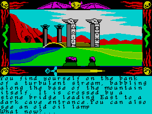
Five Ways Software appeared in 1983 producing educational Speccy titles before branching into games including two Lone Wolf game-book adaptations.
Right from the outset they used proportional font rendering + some very nice fonts while most other publishers were still using the plain ROM font. Here's their font from Lone Wolf, Aztec & King Arthur's Quest!
Day 20 - Gift from the Gods
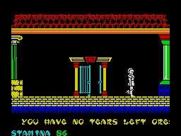
Ocean's colourful 1984 adventure Gift from the Gods developed by Denton Designs was an interesting concept marred by sluggish controls. The font however was full of unashamed big brush strokes which I've extended here to include lower-case and symbols!
[Download Gift from the Gods font](https://dl.damieng.com/fonts/conversions/Gift from the Gods.zip)
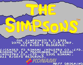
Day 22 - Simpsons Arcade
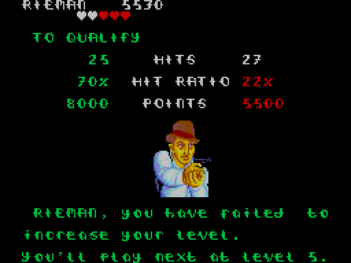
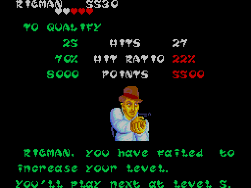
The Simpsons arcade game was a surprisingly fun multiplayer beat-em-up romp through Springfield and the in-game font captured the chaotic lettering of the TV title sequence perfectly.
Here I've attempted to add a set of lower-case characters in the same style... I hope I did it justice - it's a tricky one!
[Download Simpsons Arcade font](https://dl.damieng.com/fonts/conversions/Simpsons Arcade.zip)
