Typography articles (45)
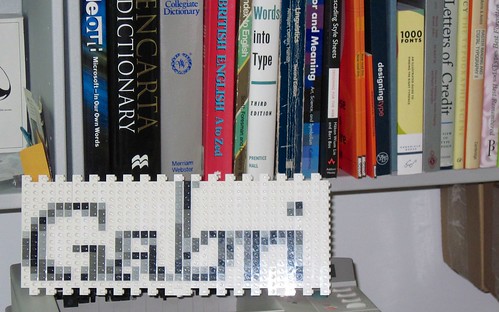
The Art of Amiga lettering
A gallery of remarkable title-screen and demo-scene logos hand-plotted in Deluxe Paint, celebrating the typographic artistry of the Amiga era.

Advent of Fonts 2025
December 2025 sees the fifth year of my Advent of Fonts project where I published a 24-day advent calendar of 8x8 pixel on Mastodon.
Advent of Fonts 2024
December 2024 sees the fourth year of my Advent of Fonts project where I published a 24-day advent calendar of 8x8 pixel on Mastodon.
Advent of Fonts 2023
December 2023 saw the third year of my Advent of Fonts project where I published a 24-day advent calendar of 8x8 pixel on Mastodon.
Advent of Fonts 2022
Through December 2022 I again produced a 24-day advent calendar of 8x8 pixel fonts this time primarily on Mastodon.

Advent of Fonts 2021
In December 2021 I tweeted a 24-day calendar of 8x8 pixel fonts.
Using variable web fonts for perf
Webfonts are now ubiquitous across the web to the point where most of the big players even have their own typefaces and the web looks a lot better for it.
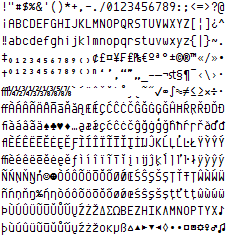
ZX Origins - free 8-bit fonts for games
I started designing fonts around 1987 on an 8-bit Sinclair ZX Spectrum. Many years later, my involvement in the Spectrum emulation scene led aul Dunn to ask me if I could provide fonts for his excellent BASIN Sinclair BASIC for Windows. My interest in 8x8 fonts was suitably rekindled, and I ended up delivering about 60 - some even extracted from my original +3 disk images.
Typography in bits: For a few pixels more
Examining the system fonts of the TRS-80 Color Computer, Dragon, Tatung Einstein, Commodore 128, Texas Instruments TI-99/4A, and Oric Atmos.
Typography in bits: Other English micros
Examining the system fonts of the Sinclair QL, Memotech MTX512, Amstrad PCW, Acorn Archimedes and SAM Coupé.
Typography on the Microsoft Campus
One of the great things about working for Microsoft was the sheer breadth of the company means there are lots of cool and interesting things going on that you can peek into even if it’s not your area.
Typography can be fun
People are always surprised when they hear you’re interested in typography. The appreciation and interest in the shape of letters and symbols is definitely a little more unusual to find as a hobby but it’s actually quite fun!
Android’s Roboto system font for Ice Cream Sandwich
Google have switched system font for Android’s latest release (known as Ice Cream Sandwich) from the Droid Family to a new typeface known as Roboto.
Typography in 16-bits: System fonts
A look at the system fonts of 16-bit machines including the IBM CGA & VGA Adapters, Apple Macintosh, Commodore Amiga, and Atari ST.

Typography in 8 bits: System fonts
Examining the system fonts of the Commodore PET, Apple ][, Atari 400/800, Acorn BBC Micro, Sinclair ZX Spectrum, Commodore 64, Amstrad CPC, and MSX.

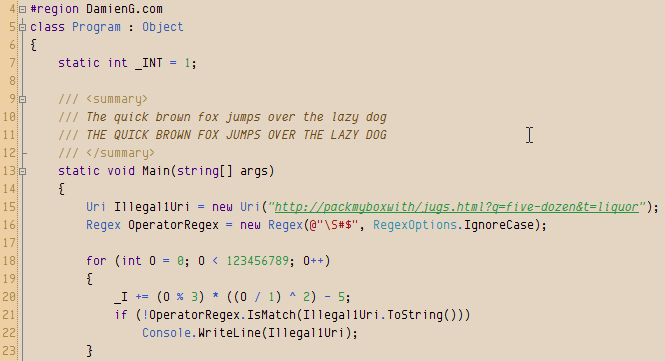
Font hinting and instructing: a primer
Taking my bitmap font Envy Code B into the vector TrueType Envy Code R was a long process, the most difficult being hinting.
The Xerox Alto mono-spaced font rises again
Computing history tells us of a mythical place where many of the innovations we take for granted today were either invented or refined to a working level at a single location known as the Xerox’s Palo-Alto Research Center (PARC).
Envy Code R preview #7 (v0.7)
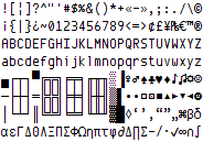
Envy Code R preview 7.2 is released with many glyphs redrawn and a full complement of box-drawing characters.
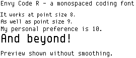
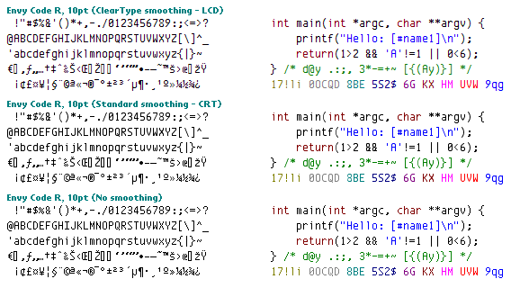
More screen-shots of Envy Code R preview #7
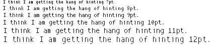
Work on my Envy Code R programming font has resumed and I’ve spent hours playing with the hinting process to ensure it looks good at sizes above and below 10 point:
Getting the hint (Where is Envy Code R?)
I know, I said there would be a good chance that the next version of Envy Code R would be out this weekend but the annoying sizing, thickness and cropping issues that came up at some sizes above and below the optimum 10 point were really annoying me.
Envy Code R coding font v0.7 preview
The next version of my Envy Code R font especially designed for programming (monospaced, easily distinguishable characters) is nearing completion and represents a very response-driven update to feedback, specifically:
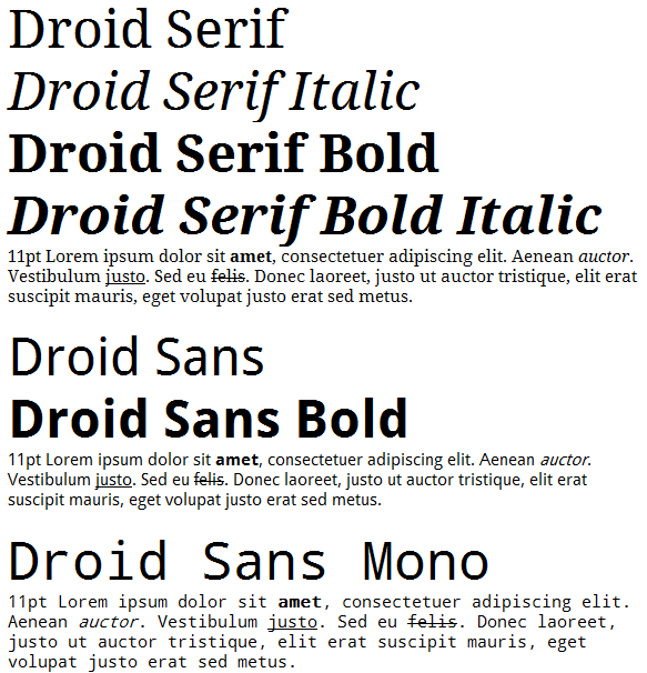
Droid font family courtesy of Google & Ascender
Google’s Android project, an open platform for mobile devices, has been hitting the news a lot in the last couple of days with it’s open APIs, Java-based development platform and optimized virtual machine.
Droid Sans Mono great coding font
Google’s Android project, an open platform for mobile devices, has been hitting the news a lot in the last couple of days with it’s open APIs, Java-based development platform and optimized virtual machine which includes the lovely set of typefaces from Ascender known as the Droid family.
Professional quality free fonts*
A roundup of high-quality typefaces available free or under generous licenses, covering FontShop's monthly giveaway, Inconsolata, Microsoft's OpenType pack, and several independent foundries.
Older pixel fonts back online
Some of my older bitmap “pixel” font files are now available again, they are:
Envy Code A
Originally titled simply Envy this font was born out of dislike for on-screen small serifs and disappointment with many alternative programming fonts.
Envy Code B
While Envy Code A was being polished for release it dawned on my how I would now prefer a thinner, taller font with slightly looser spacing and aiming for the 'perfect' size to allow good representation of all letters clearly including those with accents. The 10pt variant is that font however during testing it became apparent some people would prefer a version with tighter vertical spacing. This could not be achieved without sacrificing the uniformity of accented characters with their non-accented variants.
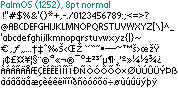
Palm OS
Palm OS was designed for very small devices and as such the font is optimized for good visibility in constrained spaces. As such it makes a great proportional font in Windows where either space is at a premium (e.g. Visual Studio output window) or where you don't want somebody to read over your shoulder (MSN Messenger).
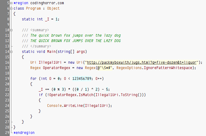
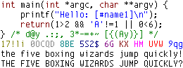
Envy Code R Jeff Atwood scheme
Jeff “Coding Horror” Atwood published a nice round-up of coding fonts he’s been looking at lately in Visual Studio with his own color scheme.
Fonts & typography
A directory of my typography work including the Envy Code programming fonts, the ZX Origins 8x8 pixel-font collection, annual Advent-of-Fonts releases, and recoveries of system, game, and movie fonts.
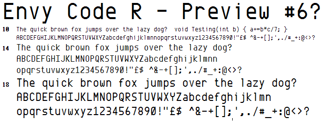
Envy Code R preview #6 released with Visual Studio italics
Release of Envy Code R preview 6 with 461 glyphs, a bold and italic variant, and a special Visual Studio build that marks the italic font as bold to work around VS's missing italic syntax highlighting.
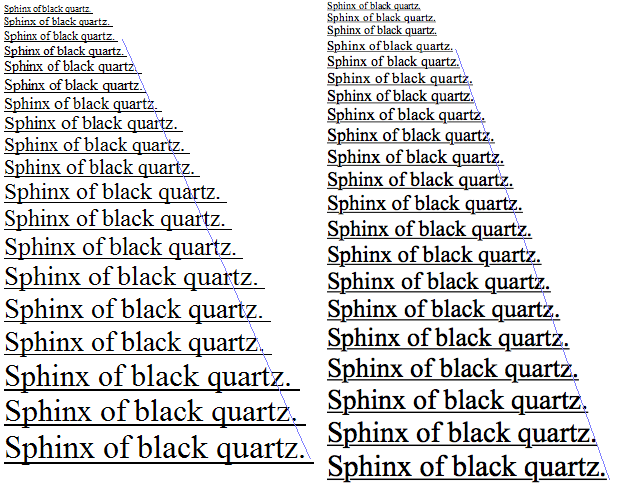
Envy Code R preview #6 forthcoming
Side-by-side comparison of preview 5 and the redrawn preview 6 of Envy Code R, addressing the awkward shapes that emerged at larger sizes after the 10pt-ClearType-optimised curves.
Font rendering philosophies of Windows & Mac OS X
Jeff Atwood asked "What’s Wrong With Apple’s Font Rendering?". Well, MacOS and Windows take opposite approaches to rendering text so let's take a look at what that means.
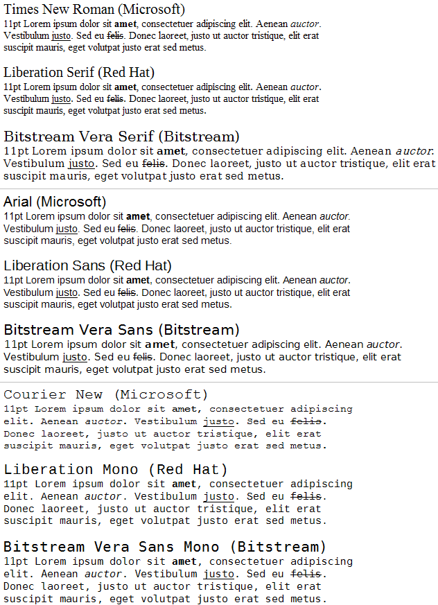
Red Hat releases Liberation fonts
Linux vendor Red Hat have released a font family named Liberation under a GPL license.
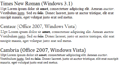
Windows font evolution
Vista and Office 2007 are interesting as they provide major user interface work that also includes new sets of fonts. I thought it would be interesting to show the evolution of the various styles.
Programming fonts you might not have tried
If you’re tired of the ugly-as-sin Courier New and have tried the popular well-known scalable TrueType/OpenType mono-spaced/fixed-width replacements:
Envy Code R programming font: preview available for download
Preview release of Envy Code R, a scalable ClearType-friendly programming font designed to match Envy Code B at 10pt, with notes on the missing characters and known rendering issues.
Envy Code R work continues
Progress notes on Envy Code R — curve adjustments for hnruc, the Windows Latin 1252 character set nearing completion, and the remaining ClearType spacing issues to solve before a pre-Christmas release.
Preview of Envy Code R programming font
My last post got me thinking, if I’m so happy with Envy Code B bar it’s ability to scale or take advantage of ClearType then there is only one real option. I reached for the pixelated TrueType conversion of Envy Code B and five hours later had a rough version of my **first ever vector font**, Envy Code R.
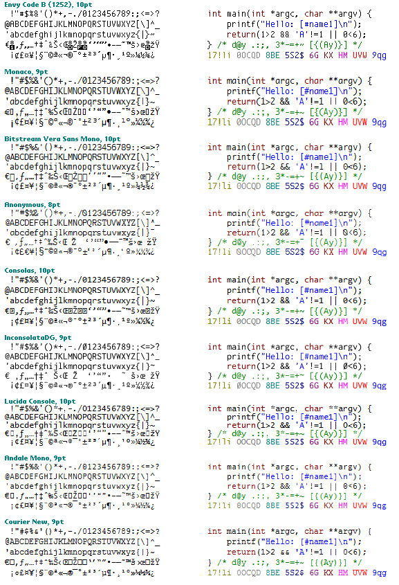
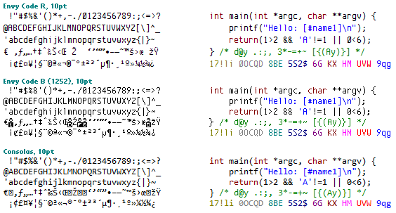
Comparing programming fonts
The blogging about favorite programming fonts doesn’t seem to want to truly die down so here’s how I rate the most popular fonts for programming in descending order with my own Envy Code B which I use all the time, but now desperately needs the ClearType treatment.
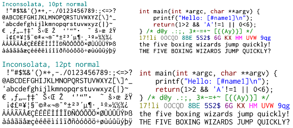
Inconsolata OpenType programming font
My quest for something to replace Envy Code B on my ClearType-enabled systems continues.
Envy Code B font available in TrueType format
It’s been a long time coming but finally, a TrueType conversion of my programming font Envy Code B.
Palm OS font available
Release of a pixel-perfect Palm OS system font conversion, reproducing the original 7pt regular and bold and 11pt larger variants from screen-shots for use on modern systems.
Envy Code A & Code B programming fonts updated
Update to the Envy Code A and Envy Code B pixel programming fonts fixing 9pt bold misalignments and introducing a new 12pt size for Envy Code A.
ClearType, smoothed fonts and the bane of MS Sans Serif
Back in the days of Windows 3.1, 95, 98 and Mac OS 7 the operating systems used a bit mapped font as the default system font for the various windows and dialogs.